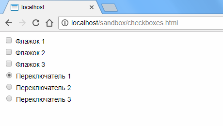
When creating CSS styles for HTML forms, developers often face the inability to directly change the appearance of checkboxes and radio buttons. Let's see how to get around this limitation using CSS3 tools and without using any JavaScript code.So, for starters, add a few ordinary checkboxes and switches to the form:/* */
<div>
<input type="checkbox" id="cb1"> <label for="cb1"> 1</label>
</div>
<div>
<input type="checkbox" id="cb2"> <label for="cb2"> 2</label>
</div>
<div>
<input type="checkbox" id="cb3"> <label for="cb3"> 3</label>
</div>
/* */
<div>
<input type="radio" name="rb" id="rb1" checked> <label for="rb1"> 1</label>
</div>
<div>
<input type="radio" name="rb" id="rb2"> <label for="rb2"> 2</label>
</div>
<div>
<input type="radio" name="rb" id="rb3"> <label for="rb3"> 3</label>
</div>
 Move the standard display of elements beyond the scope and add indents to the adjacent labels:
input[type="checkbox"]:checked,
input[type="checkbox"]:not(:checked),
input[type="radio"]:checked,
input[type="radio"]:not(:checked)
{
    position: absolute;
    left: -9999px;
}

input[type="checkbox"]:checked + label,
input[type="checkbox"]:not(:checked) + label,
input[type="radio"]:checked + label,
input[type="radio"]:not(:checked) + label {
    display: inline-block;
    position: relative;
    padding-left: 28px;
    line-height: 20px;
    cursor: pointer;
}
 Before the labels, add stylized containers for our custom elements. For flags, these will be squares with slightly rounded edges for beauty, and for switches, just small circles:
input[type="checkbox"]:checked + label:before,
input[type="checkbox"]:not(:checked) + label:before,
input[type="radio"]:checked + label:before,
input[type="radio"]:not(:checked) + label:before {
    content: "";
    position: absolute;
    left: 0px;
    top: 0px;
    width: 18px;
    height: 18px;
    border: 1px solid #dddddd;
    background-color: #ffffff;
}

input[type="checkbox"]:checked + label:before,
input[type="checkbox"]:not(:checked) + label:before {
    border-radius: 2px;
}

input[type="radio"]:checked + label:before,
input[type="radio"]:not(:checked) + label:before {
    border-radius: 100%;
}
 Now add selection indicators. For flags, these will be daws; for switches, smaller circles filled with color will be smaller than the container itself. For a larger effect, we also set up a small animation:
input[type="checkbox"]:checked + label:after,
input[type="checkbox"]:not(:checked) + label:after,
input[type="radio"]:checked + label:after,
input[type="radio"]:not(:checked) + label:after {
    content: "";
    position: absolute;
    -webkit-transition: all 0.2s ease;
    -moz-transition: all 0.2s ease;
    -o-transition: all 0.2s ease;
    transition: all 0.2s ease;
}

input[type="checkbox"]:checked + label:after,
input[type="checkbox"]:not(:checked) + label:after {
    left: 3px;
    top: 4px;
    width: 10px;
    height: 5px;
    border-radius: 1px;
    border-left: 4px solid #e145a3;
    border-bottom: 4px solid #e145a3;
    -webkit-transform: rotate(-45deg);
    -moz-transform: rotate(-45deg);
    -o-transform: rotate(-45deg);
    -ms-transform: rotate(-45deg);
    transform: rotate(-45deg);
}

input[type="radio"]:checked + label:after,
input[type="radio"]:not(:checked) + label:after {
    left: 5px;
    top: 5px;
    width: 10px;
    height: 10px;
    border-radius: 100%;
    background-color: #e145a3;
}
 To portray the jackdaw, we rotate a small rectangle, the two sides of which are painted in color, 45 degrees counterclockwise.Note that: before and: after selectors allow you to add content immediately before and after the content of the label itself. Since for labels we set relative positioning (position: relative), we can set contextual absolute positioning for their contents.It remains to hide the selection indicators when the item is not selected, and, accordingly, display them when the item is in the selected state:
input[type="checkbox"]:not(:checked) + label:after,
input[type="radio"]:not(:checked) + label:after {
    opacity: 0;
}

input[type="checkbox"]:checked + label:after,
input[type="radio"]:checked + label:after {
    opacity: 1;
}
 We add that the solution described here works in all modern versions of the browsers Chrome, Firefox, Safari, Opera, and also, starting with version 9, and in Internet Explorer.Full CSS definitions can be downloaded here .