在准备一些要在杂志上发表的结果时,出现了一个问题:如何在gnuplot中沿轴均匀分布数据。我决定了问题,我得到了图形。谁在乎,请照顾一下。最初,在工作流程中,所有图形都在MS Excel中构建。快速绘制数据,建立几条曲线并继续前进非常方便。但是在MS Excel中工作时,无法控制生成的图形。因此,在为文章编写结果时,我经常使用gnuplot。需要接收这样的图形: 通过此数据集
data.csv7.3; 0.0251; 250; 217.9006251
5.3; 0.0348; 293; 238.6280188
3.3; 0.0398; 176; 177.7890558
7.4; 0.0413; 262; 229.6579533
3.2; 0.0438; 186; 180.6920998
7.2; 0.0468; 265; 233.6496388
5.1; 0.0486; 247; 248.6435206
5.2; 0.0685; 239; 263.0861645
3.4; 0.0697; 180; 199.4893097
3.1; 0.0717; 167; 200.9408317
4.3; 0.0718; 405; 358.2750638
2.2; 0.0728; 267; 255.5794728
1.1; 0.0797; 226; 314.1587397
1.3; 0.0797; 225; 314.1587397
1.2; 0.0822; 292; 315.9731422
2.4; 0.0852; 276; 264.5789092
1.4; 0.0879; 299; 320.1099799
6.4; 0.098; 362; 311.209506
2.3; 0.102; 331; 276.771694
2.1; 0.1021; 233; 276.8442701
6.1; 0.1182; 372; 325.8698782
4.1; 0.1263; 335; 397.8290383
4.4; 0.1436; 459; 410.3847036
4.2; 0.1455; 435; 411.7636495
6.2; 0.153; 360; 351.126361
如果通过gnuplot运行此程序,则会得到以下内容:点合并。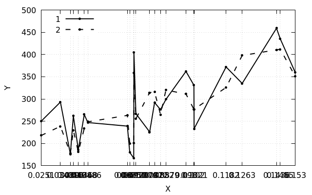 但这似乎不像我想要的。官方文档有助于了解轴上的标签(xtic)和图形区域中的标签(sprintf)的正确名称:
set xtics rotate by -60
Label(String,Size) = sprintf("{/=%d %s}", Size, String)

plot "data.csv" using 2:3:xtic(2) title "1" w lp ls 1 ,\
     "data.csv" using 2:4 title "2" w lp ls 2 ,\
     "data.csv" using 2:($3>$4?$3+20:$4+20):(Label(stringcolumn(2), 12)) with labels notitle
切片($3>$4?$3+20:$4+20)
允许您在图中以20个单位在所选点上方设置标记。结果是这样的: 但是沿轴的数据分布不均匀的问题仍然存在。该决定是在徘徊于论坛和文章的过程中形成的- 划界线。最简单的选择是手动编号。第二种选择是自动编号:
 nl -v 0 -s ';' -w 1 data.csv >> data_nums.csv
如果您需要排除注释行,则命令采用以下形式:grep -v "^#" data.csv | nl -v 0 -s ';' -w 1 >> data_nums.csv
data_nums.csv0; 7.3; 0.0251; 250; 217.9006251
1; 5.3; 0.0348; 293; 238.6280188
2; 3.3; 0.0398; 176; 177.7890558
3; 7.4; 0.0413; 262; 229.6579533
4; 3.2; 0.0438; 186; 180.6920998
5; 7.2; 0.0468; 265; 233.6496388
6; 5.1; 0.0486; 247; 248.6435206
7; 5.2; 0.0685; 239; 263.0861645
8; 3.4; 0.0697; 180; 199.4893097
9; 3.1; 0.0717; 167; 200.9408317
10; 4.3; 0.0718; 405; 358.2750638
11; 2.2; 0.0728; 267; 255.5794728
12; 1.1; 0.0797; 226; 314.1587397
13; 1.3; 0.0797; 225; 314.1587397
14; 1.2; 0.0822; 292; 315.9731422
15; 2.4; 0.0852; 276; 264.5789092
16; 1.4; 0.0879; 299; 320.1099799
17; 6.4; 0.098; 362; 311.209506
18; 2.3; 0.102; 331; 276.771694
19; 2.1; 0.1021; 233; 276.8442701
20; 6.1; 0.1182; 372; 325.8698782
21; 4.1; 0.1263; 335; 397.8290383
22; 4.4; 0.1436; 459; 410.3847036
23; 4.2; 0.1455; 435; 411.7636495
24; 6.2; 0.153; 360; 351.126361
使用此类数据集时,gnuplot将按固定间隔沿轴分布数据: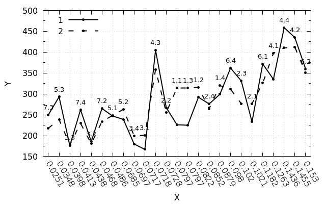 摘要脚本:
摘要脚本:#!/usr/bin/gnuplot -persist
set encoding utf8
set terminal pngcairo size 640,400 enhanced monochrome
set output "img.png"
set ylabel "Y"
set xlabel "X"
set key left top samplen 5 spacing 1.15 width 2
set xrange [-0.5:24.5]
set mytics 2
set xtics rotate by -60
set grid
set pointsize 0.5
set datafile separator ";"
set style line 1 linetype 1 pointtype 7 linewidth 2 linecolor black
set style line 2 linetype 2 pointtype 7 linewidth 2 linecolor black
Label(String,Size) = sprintf("{/=%d %s}", Size, String)
plot "data_nums.csv" using 1:4:xtic(3) title "1" w lp ls 1 ,\
"data_nums.csv" using 1:5 title "2" w lp ls 2 ,\
"data_nums.csv" using 1:($4>$5?$4+20:$5+20):(Label(stringcolumn(2), 10)) with labels notitle
更新:由于正念变形以及对文档的准确引用(第Pseudocolumns段),事实证明您无需人工编号即可完成此操作。为了使数据沿轴均匀分布,可以使用空列($ 0),该列提供行索引。在这种情况下,可以使用原始数据集-data.csv,并在脚本中进行以下更改:plot "data.csv" using 0:3:xtic(2) title "1" w lp ls 1 ,\
"data.csv" using 0:4 title "2" w lp ls 2 ,\
"data.csv" using 0:($3>$4?$3+20:$4+20):(Label(stringcolumn(2), 12)) with labels notitle