Hello everyone! In anticipation of the launch of the advanced course “IOS Developer”, we publish a translation of the second part of the article about neomorphism using SwiftUI ( read the first part ).
Dark theme
Before we begin to understand how we can improve the availability of neomorphism, let's see how we can work with the effect to create other interesting styles.First add two more colors to the extension Colorso that we have several constant values on hand:static let darkStart = Color(red: 50 / 255, green: 60 / 255, blue: 65 / 255)
static let darkEnd = Color(red: 25 / 255, green: 25 / 255, blue: 30 / 255)
We can use them as a background for ContentView, replacing the existing one Color.white, as shown here:var body: some View {
ZStack {
LinearGradient(Color.darkStart, Color.darkEnd)
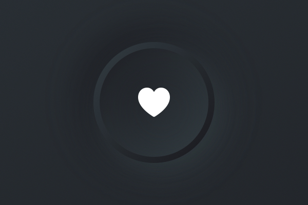
Ours SimpleButtonStylenow looks out of place, because it imposes a bright stylization on a dark background. So, we are going to create a new dark style that works better here, but this time we will divide it into two parts: a background view that we can use anywhere, and a button style that wraps it with the padding and contentShape modifiers. This will give us more flexibility, as you will see later.The new background view that we are going to add will allow us to specify any shape for our visual effect, so we are no longer attached to circles. He will also keep track of whether to concave our convex effect (inward or outward), depending on the property isHighlightedthat we can change from the outside.We will start with the simplest, using a modified shadow flip approach to get a concave effect. Add this structure:struct DarkBackground<S: Shape>: View {
var isHighlighted: Bool
var shape: S
var body: some View {
ZStack {
if isHighlighted {
shape
.fill(Color.darkEnd)
.shadow(color: Color.darkStart, radius: 10, x: 5, y: 5)
.shadow(color: Color.darkEnd, radius: 10, x: -5, y: -5)
} else {
shape
.fill(Color.darkEnd)
.shadow(color: Color.darkStart, radius: 10, x: -10, y: -10)
.shadow(color: Color.darkEnd, radius: 10, x: 10, y: 10)
}
}
}
}
The modification is that when the button is pressed, the size of the shadow decreases - we use a distance of 5 points instead of 10.Then we can wrap it with the help of DarkButtonStylepadding and contentShape, as shown here:struct DarkButtonStyle: ButtonStyle {
func makeBody(configuration: Self.Configuration) -> some View {
configuration.label
.padding(30)
.contentShape(Circle())
.background(
DarkBackground(isHighlighted: configuration.isPressed, shape: Circle())
)
}
}
Finally, we can apply this to our button in ContentViewby changing it ButtonStyle():.buttonStyle(DarkButtonStyle())
Let's see what happened - although we don't have much code, I think the result looks good enough.
Some experiments
Now is the time to experiment with the effect, because it will help you better understand what SwiftUI is specifically capable of.For example, we could create a smooth convex button by adding a linear gradient to it and flip it when pressed:if isHighlighted {
shape
.fill(LinearGradient(Color.darkEnd, Color.darkStart))
.shadow(color: Color.darkStart, radius: 10, x: 5, y: 5)
.shadow(color: Color.darkEnd, radius: 10, x: -5, y: -5)
} else {
shape
.fill(LinearGradient(Color.darkStart, Color.darkEnd))
.shadow(color: Color.darkStart, radius: 10, x: -10, y: -10)
.shadow(color: Color.darkEnd, radius: 10, x: 10, y: 10)
}
If you run this, you will see that the button smoothly animates up and down when pressed and released. I think the animation is a little distracting, so I recommend disabling it by adding this modifier to the method makeBody()from DarkButtonStyle, after the modifier present there background():.animation(nil)
 This effect of the cushion button is charming, but if you plan to use it, I would advise you to try the following three changes to make the button stand out a little more.Firstly, despite the fact that this contradicts the low-contrast principle of neomorphic design, I would replace the gray icon with a white one to make it stand out. So,
 ContentViewyou would need the following:Image(systemName: "heart.fill")
.foregroundColor(.white)
Secondly, if you add overlay for the button in the pressed state, this will not only make it look more like a real physical button pressed evenly, but will also help to distinguish its pressed state from the unpressed one.To implement this, you need to insert the modifier overlay()after fill()when isHighlightedit is true, as here:if isHighlighted {
shape
.fill(LinearGradient(Color.darkEnd, Color.darkStart))
.overlay(shape.stroke(LinearGradient(Color.darkStart, Color.darkEnd), lineWidth: 4))
.shadow(color: Color.darkStart, radius: 10, x: 5, y: 5)
.shadow(color: Color.darkEnd, radius: 10, x: -5, y: -5)
 To achieve an even sharper look, you can remove two modifiers
 shadow()for the pressed state that focus on overlay otherwise.Thirdly, you can also add overlay to the unpressed state, just to mark that it is a button. Put it immediately after fill(), like so:} else {
shape
.fill(LinearGradient(Color.darkStart, Color.darkEnd))
.overlay(shape.stroke(Color.darkEnd, lineWidth: 4))
.shadow(color: Color.darkStart, radius: 10, x: -10, y: -10)
.shadow(color: Color.darkEnd, radius: 10, x: 10, y: 10)
}

Adding a Switch Style
One of the advantages of separating a button style from a non-morphic background style is that we can now add a switch style using the same effect. This means creating a new protocol-compliant structure ToggleStylethat is similar to ButtonStyle, except that:- We need to read
configuration.isOnto determine if the switch is on. - We need to provide a button to handle the act of switching, or at least something like
onTapGesture()or something like that.
Add this structure to your project:struct DarkToggleStyle: ToggleStyle {
func makeBody(configuration: Self.Configuration) -> some View {
Button(action: {
configuration.isOn.toggle()
}) {
configuration.label
.padding(30)
.contentShape(Circle())
}
.background(
DarkBackground(isHighlighted: configuration.isOn, shape: Circle())
)
}
}
We want to put one of them in ContentViewso that you can test it yourself, so start by adding this property:@State private var isToggled = false
Then wrap the existing button in VStackwith spacing equal to 40 and place it below:Toggle(isOn: $isToggled) {
Image(systemName: "heart.fill")
.foregroundColor(.white)
}
.toggleStyle(DarkToggleStyle())
Your structure ContentViewshould look like this:struct ContentView: View {
@State private var isToggled = false
var body: some View {
    ZStack {
        LinearGradient(Color.darkStart, Color.darkEnd)
VStack(spacing: 40) {
Button(action: {
print("Button tapped")
}) {
Image(systemName: "heart.fill")
    .foregroundColor(.white)
}
.buttonStyle(DarkButtonStyle())
Toggle(isOn: $isToggled) {
    Image(systemName: "heart.fill")
        .foregroundColor(.white)
}
.toggleStyle(DarkToggleStyle())
}
}
.edgesIgnoringSafeArea(.all)
}
}
And that’s all - we applied our common neomorphic design in two places!Accessibility improvement
We had enough time to play with various neomorphic styles, but now I want to dwell on the problems of this design: an extreme lack of contrast means that buttons and other important controls are not enough to stand out from their surroundings, which makes it difficult to use our applications for people with imperfect vision.This is the moment around which I observe some misunderstanding, so I want to say a few things in advance:- Yes, I understand that standard Apple buttons look just like blue text and therefore do not resemble familiar buttons, at least at first glance, but they have a high contrast ratio.
- « , , » — — « », , , - .
- - SwiftUI, , VoiceOver Apple.
You have already seen how we changed the gray icon to white to get instant contrast enhancement, but the buttons and switches still need much more contrast if you want to make them more accessible.So, we are going to consider what changes we could make so that the elements really stand out.First, I would like you to add two new colors to our extension:static let lightStart = Color(red: 60 / 255, green: 160 / 255, blue: 240 / 255)
static let lightEnd = Color(red: 30 / 255, green: 80 / 255, blue: 120 / 255)
Secondly, duplicate the existing one DarkBackgroundand name the copy ColorfulBackground. We will deal with it in a moment, but again, first we need to do some preparation.Third, duplicate the dark style of the button and switch, rename them to ColorfulButtonStyleand ColorfulToggleStyle, and then make them use the new one ColorfulBackgroundas the background.So they should look like this:struct ColorfulButtonStyle: ButtonStyle {
func makeBody(configuration: Self.Configuration) -> some View {
configuration.label
.padding(30)
.contentShape(Circle())
.background(
ColorfulBackground(isHighlighted: configuration.isPressed, shape: Circle())
)
.animation(nil)
}
}
struct ColorfulToggleStyle: ToggleStyle {
func makeBody(configuration: Self.Configuration) -> some View {
Button(action: {
configuration.isOn.toggle()
}) {
configuration.label
.padding(30)
.contentShape(Circle())
}
.background(
ColorfulBackground(isHighlighted: configuration.isOn, shape: Circle())
)
}
}
And finally, edit the button and switch in ContentViewto use the new style:Button(action: {
print("Button tapped")
}) {
Image(systemName: "heart.fill")
.foregroundColor(.white)
}
.buttonStyle(ColorfulButtonStyle())
Toggle(isOn: $isToggled) {
Image(systemName: "heart.fill")
.foregroundColor(.white)
}
.toggleStyle(ColorfulToggleStyle())
You can run the application if you want, but that makes no sense - it has not actually changed.To bring our colorful version of life, we are going to change the modifiers fill()and overlay()for the pressed and unpressed states. So, when isHighlightedtrue, change darkStartboth darkEndto lightStartand lightEnd, like this:if isHighlighted {
shape
.fill(LinearGradient(Color.lightEnd, Color.lightStart))
.overlay(shape.stroke(LinearGradient(Color.lightStart, Color.lightEnd), lineWidth: 4))
.shadow(color: Color.darkStart, radius: 10, x: 5, y: 5)
.shadow(color: Color.darkEnd, radius: 10, x: -5, y: -5)
If you run the application again, you will see that it has already improved significantly: the pressed state now has a bright blue color, so it becomes clear when the buttons are pressed and the switches are active. But we can do something else - we can add the same color around the button when it is not pressed, helping to draw attention to it.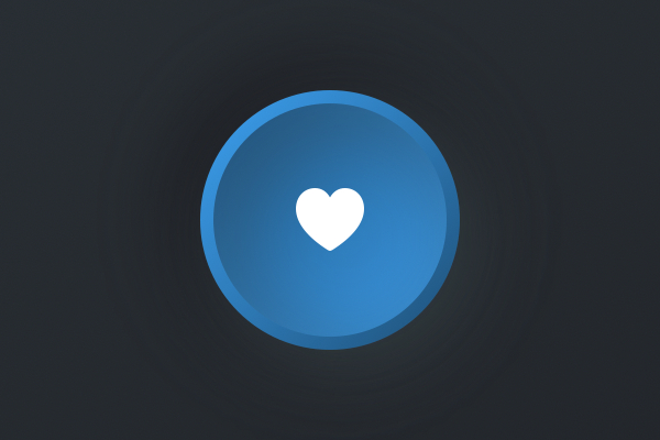 To do this, change the existing
 overlay()non-stressed state to this:.overlay(shape.stroke(LinearGradient(Color.lightStart, Color.lightEnd), lineWidth: 4))
So, the finished button style should look like this:ZStack {
if isHighlighted {
    shape
        .fill(LinearGradient(Color.lightEnd, Color.lightStart))
        .overlay(shape.stroke(LinearGradient(Color.lightStart, Color.lightEnd), lineWidth: 4))
        .shadow(color: Color.darkStart, radius: 10, x: 5, y: 5)
        .shadow(color: Color.darkEnd, radius: 10, x: -5, y: -5)
} else {
shape
.fill(LinearGradient(Color.darkStart, Color.darkEnd))
.overlay(shape.stroke(LinearGradient(Color.lightStart, Color.lightEnd), lineWidth: 4))
.shadow(color: Color.darkStart, radius: 10, x: -10, y: -10)
.shadow(color: Color.darkEnd, radius: 10, x: 10, y: 10)
}
}
Now run the application again, and you will see that a blue ring has appeared around the buttons and switches, and when clicked it is filled with blue - it is much more accessible.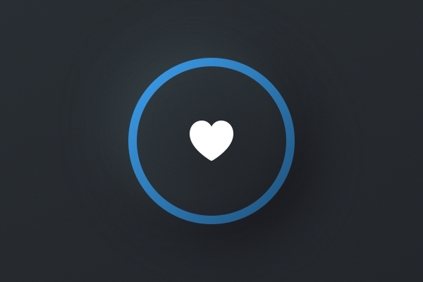
Conclusion
In practice, you will not have several different button styles in one project, at least if you do not like to create a headache for your users. But this is an interesting space for experimentation, and I hope that you catch this idea of my article, because you can create really beautiful effects without tearing your back.I have repeatedly said that you should always monitor the availability of your application, and that means more than just making sure VoiceOver works with your user interface. Make sure your buttons look interactive, make sure your text labels and icons have a sufficient contrast ratio to the background (at least 4.5: 1, but tend to 7: 1), and make sure your clickable areas are comfortable and large (at least 44x44 pixels).And for heaven’s sake, use the neomorphic design to experiment and expand your knowledge of SwiftUI, but never forget that if you sacrifice usability for a new fashion design trend, you won nothing.You can get the full source code for this project on GitHub .Read the first part.
Learn more about the course.