This article was translated ahead of the Python Developer course .
Storytelling is one of the most important skills for data analysis professionals. To communicate ideas and do it convincingly, you need to build effective communication. In this article, we will introduce 5 visualization methods that go beyond the classical understanding and can make your Data Story more aesthetic and beautiful. We will work with the Plotly graphics library in Python (it is also available in R), which allows you to create animated and interactive diagrams with minimal effort.What's good at Plotly
Plotly graphs can be easily integrated into various environments: they work well in jupyter notebooks, they can be embedded in a website, and they are also fully integrated with Dash - an excellent tool for creating dashboards and analytical applications.Let's start
If you have not already installed plotly, you can do this with the following command:pip install plotly
Great, now you can continue!1. Animations
Our work is often related to temporal data, for example, when we consider the evolution of a particular metric. Animation in plotly is a cool tool that helps reflect how data changes over time with just one line of code.
import plotly.express as px
from vega_datasets import data
df = data.disasters()
df = df[df.Year > 1990]
fig = px.bar(df,
y="Entity",
x="Deaths",
animation_frame="Year",
orientation='h',
range_x=[0, df.Deaths.max()],
color="Entity")
fig.update_layout(width=1000,
height=800,
xaxis_showgrid=False,
yaxis_showgrid=False,
paper_bgcolor='rgba(0,0,0,0)',
plot_bgcolor='rgba(0,0,0,0)',
title_text='Evolution of Natural Disasters',
showlegend=False)
fig.update_xaxes(title_text='Number of Deaths')
fig.update_yaxes(title_text='')
fig.show()
Almost any chart can be animated if you have a variable that helps you filter by time. Scatter plot animation example:import plotly.express as px
df = px.data.gapminder()
fig = px.scatter(
df,
x="gdpPercap",
y="lifeExp",
animation_frame="year",
size="pop",
color="continent",
hover_name="country",
log_x=True,
size_max=55,
range_x=[100, 100000],
range_y=[25, 90],
)
fig.update_layout(width=1000,
height=800,
xaxis_showgrid=False,
yaxis_showgrid=False,
paper_bgcolor='rgba(0,0,0,0)',
plot_bgcolor='rgba(0,0,0,0)')
2. Sunburst Charts
Sunburst charts are a great way to visualize a group by operation . If you want to break the available amount of data into one or more categorical variables, use the sunburst chart.Suppose we need to get the tip distribution by gender and time of day. So, we can use the group by operator twice and easily visualize the received data so as not to see the usual table output.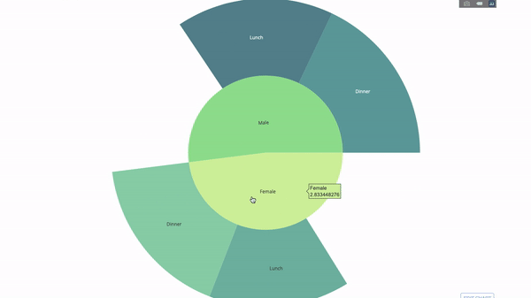 The diagram is interactive, you can click on the categories and view each category individually. All you have to do is decide on these categories, think through the hierarchy between them (argument
parentsin the code) and assign the appropriate values, which in our case will be the output of the group by operators .import plotly.graph_objects as go
import plotly.express as px
import numpy as np
import pandas as pd
df = px.data.tips()
fig = go.Figure(go.Sunburst(
labels=["Female", "Male", "Dinner", "Lunch", 'Dinner ', 'Lunch '],
parents=["", "", "Female", "Female", 'Male', 'Male'],
values=np.append(
df.groupby('sex').tip.mean().values,
df.groupby(['sex', 'time']).tip.mean().values),
marker=dict(colors=px.colors.sequential.Emrld)),
layout=go.Layout(paper_bgcolor='rgba(0,0,0,0)',
plot_bgcolor='rgba(0,0,0,0)'))
fig.update_layout(margin=dict(t=0, l=0, r=0, b=0),
title_text='Tipping Habbits Per Gender, Time and Day')
fig.show()
Now let's add another hierarchy level: To do this, we will add the result of another group by , from which we will get three more categories.
import plotly.graph_objects as go
import plotly.express as px
import pandas as pd
import numpy as np
df = px.data.tips()
fig = go.Figure(go.Sunburst(labels=[
    "Female", "Male", "Dinner", "Lunch", 'Dinner ', 'Lunch ', 'Fri', 'Sat',
    'Sun', 'Thu', 'Fri ', 'Thu ', 'Fri  ', 'Sat  ', 'Sun  ', 'Fri   ', 'Thu   '
],
                            parents=[
                                "", "", "Female", "Female", 'Male', 'Male',
                                'Dinner', 'Dinner', 'Dinner', 'Dinner',
                                'Lunch', 'Lunch', 'Dinner ', 'Dinner ',
                                'Dinner ', 'Lunch ', 'Lunch '
                            ],
                            values=np.append(
                                np.append(
                                    df.groupby('sex').tip.mean().values,
                                    df.groupby(['sex',
                                                'time']).tip.mean().values,
                                ),
                                df.groupby(['sex', 'time',
                                            'day']).tip.mean().values),
                            marker=dict(colors=px.colors.sequential.Emrld)),
                layout=go.Layout(paper_bgcolor='rgba(0,0,0,0)',
                                 plot_bgcolor='rgba(0,0,0,0)'))
fig.update_layout(margin=dict(t=0, l=0, r=0, b=0),
                  title_text='Tipping Habbits Per Gender, Time and Day')

fig.show()
3. Parallel categories
Another good way to visualize relationships between categories is with this parallel category chart. You can drag, select, and get values on the go, which is great for presentations.
import plotly.express as px
from vega_datasets import data
import pandas as pd
df = data.movies()
df = df.dropna()
df['Genre_id'] = df.Major_Genre.factorize()[0]
fig = px.parallel_categories(
    df,
    dimensions=['MPAA_Rating', 'Creative_Type', 'Major_Genre'],
    color="Genre_id",
    color_continuous_scale=px.colors.sequential.Emrld,
)
fig.show()
4. Parallel coordinates
A parallel coordinate diagram is an expanded version of the above graph. Here, each part of the graph reflects one observation. This is a good tool for detecting outliers (single streams isolated from the rest of the data), clusters, trends, and redundant data (for example, if two variables have the same values for all observations, they will lie on a horizontal line, which indicates the presence of redundancy).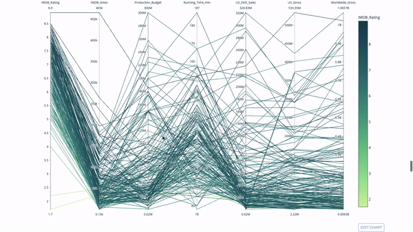
import plotly.express as px
from vega_datasets import data
import pandas as pd
df = data.movies()
df = df.dropna()
df['Genre_id'] = df.Major_Genre.factorize()[0]
fig = px.parallel_coordinates(
    df,
    dimensions=[
        'IMDB_Rating', 'IMDB_Votes', 'Production_Budget', 'Running_Time_min',
        'US_Gross', 'Worldwide_Gross', 'US_DVD_Sales'
    ],
    color='IMDB_Rating',
    color_continuous_scale=px.colors.sequential.Emrld)
fig.show()
5. Charts, sensors and indicators
 Sensor diagrams are needed for aesthetics. They are a good way to report success or performance indicators and relate them to your goal.
 Indicators will be very useful in the context of business and consulting. They complement visual effects with text that captures the attention of the audience and broadcasts growth indicators to the audience.
import plotly.graph_objects as go
fig = go.Figure(go.Indicator(
    domain = {'x': [0, 1], 'y': [0, 1]},
    value = 4.3,
    mode = "gauge+number+delta",
    title = {'text': "Success Metric"},
    delta = {'reference': 3.9},
    gauge = {'bar': {'color': "lightgreen"},
        'axis': {'range': [None, 5]},
             'steps' : [
                 {'range': [0, 2.5], 'color': "lightgray"},
                 {'range': [2.5, 4], 'color': "gray"}],
          }))
fig.show()
import plotly.graph_objects as go
fig = go.Figure(go.Indicator(
    title = {'text': "Success Metric"},
     mode = "number+delta",
    value = 300,
    delta = {'reference': 160}))
fig.show()


fig = go.Figure(go.Indicator(
     title = {'text': "Success Metric"},
    mode = "delta",
    value = 40,
 delta = {'reference': 160}))
fig.show()
That's all!
I hope you find something useful for yourself. Stay at home, be safe, work productively.
Learn more about the course.