Hi everyone, my name is Fedor Indukaev, I work as an analyst in Yandex.Routing. Today I want to tell you about the task of visualizing intersecting sets and about the open source Python package I created to solve it. In the process, we will learn how Venn and Euler diagrams differ, get acquainted with the service of order distribution and tangentially touch upon such a field of science as bioinformatics. We will move from simple to more complex. Go!What is it about and why is it needed?
Almost everyone who was engaged in exploratory data analysis had to look for an answer to questions of this type at least once:- There is a dataset with several independent binary variables. Which of them are often found together?
- There are several tables with objects of the same nature that have IDs. How do the sets of IDs from different tables relate - either each table has its own ID, or the same in all the tables, or the sets differ, but only slightly?
- There are several species. Which organisms have similar sets of genes or proteins?
- How to plot like pie chart if categories overlap? (True, this is not becoming a problem for everyone: see percentages in the figure below.)
All these questions can be reduced to the same wording. It sounds like this: a few finite sets are given, possibly intersecting each other, and we need to evaluate their relative position - that is, to understand how exactly they intersect.We will focus on visualizations and software tools to help solve this problem.Venn diagrams
Such drawings with two or three circles, I think, are familiar to everyone and do not require explanation:A feature of the Venn diagram is that it is static. The figures on it are equal and are located symmetrically. The figure shows all possible intersections, even if most of them are actually empty. Such diagrams are suitable to illustrate abstract concepts or sets whose exact dimensions are unknown or unimportant. The basic information here is contained not in the schedule, but in the signatures.
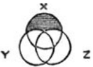 That is how they were conceived by John Venn, an English mathematician and philosopher. In his article of 1880he proposed diagrams for graphically displaying logical propositions. For example, the statement “any X is either Y or Z” gives a diagram on the right (illustration taken from the original article). The area that does not satisfy the statement is shaded over with black: those X that are neither Y nor Z. The main message of the article is that static drawings without varying the shape and arrangement of figures are better suited for the purposes of logic than the dynamic Euler diagrams, which are discussed will go below.It is clear that in the analysis of data, the scope of Venn diagrams is limited. They give only qualitative information, but not quantitative and do not reflect either the size or even the emptiness of intersections. If this does not stop you, you have at your disposal the venn package , which builds such diagrams forsets. For each there are one or two typical pictures, and only the signatures will differ:If we want something more dynamically dependent on the data, you should pay attention to another approach: Euler diagrams.
Euler Charts
Unlike Venn diagrams, the shape and position of the figures on the plane here are chosen to show the relationship of sets or concepts. If some intersection is empty, then the figures also do not overlap whenever possible, as in the figure about plants and animals.Please note that the drawing about the question in the lecture is different from the other two. It is important not only the position of the figures, but also the size of the intersections - all humor is enclosed in them.This idea can be used for our task. Take two or three sets and draw circles with areas proportional to the sizes of these sets. And then we will try to arrange the circles on the plane so that the overlap areas are also proportional to the size of the intersections.This is exactly what the package does (despite its name)matplotlib-venn : Drawing two sets with exact proportions is easy. But already at three, the method may fail. Let, for example, one of the three sets be exactly the intersection of the other two:The picture does not look good, a strange area appeared with the number 0. But there is nothing to be surprised at, because the intersection of two circles cannot be represented as a circle.And here is an even more depressing example: two sets and their symmetric difference (union minus intersection):It turned out to be something completely strange: pay attention to how many zeros there are!The first example can still be saved if we take rectangles instead of circles (the intersection of rectangles is also a rectangle), while the second requires at least non-convex shapes. Well, more than three sets, this package does not support in principle.I don’t know of other public tools for Python that develop the Euler-Venn approach, and the history of my own experiments will go further. But before continuing, I will make a small digression to explain why I even took up the task of visualizing sets.
A few words about the API for building optimal routes
As I said, our department does Yandex.routing. One of our services helps online stores, delivery services, and any company whose business includes logistics to build optimal routes for transport.Clients interact with the service by sending API requests. Each request contains a list of orders (delivery points) with coordinates, delivery intervals, etc., as well as a list of machines that need to deliver orders. Our algorithm digests all this data and produces optimal routes taking into account traffic jams, car capacity and much more.We have hundreds, not millions of customers, like the popular Yandex B2C services. Therefore, the happiness of each client is especially important to us, in addition, it is possible to pay him more attention and dive deeper into his tasks. For this, in particular, it is useful to have tools to help you understand what requests the client is sending us.I will give an example. Suppose, in one day, 24 requests were received from Romashka. This may mean that:- They work across the country and have built 24 route sets for 24 warehouses.
- There is only one warehouse, but the customer is constantly receiving new orders. To take them into account, you must update the routes every hour.
- Requests from the client are formed with an error due to which he was unable to get a good solution to a single task 24 times in a row.
A priori it is completely unclear what really happened. But if we can quickly compare 24 sets of order IDs, the situation will immediately become clear. If they do not intersect at all - this is the first case (24 warehouses). If the sets flow from one to the other, the second (scheduled update of routes). Well, 24 almost identical sets are a possible sign that the client needs help.Simplify the task: from circles to stripes
For some time I used the matplotlib-venn package, but the restriction of two and a half sets, of course, was frustrating. Reflecting on different approaches to the problem, I decided to try to move from circles and generally two-dimensional primitives to one-dimensional - horizontal stripes. Intersections can then be depicted vertically overlaid like this:Linear dimensions are perceived by the eye better than squares, complex trigonometry is not needed for construction, and spacing the sets along the Y axis makes the graph less overloaded. In addition, our first unsuccessful example (two sets and their intersection as the third) improves by itself:The problem with the symmetric difference is still here. But we will deal with it as Alexander the Great with the Gordian knot: let us, if necessary, cut one of the sets into two parts:The red set is depicted in two stripes instead of one, but there is nothing wrong with that. Both are at the same height and have the same color, so that their unity is visually well read.It is easy to verify that in this way, with the exact observance of proportions, any three sets can be depicted. Thus, the problem forequal to 2 or 3 can be considered resolved.Another plus of this approach is that it is easy to apply to any number of sets, which we will do very soon. All that is needed is to resolve not one, but an arbitrary number of line breaks. But first, a little simple combinatorics.A bit of arithmetic
Let's look at the Venn diagram with three circles and calculate how many areas the circles divide each other:Each area is determined by whether it lies inside or outside of each of the three circles, but the external area is superfluous. Total we get. Other locations of the three circles can give fewer areas up to 1, when all the circles coincide.Transferring this argument from circles to sets, we get that any sets break each other no more than such elementary parts. It is important that each of these parts is either wholly included or not wholly included in any of these sets. In our new diagrams, columns are such elementary parts.More sets!
So, we want to generalize these schemes to the case :For sets we get a grid with lines and columns, as we just calculated. It remains to go through each line and fill in the cells corresponding to the elementary parts included in this set.To illustrate, take a five-set model example:programming_languages = {'python', 'r', 'c', 'c++', 'java', 'julia'}
geographic_places = {'java', 'buffalo', 'turkey', 'moscow'}
letters = {'a', 'r', 'c', 'i', 'z'}
human_names = {'robin', 'julia', 'alice', 'bob', 'conrad'}
animals = {'python', 'buffalo', 'turkey', 'cat', 'dog', 'robin'}
Acting as described above, we get the following figure:It reads poorly: there are too many gaps in the lines, all the sets are chopped into cabbage. But since we don’t like breaks, why not directly set the task of minimizing them? After all, the order of the columns is insignificant, nothing prevents us from rearranging them as we want. We come to this problem: find the permutation of the columns of a given matrix of zeros and ones with a minimum number of gaps between units in rows.As I was told later, this is practically the task of a traveling salesman in the Hamming metric ; it is NP-complete . If there are few columns (say, no more than 12), then you can find the necessary permutation by exhaustive search, otherwise you need to resort to certain heuristics.We apply a simple greedy algorithm. Let us call the similarity of two columns the number of positions at which the values in these columns coincide. Take the two most similar columns, put them together. Further we will eagerly build up the sequence on both sides of this pair. Among the remaining columns, we find the one that most closely resembles one of the two, attach it - and so on with the rest of the columns.Here are the figures before and after applying the algorithm:It has become much better. It was at this stage that I felt that something useful was coming out. Having experimented, I noticed that the algorithm tends to stick at local minima. We managed to treat this well with a simple randomization: we make a little noise about the similarity of the columns, run the algorithm, repeat 1000 times, choose the best of 1000 solutions.The result is already quite a working tool, but you can add some more useful information to it. I made two additional graphs: the sizes of the original sets are shown on the right, and the top one for each intersection shows how many of our sets it is in. In fact, this is nothing more than the sum of our binary matrix in rows (on the right) and in columns (at the top):I also added the option of ordering the sets themselves (i.e., rows) according to the same principle as columns: with minimizing the number of breaks. As a result, similar sets are grouped:Application in work
Naturally, first of all, I began to use the new tool for the task for which it was created: to examine customer requests for our API. The results pleased me. So, for example, the working day of one of the clients looked like. Each line is a request to the API (many IDs of the orders included in it), and the signature in the middle is the time of sending requests:All day in full view. At 10:49 a customer logistic with an interval of 23 seconds sent two identical requests with 129 orders. From 11:25 to 15:53 there were three requests with a different set of 152 orders. At 16:43 a third unique request arrived with 114 orders. To solve this request, the logistician then applied four manual edits (this can be done through our UI).And this is what an ideal day looks like: all independent tasks were solved once, no corrections or selection of parameters was required:And here is an example from a client sending requests every 15-30 minutes to take into account orders received in real time:Even on 50 sets, the algorithm clearly revealed the structure hidden in the data. You can see how old orders were removed from requests and replaced with new ones as they were executed.In a word, I completely managed to close my working need with the created tool.Banana for scale (not really)
While I was studying existing approaches, I came across several times a drawing from the journal Nature , which compares the genomes of banana and five other plants:Notice how the sizes of the regions relate to 13 and 149 elements (indicated by arrows): the second is several times smaller. So there is no question of any proportionality.Of course, I wanted to try my hand at such data, but the result did not please me:The graph looks messy. The reason is that, firstly, almost all intersections (62 out of 63 possible) are nonempty, and secondly, their sizes differ by three orders of magnitude. As a result, numerical annotations become very crowded.To make my tool convenient for such data, I added several parameters. One allows you to partially align the column widths, the other hides annotations if the column width is less than a specified value.This option is read quite well, but for the sake of this I had to sacrifice the exact proportionality of size.As it turned out, paying attention to the field of bioinformatics, I was right. I sent a post about my tool to Reddit in r / visualization , r / datascience and r / bioinformatics , it was in the latter that it was best received, the reviews were really enthusiastic.Product Conversion
In the end, I realized that it turned out to be a good tool that can be useful to many. Therefore, the idea was born to turn it into a complete open source package. Of course, the consent of the leaders was necessary, but the guys not only did not mind, but also supported me, for which many thanks to them.Working mainly on weekends, I began to gradually bring the code to marketability, write tests and deal with the package system in Python. This is my first project of this kind, so it took several months.To come up with a good name was also a difficult task, and I coped with it poorly. Selected Name (super venn) cannot be called successful, because the whole salt of Venn diagrams is in their static nature, but, on the contrary, I tried to accurately show the real dimensions. But when I realized this, the project was already published and it was too late to change the name.Analogs
Of course, I was not the first to use this approach to visualization of sets: the idea, in general, lies on the surface. There are two similar web applications in open access: RainBio and Linear Diagram Generator , the second uses exactly the same principle as mine. (The authors also wrote an article on 40 pages , which experimentally compared what is better perceived - horizontal or vertical lines, thin or thick, etc. It even seemed to me that the article was primary for them, and the tool itself was just an addition to it .)To compare these two applications with my package, we again use the example with words. You can decide for yourself which option is more readable and informative.RainbioLinear Diagram GeneratorsupervennOther approaches
One cannot but mention the UpSet project , which exists as a web application and packages for R and Python. The basic principle can be understood by looking at the display of banana genome data. The graph is cropped to the right, only 30 intersections of 62 are shown:Interestingly, if you use supervenn to sort the columns by width and make the columns the same using the width alignment option, you will get almost the same thing, although this is not immediately noticeable. All that is missing is vertical lines with intersection sizes, instead of them there are only numbers at the bottom of the graph:While writing this text, I tried to use the Python version of UpSet, but I found that the package has not been updated since 2016, the documentation does not describe the input format in any way, and the test case crashes with an error. The web version is working, it has many useful auxiliary functions, but working with it is quite difficult due to the complicated way of entering data.Finally, an interesting overview of set visualization techniques is available online . Not all of them are implemented as software tools. Here are some pictures to get your attention:I was particularly interested in the Bubble Sets method (bottom row), which allows you to display small sets on top of a given arrangement of elements on a plane. This can be convenient, for example, when the elements are attached to the time axis (a) or to the map (b). So far, this method has been implemented only in Java and JavaScript (the links are on the authors page), and it would be great if someone undertook to port it to Python.I sent letters with a brief description of the project to the authors of UpSet and the review and received good reviews. Two of them even promised to include supervenn in their lectures on visualization of sets.Conclusion
If you want to use the package, it is available on GitHub and in PyPI: pip install supervenn . I will be grateful for any comments about the code and use of the package, for ideas and criticism. I will be especially pleased to read recommendations on how to improve the column permutation algorithm for large, and tips on how to write tests for charting functions.Thank you for the attention!References
1. John Venn. On the diagrammatic and mechanical representation of propositions and reasonings . The London, Edinburgh and Dublin Philosophical Magazine, July 1880.2. J.-B. Lamy and R. Tsopra. RainBio: Proportional visualization of large sets in biology . IEEE Transactions on Visualization and Computer Graphics, doi: 10.1109 / TVCG.2019.2921544.3. Peter Rodgers, Gem Stapleton and Peter Chapman. Visualizing Sets with Linear Diagrams . ACM Transactions on Computer Human Interaction 22 (6) pp. 27: 1-27: 39 September 2015. doi: 10.1145 / 2810012.4. Alexander Lex, Nils Gehlenborg, Hendrik Strobelt, Romain Vuillemot, Hanspeter PfisterUpSet: Visualization of Intersecting Sets. IEEE Transactions on Visualization and Computer Graphics (InfoVis'14), 2014.5. Bilal Alsallakh, Luana Micallef, Wolfgang Aigner, Helwig Hauser, Silvia Miksch and Peter Rodgers. The State-of-the-Art of Set Visualization . Computer Graphics Forum. Volume 00 (2015), number 0 pp. 1–27 10.1111 / cgf.12722.6. Christopher Collins, Gerald Penn and Sheelagh Carpendale. Bubble Sets: Revealing Set Relations with Isocontours over Existing Visualizations . IEEE Trans. on Visualization and Computer Graphics (Proc. of the IEEE Conf. on Information Visualization), vol. 15, iss. 6, pp. 1009−1016, 2009.