Support for CSS comparison functions min(), max()and clamp()appeared in Firefox on April 8, 2020. This means that these features are now supported in all major browsers. These CSS features extend our ability to create dynamic layouts and design more flexible components than before. They can be used to adjust the size of container elements, fonts, indents, and more. True, a web designer who creates page layouts taking into account the possibility of using these amazing functions may need to learn to think in a new way. Today I want to talk about the features of these functions, explain everything that may be incomprehensible in them, and give practical examples of their use.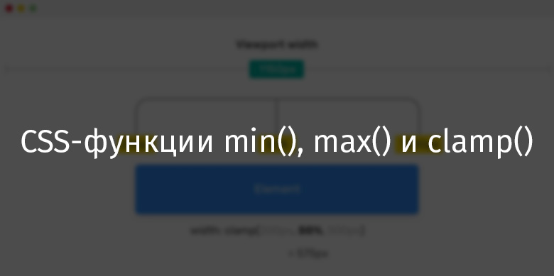
Browser support
First, I would like to touch on browser support for functions min(), max()and clamp(). Nevertheless, they appeared relatively recently. It should be noted that the functions min()and max()use the same level of browser support.Support for the min () function (the max () support information also looks like this)Below is information about the support for the functionclamp().Clamp () function supportCSS comparison functions
The CSS specification tells us that there are comparison functions min(), max()and clamp()allow us to compare the values of expressions and represent one of them. The value returned by a function depends on its features. Explore these features.Min () function
A function min()takes one or more values, separated by a comma, and returns the smallest of them. This function is used to limit the values of CSS properties to a strictly specified maximum level.Consider the following example. We need the maximum width of the element to not exceed 500px..element {
width: min(50%, 500px);
}
With a viewport width of 1150px, which is greater than 1000px, the item will have a width of 500px. Thebrowser will need to select the smallest value from50%and500px. The width of the viewport affects the selection result. If 50% of the width of the viewport is more than500px, then this value will be ignored and the function will return500px.Otherwise, if 50% of the width of the viewport is less500px, the resulting value will be used to adjust the width of the element. What do you think, at what width of the viewing area 50% of its width will not exceed500px? This is obviously1000px. With this width, both values passed to the function will be the same. If the width of the viewport is less1000px, then it will be used to adjust the width of the element.If the width of the viewport is less than 1000px, then 50% of this width will be used to adjust the width of the element.I hope that I managed to clearly explain all this. I thought about the function for a long timemin(), trying to penetrate into its essence. Therefore, I would very much like to clearly talk about it. Here is a video demonstrating the results of using this feature.The item width is limited to 500px.Here is an interactive example used to record the above video. To see the functionmin()in action, try resizing the browser window.Function max ()
The function max()takes one or more values, separated by commas, and returns the largest of them. This function is used to fix the minimum value that a CSS property can take.In the following example, we need the element width to be at least 500px..element {
width: max(50%, 500px);
}
If 50% of the width of the viewport is greater than 500px - this value will be used to adjust the width of the element. Thebrowser needs to select the maximum value from50%and500px. The choice depends on the width of the viewport. If 50% of the width of the viewport is less than500px, the browser will ignore this value and use the value500px.If 50% of the width of the viewport is greater500px, then the width of the element will be set equal to this value. As you can see, a functionmax()is the opposite of a functionmin().To better understand this, take a look at this interactive demo.Clamp () function
The function clamp()allows you to limit the range of variation of a certain value by setting its lower and upper limits. It takes three parameters: the minimum value, the calculated (recommended) value, and the maximum value. If the calculated value does not exceed the limits limited by the minimum and maximum values passed to the function, then it will return that value.Here is an example..element {
width: clamp(200px, 50%, 1000px);
}
Here we adjust the width of the element, which should not be less 200pxand more 1000px. If the value in 50%does not go beyond these limits, this value is used. Here is how it looks.If 50% of the width of the viewport falls into the range of 200px-1000px - this value will be used to set the width of the element. In this case, it is 575px.Let us examine this example:- The width of an element will never be smaller
200px. - The second parameter of the function, set as
50%, will be used only if the width of the viewport is larger 400pxand smaller 2000px. - The width of the item will not exceed
1000px.
As a result, we can say that the function clamp()allows you to specify the range in which the calculated value transmitted to it can change.Here you can experiment with the page that is stylized using this function.▍How are the results of the clamp () function calculated?
You can find information on MDN that when a function is used as the value of a CSS property clamp(), it is equivalent to the construction in which the max()and functions are applied min(). Take a look at the following example:.element {
width: clamp(200px, 50%, 1000px);
width: max(200px, min(50%, 1000px));
}
The value 50%depends on the width of the browser viewing area. Imagine that the width of the viewport is 1150px..element {
width: max(200px, min(50%, 1000px));
width: max(200px, min(575px, 1000px));
width: max(200px, 575px);
width: 575px;
}
▍Context matters
The calculated value depends on the context. If you specify a calculated value, you can use different units of measurement: %, em, rem, vw/vh. Even if the value is expressed as a percentage, when calculating it, either the width of the viewing area can be used - if the element is in the tag <body>, or the width of another element that is the container of the element.▍Math expressions
It is worth saying that when using a function, clamp()you can pass mathematical expressions to it, which saves us from having to use a function calc(). The specification tells us that clamp()full mathematical expressions can be used in each of the arguments . Therefore, there is no need for nested functions calc(). In addition, if you need to apply several restrictions to the final value, you can pass more than two arguments to the function.Take a look at the following example:.type {
font-size: clamp(12px, 10 * (1vw + 1vh) / 2, 100px);
}
What will CSS comparison functions change in the way we design page layouts?
It often happens that a designer, designing a page, focuses on both mobile and desktop devices, counting on two scenarios for its use. And when working on some projects, more scenarios have to be taken into account.I see this situation as shown below.Upstairs is how pages are designed today. Below is what you can expect in the future. Thetop of the illustration is how the pages are designed these days. Here you can see several steps representing different viewing areas on which the page should be designed. These steps may, for example, represent the value of a property. The lower part of the illustration shows a continuous range of values that can be obtained by limiting this value to a certain minimum and maximum. I believe that in the future, for example, when setting the font size, designers will do something similar to the one shown below.The minimum, recommended, and maximum values of the property.For me, this is just wonderful. I admire the idea of working on projects whose components need some flexibility. Of course, not all components need to be dynamic, but some of them may very well be.Use cases
▍ Sidebar and main page area
On the left is the side panel. On the right is the main area of the page.Usually the side panels of the pages have a fixed width, and the width of the main areas flexibly adjusts to the viewing area. We can expand the capabilities of the sidebar and make it more dynamic, make it, with a sufficiently large viewing area, take up more space. In order to achieve this, you need to limit the size of the minimum width of the sidebar using the functionmax().Consider the following example..wrapper {
display: flex;
}
aside {
flex-basis: max(30vw, 150px);
}
main {
flex-grow: 1;
}
The minimum width of the element asidewill be 150px. It will take size 30vwif the width of the viewport is larger 500px(500 * 30% = 150).→ Here is an example▍ Header font size
Flexible header font size adjustmentAn excellent script for using the functionclamp()is flexible header font size adjustment. Imagine that we need the minimum font size of the header to be16px, and the maximum -50px. Thanks to the use of the function,clamp()we can make the font size be within these values without going either lower or higher..title {
font-size: clamp(16px, 5vw, 50px);
}
Function clamp()is the perfect solution to the above problem. It allows you to set the font size so that the text remains accessible and easy to read at different sizes of the viewing area. If here, for example, you use the function min(), then we will lose control over the font size on the page displayed in small viewing areas..title {
font-size: min(3vw, 24px);
}
The following is an illustration of this idea.Using the min () function makes the text appear too small on the small screen.On the screen of the mobile device, the font size is too small. Therefore, it is not recommended to use only a function for setting font sizesmin(). Of course, the font size can be reconfigured using a media query, but then the meaning of using CSS comparison functions is completely lost.As already mentioned, a functionmin()can be used inside a functionmax(). This allows you to reproduce the features of the functionclamp()..title {
font-size: max(16px, min(10vw, 50px));
}
Here you can experiment with an example.I want to note that after the discussion on Twitter it turned out that it is not quite correct to use 10vwfont size as a calculated value. Namely, we are talking about the fact that this will cause accessibility problems if the user zooms in on the browser.Therefore, it is better to do so:.title {
font-size: clamp(16px, (1rem + 5vw), 50px);
}
Here, the expression is specified as the calculated font size (1rem + 5vw). This solves the problem.▍Decorative headers
Decorative translucent heading, displayed using a very large font.Do you see a large translucent text located under the main text of the heading? This is a decorative title, the dimensions of which should be consistent with the size of the viewport. To form such a header, you can use the functionmax()with a value expressed in units of measure passed to itvw. This will make it possible to ensure that the font size is not less than the specified value..section-title:before {
content: attr(data-test);
font-size: max(13vw, 50px);
}
→ Here is a working example▍ Output smooth gradients in different viewing areas
When adjusting gradients using CSS, you may need to dynamically adjust them to make gradients displayed on mobile screens smoother. Take a look at the following example. There is such a gradient:.element {
background: linear-gradient(135deg, #2c3e50, #2c3e50 60%, #3498db);
}
The gradient on the mobile screen is characterized by a too sharp transition between colors.Please note that on the mobile screen, the border of the separation of colors is clearly visible. This is bad. You can correct the situation with the help of a good old media inquiry. (Oops, it seems that I already consider media queries "good old technology.")@media (max-width: 700px) {
.element {
background: linear-gradient(135deg, #2c3e50, #2c3e50 25%, #3498db)
}
}
Although this is a normal way to solve the problem, in a similar situation we can use the CSS function min()..element {
background: linear-gradient(135deg, #2c3e50, #2c3e50 min(20vw, 60%), #3498db);
}
The result is what is shown below.The gradient looks smooth when viewed on any screen→ Here is a demonstration of this idea▍ Translucent gradient
When you need to place text on top of a photograph, then under it should be "put" a gradient. This will make it easier to read text. As in the previous example, the gradient parameters should depend on the size of the viewport. Take a look at the following figure.Flexible gradient settings on screens of different sizes.element {
background: linear-gradient(to top, #000 0, transparent max(20%, 20vw));
}
Thanks to this small improvement, the gradient on mobile devices will look much better than before. If the gradient size equals, on the desktop screen, 50% of the parent element, then on the mobile device it should already be something in the region of 30%. You can set the minimum value of the gradient size using the function max().→ Here is an example▍Dynamic outer margins
Customizing indentationYou can use units associated with the characteristics of the viewport to adjust the dynamic indentation of elements. However, this approach does not always show itself well. The fact is that the user can view the page on the rotated screen of a mobile device with a very large vertical height. Here's how to solve this problem using media queries:h1, h2, h3, h4, h5 {
margin: 7vh 0 1.05rem;
}
@media (max-height: 2000px) {
h1, h2, h3, h4, h5 {
margin: 2.75rem 0 1.05rem;
}
}
Although this code works correctly, the same effect can be achieved with just one line of code:h1, h2, h3, h4, h5 {
margin: min(7vh, 2.75rem) 0 1.05rem;
}
By using the function, min()we set the maximum indent value to 2.75rem. As you can see, it is very simple and convenient.→ Here is a working example▍ Container Width
Dynamically adjusting the width of a containerSuppose we need a container element whose width should be 80% of the width of its parent element. The width of the container should not exceed780px. How to create a similar container? Usually in this situation, they do something like this:.container {
max-width: 780px;
width: 80%;
}
But using the function min()allows you to limit the maximum width of the container like this:.container {
max-width: min(80%, 780px);
}
→ Here is a working example▍ Vertical Indent
clamp()I like the function in that it is ideal for limiting the size of the indentation of page sections. Take a look at the following example, which shows the configuration of the top of the page (hero section).Customizing the indentation of the section located at the top of the page You canflexibly adjust the indentation of such a section using just one line of CSS code..hero {
padding: clamp(2rem, 10vmax, 10rem) 1rem;
}
→ Here is an example▍Boundaries and Shadows
Here is a video that shows an element that has a wide border.Element with a wide borderIn some cases, the design of pages uses elements with wide borders and with large radius radii. When displaying such elements on mobile screens, their boundaries need to be made smaller. The same goes for corner radii. Using the functionclamp()allows you to dynamically adjust the border parameters, tying them to the width of the viewing area..element {
box-shadow: 0 3px 10px 0 red;
border: min(1vw, 10px) solid #468eef;
border-radius: clamp(7px, 2vw, 20px);
box-shadow: 0 3px clamp(5px, 4vw, 50px) 0 rgba(0, 0, 0, 0.2);
}
Here you can experiment with a working example.▍Distance between cells of the grid layout
Grid layoutAn interesting way to use the functionclamp()is to set the propertygrid-gapin grid layouts. In particular, we are talking about the fact that on mobile screens the distance between the grid cells would be less than on desktop ones..wrapper {
display: grid;
grid-template-columns: repeat(auto-fit, minmax(200px, 1fr));
grid-gap: clamp(1rem, 2vw, 24px);
}
If you are interested in using CSS comparison functions when designing grid layouts, take a look at this good article.→ Here is an example for this section▍Use in CSS functions for comparing values without units
In the course of experimenting with CSS functions, I decided to find out what happens if you pass functions clamp()as the minimum value 0. Here's what it looks like in code:.element {
width: clamp(0, 10vmax, 10rem);
}
This is bad CSS. I believe the fact is that numbers without units of measurement should not be used here.▍ Redundant mechanisms for browsers that do not support min (), max () and clamp ()
As is the case with any other new CSS features, applying functions min(), max()and clamp(), you need to take care of the backup mechanisms. To create these mechanisms, you can use one of the following approaches.1. Manual configuration of the backup mechanism
Here, manual configuration is understood as adding to the code a property that enjoys wide browser support. This property must be placed in front of the property that uses CSS comparison functions. Here's what it might look like:.hero {
padding: 4rem 1rem;
padding: clamp(2rem, 10vmax, 10rem) 1rem;
}
Here supporting browsers will clamp()ignore the first expression. And those that do not support this function will use the first way to adjust the indentation.2. Using the CSS directive supports
A directive @supportsdesigned to test browser support for various technologies can be used to find out if the browser can work with CSS comparison functions. I prefer to use this solution rather than the manual one described in the first paragraph. The fact is that any browser that supports comparison functions must also support the directive @supports..hero {
padding: 4rem 1rem;
}
@supports (width: min(10px, 5vw)) {
.hero {
    padding: clamp(2rem, 10vmax, 10rem) 1rem;
}
}
▍About content availability
While CSS comparison features give us a new way to create more flexible web pages using them, care must be taken. For example, using a function alone min()to set a property is font-sizenot enough. The fact is that on mobile devices, a font whose size is set using only this function may be too small. When setting up particularly important page content, remember to limit the minimum and maximum settings. Otherwise, it may worsen the user experience of working with the project.Do you use CSS functions min(), max()and clamp()?