 Hey. Today I will show you the color scheme that I have been using for the last 2 years. It was invented to get rid of a huge number of variables in CSS on a problematic project. And then it turned out that these principles can be applied to almost any project.In general, I’ll try to explain how designers use color in the UI and how all this can be “typed” without pushing designers into tight frames. I will give examples of implementation on React JS (for the developer) and in Figma (for the designer). The scheme does not have bindings to React and Figma, it's just that I’m more familiar with them.There is nothing cunning and unique in the scheme (maybe just a name). All ideas hang in the air. You can take it as my best practice for working with color in applications. Opium.Fill - these are general principles combined with love to give names to everything.The system can be used in conjunction with Material Design.The article is written for the front-end developer and a little for the designer.
Table of contents
- What problems do we solve
- Ideology Opium.Fill
- Basic assumptions
- Block No. 1. Parent colors
- Block No. 2. Substitution
- Block No. 3. Shifts
- Color inversion
- Using
- When it makes no sense to use
- Criticism
- Conclusion
All pictures are clickable1. What problems do we solve?
1.1. 50 shades of grey
Probably everyone is familiar with this problem. Most often it can be seen on shades of gray, but with other colors (for example, blue) this happens. Where to put, where to use? Even designers are confused about this.1.2. Designer plays with flowers
Sometimes a designer can deliver a new color simply because the old one is tired and disliked (or because he missed a pipette). There is nothing wrong with this; you do not need to blame the designer. But the problem is that the developer is not always aware of the changes.In this case, many color variables accumulate. After all, the developer does not understand whether it is necessary to remove old colors, or whether they are still used somewhere. Of the projects I've seen, the record is 273 color-only variables.A similar situation can occur on all projects where work is done on Agile and the design changes simultaneously with the development.1.3. Nightly themes and branding design
This problem stems from the previous one. If the project has a great many disordered variables, it is difficult to introduce new color schemes.For example, you are working on creating CRM. And your CRM gives the client the opportunity to adjust his color scheme to the corporate identity of the client. If you do not have a clear color scheme, then it will be difficult to do.But what if you need a dark theme for the application? Then the sentence “Vasily, let's take our 273 variables and systematize them” leads to the fact that Vasily broke the form at the 10th step of filling out the application, had a fight with the developer from the neighboring department and went crazy a week later.2. The ideology of Opium.Fill
2.1. Do not bother the designer to work
Opium.Fill was invented to “decipher” the design, and not to load the designer. The designer does not need to know about the existence of Opium.Fill in order to do everything according to the scheme.You should not impose a color scheme on the designer and it is better to wait until he finishes drawing the main concept of the application. Only after that it is useful to show him if something does not fit in with the color scheme, and to clarify whether these places can be corrected. On 9 out of 10 such questions, designers say "Pf, this is not a problem, let's replace it" or "Oh, but this is generally my cant, thanks for noticing."2.2. Define colors "by eye"
According to the periodic table, it is possible to predict the existence of elements not yet discovered. For this, empty cells were pre-allocated. We will use this principle for our color scheme. Make a table and leave some of the cells blank. But for the rest of the parameters, you will understand even by eye what color should be there.
2.3. Do not be discouraged if not everything turns out
Our task is to optimize the largest, routine part of working with color. If, indicating the color when developing the application, 1 time out of 100 you will come across something that does not fit into the circuit, this is not considered a problem.3. Basic Assumptions
3.1. To each color - a pair
We believe that each color has two “incarnations”. The first is saturated (conditionally Strong). The second is unsaturated (conditionally Weak). If we see blue, then in addition to being blue, we must define it as Strong or Weak. Is it saturated or unsaturated?3.2. Divide colors by functionality
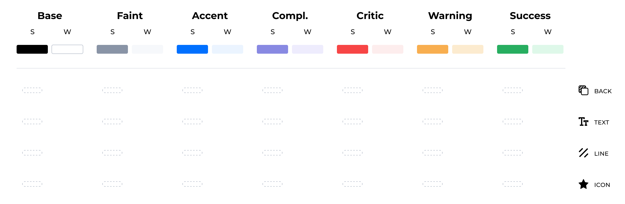
Forget about "sky-blue", "gold", "jet-black" and the like in the names of the colors. The name of the color should reflect its functionality, not its hex. Now we are working with the following names: Base, Faint, Accent, Complement, Critic, Warning, Success.3.3. Three blocks
Block No. 1 is the most important. Block number 3 is the most unimportant. Below I will describe each of the blocks. This separation is necessary so that colors less significant for drawing the interface distract us less.4. Block number 1. Parent colors
4.1. Names
Back to our new color names. Base, Faint, Accent, Complement, Critic, Warning, Success. Let's take it one at a time.Base
It is black and white. Or those colors that are similar to them to a degree of confusion. They are basic for text and background.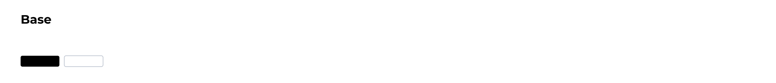
Faint
So we call shades of gray. Some background text or a grayish background is Faint. Black with transparency (if it is perceived as gray) is also included here.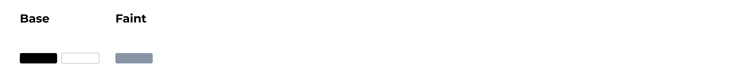
Accent
This is the main corporate color or the color that highlights the most important elements of the interface. For example, if you look at Russian banks, then: Sberbank is green, VTB is blue (or red, as you can see), Tinkoff is yellow, Alpha is red. For convenience, let's refer to shades of blue in our table under Accent.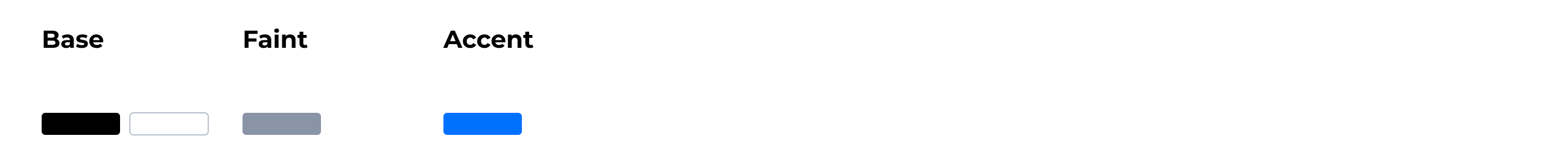
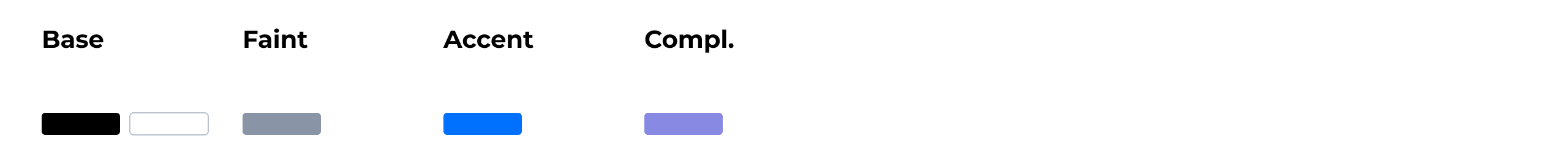
Complement
This is an optional accent color. Not everyone has it. Let's look at Airbnb - I would say that it is dark green: for our convenience, I will indicate Complement in purple, it will be useful to us in the design examples that I will show below.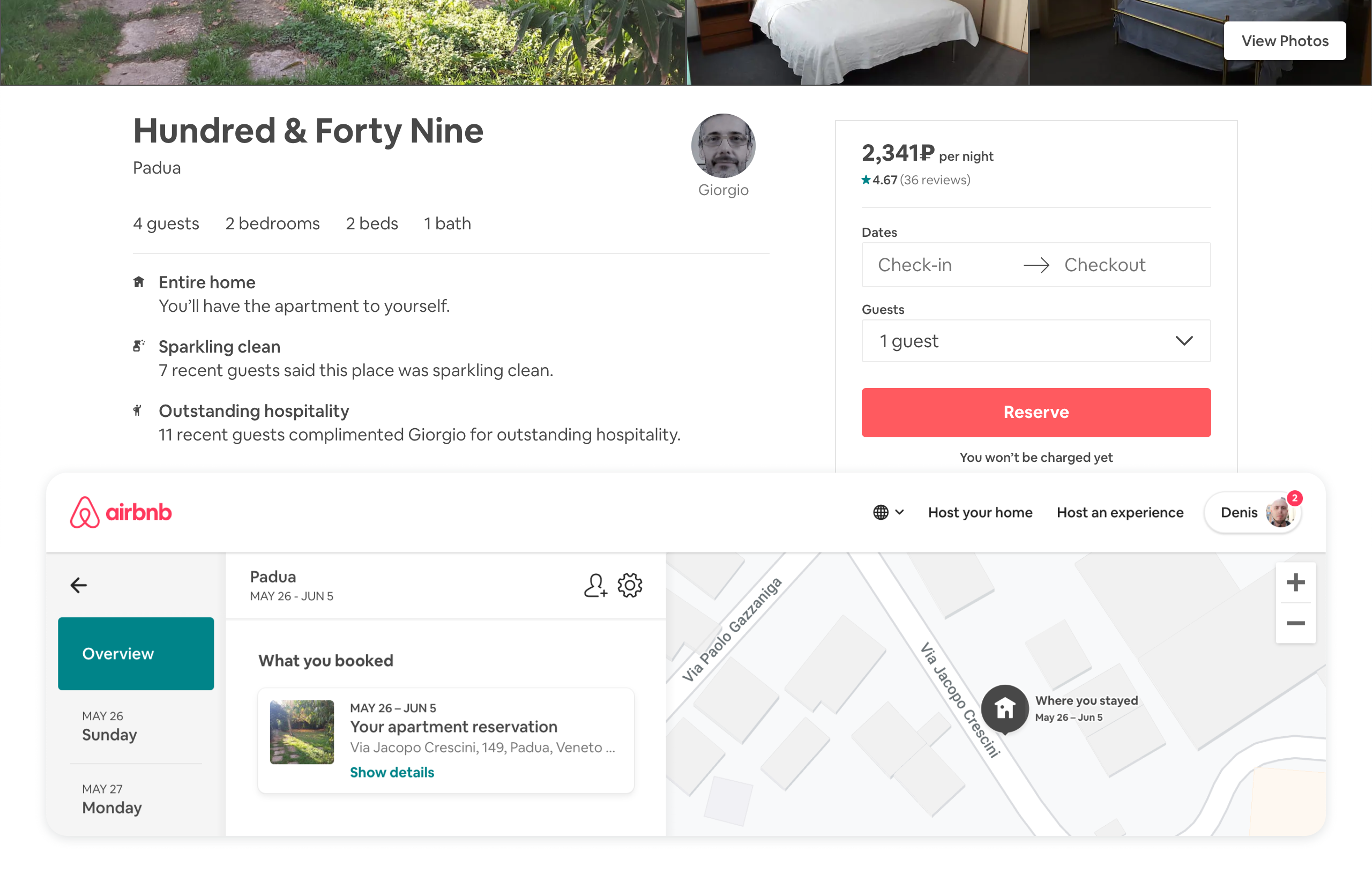
Critical
Color for highlighting errors and other extremely significant information. Usually something red.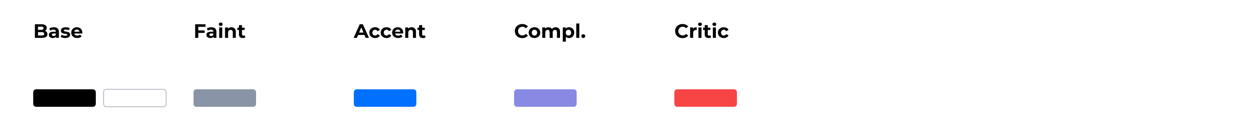
Warning
If you want to share critical information with another, also important, but not deadly, Warning is needed. Usually this is a kind of yellow-orange.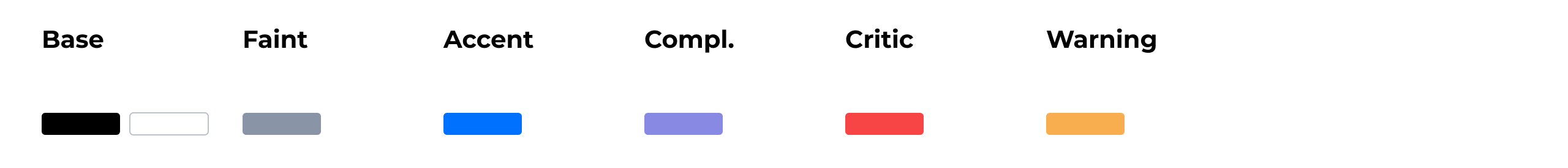
Success
Sometimes a successful action is enough to show the color Accent. But if Accent is of some unusual color (red) or for some reason you want to introduce a new color, then here is Success. Most likely, it will turn out to be greenish. 7 basic color names have been released. It is not necessary to use all of them. And of course, you can supplement the set if you have a serious reason for this.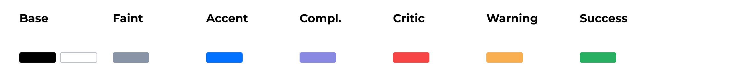
4.2. Color families
You probably already noticed that when I talk about color, I don’t indicate a specific meaning, but I use the words “shades of gray”, “something red”, “greenish”, etc. This is not just like that. Let's introduce the concept of “Color Family”.As I said above, we divide colors in pairs. Just Accent cannot exist. Be sure to have Accent Strong and Accent Weak. These are always exactly the two colors that form the basis of the family. Like dad and mom. Let's imagine for a while that our colors are a married couple. Suppose it does not matter what gender the parents are, the main thing is that one is strong (Strong), and the second - weak (Weak). And we will also accept that strength and weakness are character traits, like quick temper and calm.
So here. Dad is hot-tempered. He is often nervous in traffic jams and kicks hedgehogs in the forest. Mom is calm. She works as a psychologist and plays poker. This is the basis of our color scheme.Base colors are already divided (black and white). Divide the rest into families: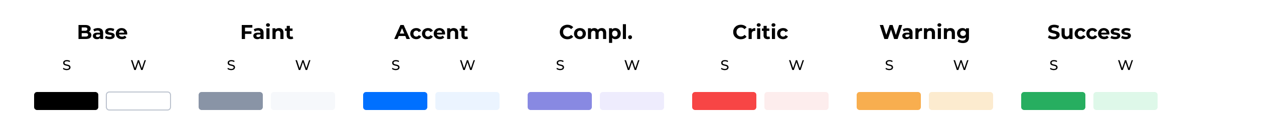
5. Block No. 2. Substitution
5.1. Context
Take a look at Bitbucket. Then the designer considered that the blue color, which is on the back left, is a bit dark for the text. And so he brightened it. Now all the text, although it looks blue (like a side menu), actually has a different meaning in hex: Any color has a context in which it is used. Color can be applied to the background, text, lines, icons. This is what we call context. In any of these cases, the color may need to be changed somehow, so that it better suits the context. We call this change Substitution . We select a place in the table for substitutions. Each new line is a context for which we can add substitutions. By default, there will be empty cells: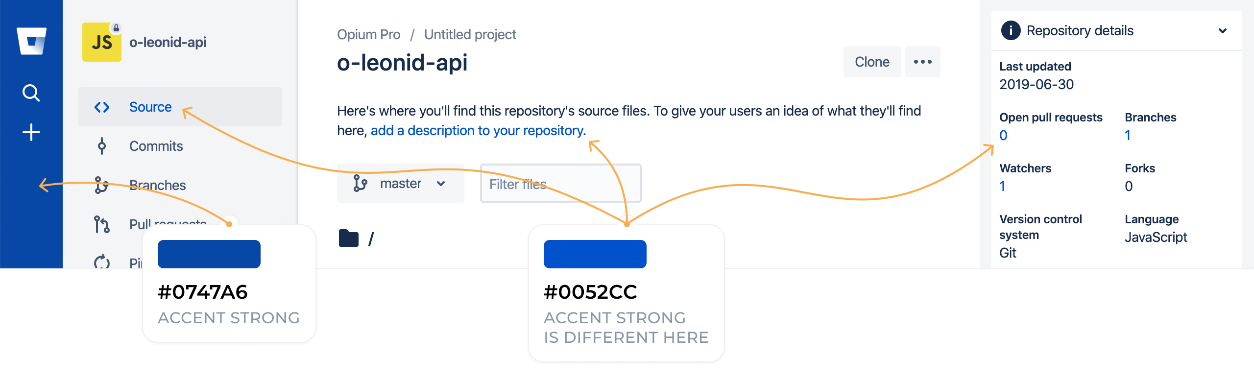
We added substitution cells only for Strong colors. The Weak colors in block # 2 show how that color looks on a dark background. While we will not touch them, but in the end we will return to them.If the substitution is not filled, then the color for the text, icons and everything elseis taken from block No. 1.Note. We can substitute colors only in primitive design elements. This set is taken almost 1: 1 from the graphic editors used by designers. There you can draw a rectangle (background), add a block of text, draw a line or add some unusual shape, such as an asterisk (read the icon).
5.2. Fancy
There is another special kind of substitution - substitution for the gradient. We call gradients the word Fancy - context for a "special occasion." Fancy is one for all. There can be no separate gradient for text, icons, etc. (in theory, of course, it can, but it is not worth making the table more difficult because of such a rare case). Let’s highlight the place at the bottom of the table for Fancy: We prepared for the changes depending on the context, the designers do it 100%. Empty cells give us some flexibility. Sometimes substitutions have to be done more often, sometimes less often. If block number 2 remains almost empty, this is normal (the designer also tries to reduce the number of colors).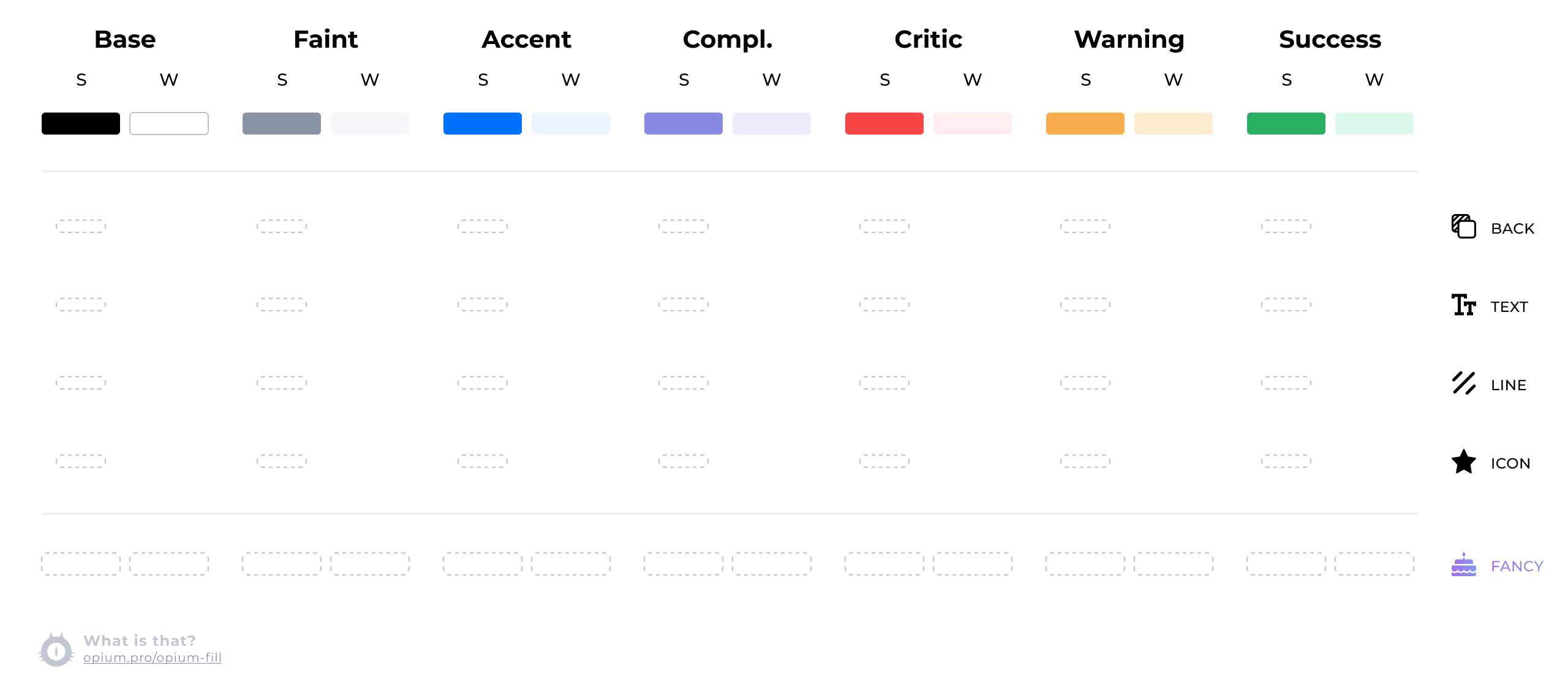
6. Block number 3. Shifts
Sometimes the color needs to be slightly darkened or lightened. But this is not because the context has changed, but simply that each color has two additional states: “darker” and “lighter”. Most often, designers use this to make a mouseover reaction. We call this color change Shift. You can make a shift up (darker) or shift down (lighter). An empty table now looks like this:
7. Color inversion
I deliberately did not talk about it right away, because it is rare and not everyone needs it. Sometimes you want to write something on a dark substrate, but not all colors are adapted for this. Let's look at an example of one of our designs: There is text on a blue plate, which is subjectively perceived as Faint. And there are circles under the icons that I would also define in the Faint family. If the die were light, then both of these elements would most likely be just gray. But the die is dark. There are no matching colors in our table, you can add them. Just for this you need the Weak column in block No. 2. For this layout, the table looks like this: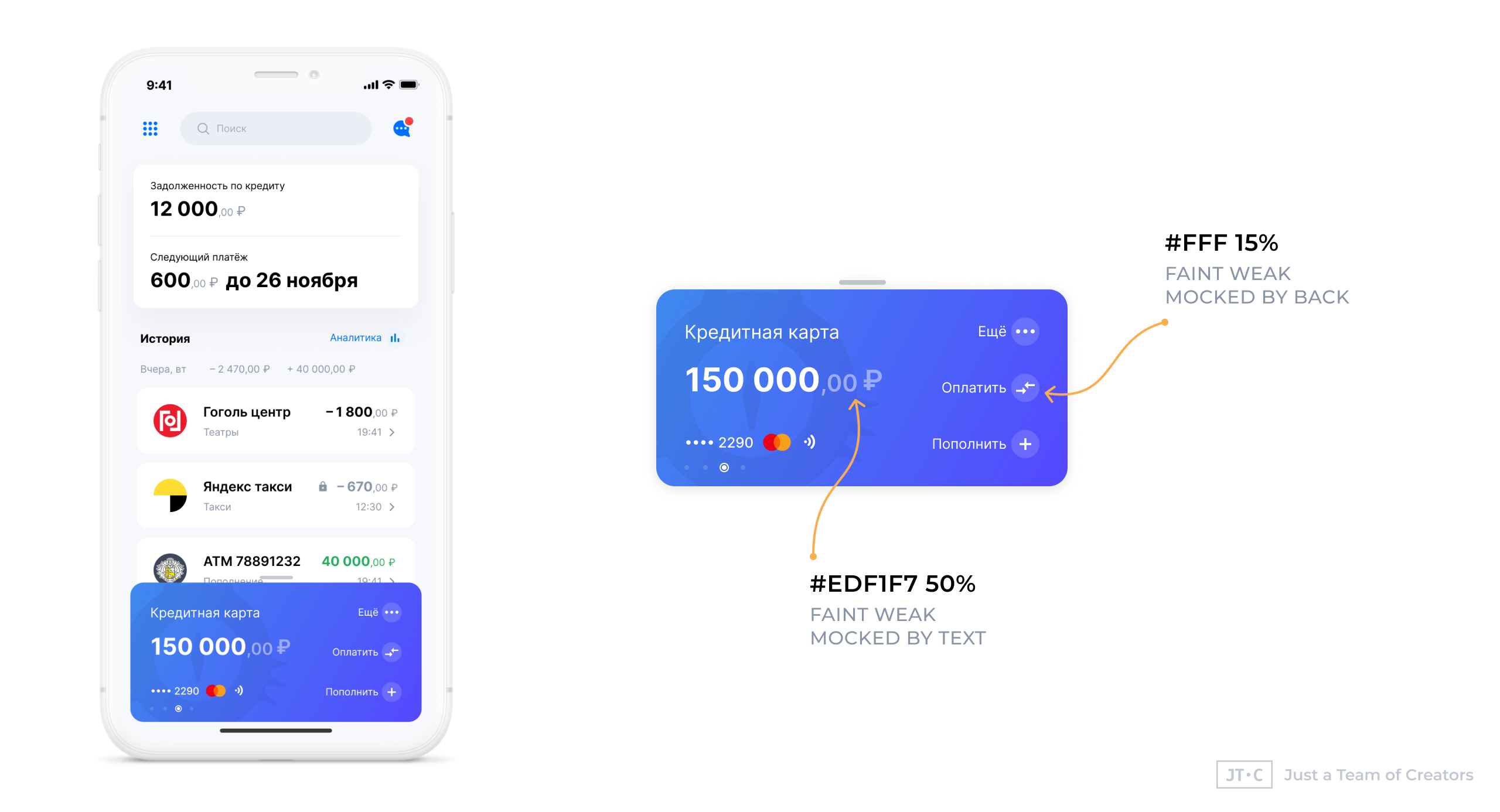
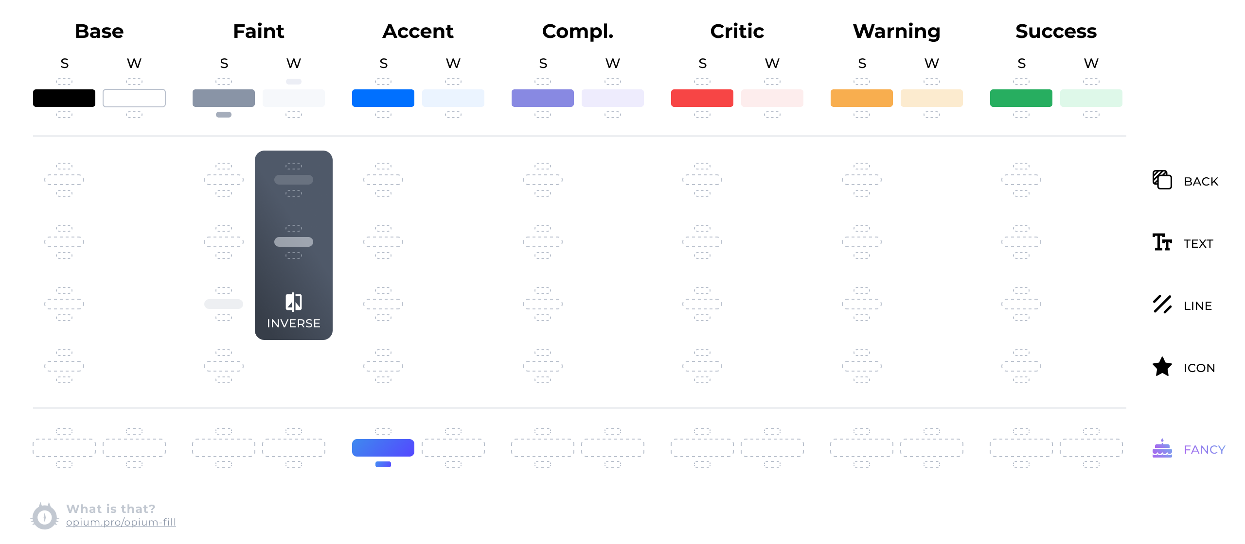
Please note that now the lines will be drawn with a lighter Faint Strong, this is also reflected in the table. Also added gradients for Accent and shifts for parent Faint (they come in handy to draw a search field).Note. No need to confuse inversion and night theme. The night theme has many of its nuances in color. So it’s better to create a separate table for it.
8. Use
8.1. CSS, React
Let's try to draw such a button. In pure CSS, variables can be organized as follows:
:root {
--base-strong: #000;
--base-weak: #fff;
--faint-strong: #8994A6;
--faint-weak: #F6F8FB;
--accent-strong: #0070FF;
--accent-weak: #EBF4FF;
--complement-strong: #8889E2;
--complement-weak: #EEECFD;
--critic-strong: #F74545;
--critic-weak: #FDEDED;
--warning-strong: #F8AE4F;
--warning-weak: #FCEBCF;
--success-strong: #27AE60;
--success-weak: #DEF8E9;
--faint-strong-down: #A5ADBB;
--faint-weak-up: #ECEEF5;
}
.back {
--faint-weak: rgba(255, 255, 255, 0.15);
}
.text {
--faint-weak: rgba(237, 241, 247, 0.5);
}
.line {
--faint-strong: #EDEFF2;
}
.icon {}
.fancy {
--accent-strong: linear-gradient(132deg, #3F89EE, #5447FF);
--accent-strong-down: linear-gradient(132deg, #448FF3, #594CFF);
}
.button {
background: var(--accent-strong);
color: var(--base-weak);
}
.button:hover {
background: var(--accent-strong-down);
}
And then, to create a button in HTML, you will need to add such markup:<button class="fancy button">
<div class="text">
Hello Button
</div>
</button>
There is no means in CSS to natively track a context, and then you have to specify it manually through classes. You can, of course, try to understand the context of the tags used, but this decision is not for everyone.On React, the code might look like this:class Button extends React.Component {
render() {
return (
<Box fill="accentStrong" fancy className="button">
<Font fill="baseWeak">Hello Button</Font>
</Box>
)
}
}
class Button extends React.Component {
render() {
return (
<Box.Accent fancy className="button">
<Font>Hello Button</Font>
</Box.Accent>
)
}
}
In order not to be tied to CSS (you do not just make applications for the browser), color variables can be stored in json:{
"color": {
"parents": {
"baseStrong": "#000",
"baseWeak": "#fff",
"faintStrong": {
"default": "#8994A6",
"shiftDown": "#A5ADBB"
},
"faintWeak": {
"default": "#F6F8FB",
"shiftUp": "#EDEFF2"
},
"accentStrong": "#0070FF",
"accentWeak": "#EBF4FF",
"complementStrong": "#8889E2",
"complementWeak": "#EEECFD",
"criticStrong": "#F74545",
"criticWeak": "#FDEDED",
"warningStrong": "#F8AE4F",
"warningWeak": "#FCEBCF",
"successStrong": "#27AE60",
"successWeak": "#DEF8E9"
},
"context": {
"back": {
"faintWeak": "rgba(255, 255, 255, 0.15)"
},
"text": {
"faintWeak": "rgba(237, 241, 247, 0.5)"
},
"line": {
"faintStrong": "#EDEFF2"
},
"icon": {},
"fancy": {
"accentStrong": {
"default": "linear-gradient(132deg, #3F89EE, #5447FF)",
"shiftDown": "linear-gradient(132deg, #448FF3, #594CFF)"
}
}
}
}
}
8.2. Color scheme in Figma
It seems to me that it will be right to divide the colors into contexts so that the context names are visible. And add shifts to the very end of these blocks. If the shift is really used only for the haver, then you should not even add it to the palette so that it does not distract you once again.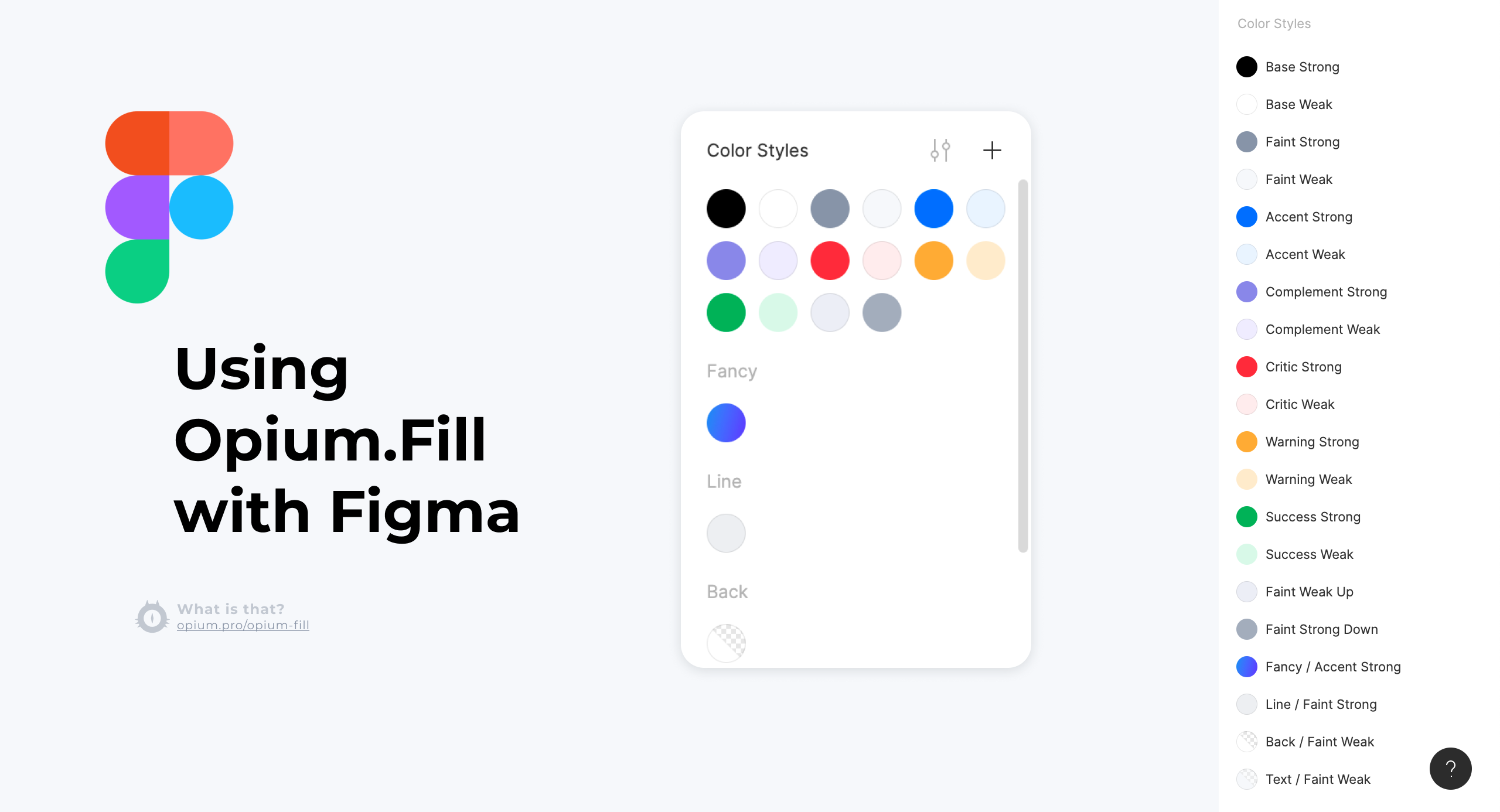
9. When it makes no sense to use the system
9.1. Unusual design project
Opium.Fill is designed so that the base colors are black and white (or those that are subjectively similar to them to the point of confusion). If you need to write a lot of blue and red or constantly use a variety of colors in one interface, then Opium.Fill is not the best solution.9.2. Small project
For a small project, it simply does not make sense to introduce some kind of system. It will be faster to throw all counter colors into variables as they become available, but it is better to use the list received from the designer. And sometimes everything is so simple that you can directly set colors in styles so that you won’t get confused.9.3. You are already using something else
If your team uses Material Design (and not only) and everyone is happy with everything, then there is no point in changing or adjusting what works.10. Criticism
Here are a few frequently voiced problems with Opium.Fill. I will try to answer some of the claims. You can consider this an open topic. If someone encounters difficulties, I will be glad if you share with me.10.1. There are still a lot of variables
The inquisitive reader has already calculated that we have cells for 252 variables. What is better than what was in the beginning?I can assure you that all these colors will never be used at the same time. There is a place for them, but these are empty cells, like undiscovered elements in the periodic table. On real projects, we manage to “open” up to 30 elements.If more than 50 pieces accumulate in your table, then something is probably going wrong and the scheme, unfortunately, does not help to fix it.10.2. To fill the graphs, you have to greatly expand the table.
If you have a lot of graphs or you need to color categories of products in different colors (and there are, for example, 20 pieces), then you will have to add new color families. Seven pieces that I described above is not enough.10.3. Why add substitutions if in theory all needs can be covered by shifts?
I proceed from the idea that contextual substitutions are a more “high-level” explanation of how a designer uses colors. And so substitutions are easier to understand and use.Shifts are useful for rare flowers, it is better to fill them in cases:- Event Handling (such as a Haver or Click)
- When you need an extra spectrum of shades of gray
Conclusion
The concept appeared at the beginning of 2018 and has not changed much since then. In my favorite organization, we implemented Opium.Fill both in design and development. Sometimes it was necessary to implement the design made by other teams (from other organizations), but this did not interfere with the use of the color scheme, we ran into difficulties, but we managed to solve them. Some projects have already gone into production.If the topic of color management on a project is close to you, it may be interesting to read about other options: Material Design , Atlassian Designthank
We came up with a scheme and wrote an article - Denis Elianovsky, JTC team.Illustration in the header - Elena Efimova