What do we say to the god of death? - Not today.
Sirio Trout, TV series Game of Thrones.How dangerous is the coronavirus COVID-19? How many people will die from coronavirus in the world? And how much - in Russia? Are tough measures taken to combat coronavirus in most countries of the world really necessary? What will cause more damage: death of people from coronavirus or economic decline caused by restrictive measures?To answer these urgent questions, it is necessary to carry out mathematical modeling and predict the damage from coronavirus for individual countries and for the world as a whole. The construction of such forecasts is devoted to this article.To make the material accessible to all readers, at the beginning of the article we will concentrate on qualitative analysis and beautiful pictures. And at the very end, for those interested, we’ll give the source code for calculations performed in Python.
UFO Care Minute
The pandemic COVID-19, a potentially severe acute respiratory infection caused by the SARS-CoV-2 coronavirus (2019-nCoV), has officially been announced in the world. There is a lot of information on Habré on this topic - always remember that it can be both reliable / useful, and vice versa.
We urge you to be critical of any published information.
Wash your hands, take care of your loved ones, stay at home whenever possible and work remotely.
Read publications about: coronavirus | remote work
Counting only death
Note that we will evaluate the damage from COVID-19 in the number of human deaths associated with this disease. A large part of the article will be devoted to forecasting the number of deaths from coronavirus. We generally refused to consider the number of patients with coronavirus and predict their number. There are several reasons for this. The main thing is that it is impossible to compare statistics on the number of cases of COVID-19 in different countries. In some countries, rapid testing methods are available much more than in others. In some countries, an almost universal screening of the population is carried out, while in others only people with severe symptoms are checked. Given that in a significant number of cases, the disease is almost asymptomatic, we see a huge spread in the number of deaths among patients: from less than 0.5% to more than 3.5%.Most likely, the scatter in mortality data is largely due to the detection of COVID-19 cases.Mortality statistics in this case look much more reliable. Naturally, we can encounter both an underestimation of the number of deaths, when the cause of death is not indicated as a coronavirus, but a concomitant disease, and vice versa, overestimation, when COVID-19 is diagnosed incorrectly, and a person dies, for example, from seasonal flu. However, we can expect that the statistics on deaths are more reliable, because an asymptomatic disease with a high degree of probability can generally pass by the attention of specialists, and doctors are forced to analyze every death case.We also note that the real damage to society is caused by the death of its members, and not by a mild disease that passes relatively quickly.Did you think the world is ruled by an exhibitor? And no!
As soon as we begin to predict the number of deaths, we immediately encounter the first myth: tens or even hundreds of millions of people will die from the coronavirus. This myth is based on the belief that the world is ruled by an exhibitor. Take a look at the chart.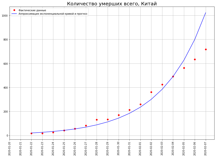 It shows the number of deaths from COVID-19 in China as of February 7th. If we build a forecast based on this graph using an exponential function, we get that by February 29, 50 million people should have died in China!
 And how many really died? 2837 people. Why such a colossal difference?The thing is that the world is ruled not by an exhibitor, but by a logistic curve.Unlike the exhibitor, the logistic curve does not pass not only at school, but even at leading technical universities (for example, at the Physics Department of Moscow State University and at the PhysTech). Therefore, physicists and technicians in general often have no idea about it.Nevertheless, a huge number of phenomena in economics, biology, sociology, science and technology are developing in full accordance with this mathematical model. Let's take a closer look at it. Here she is. Time is plotted on the x axis, and on y the number that characterizes the phenomena studied by us (in our case, the number of deaths from coronavirus).
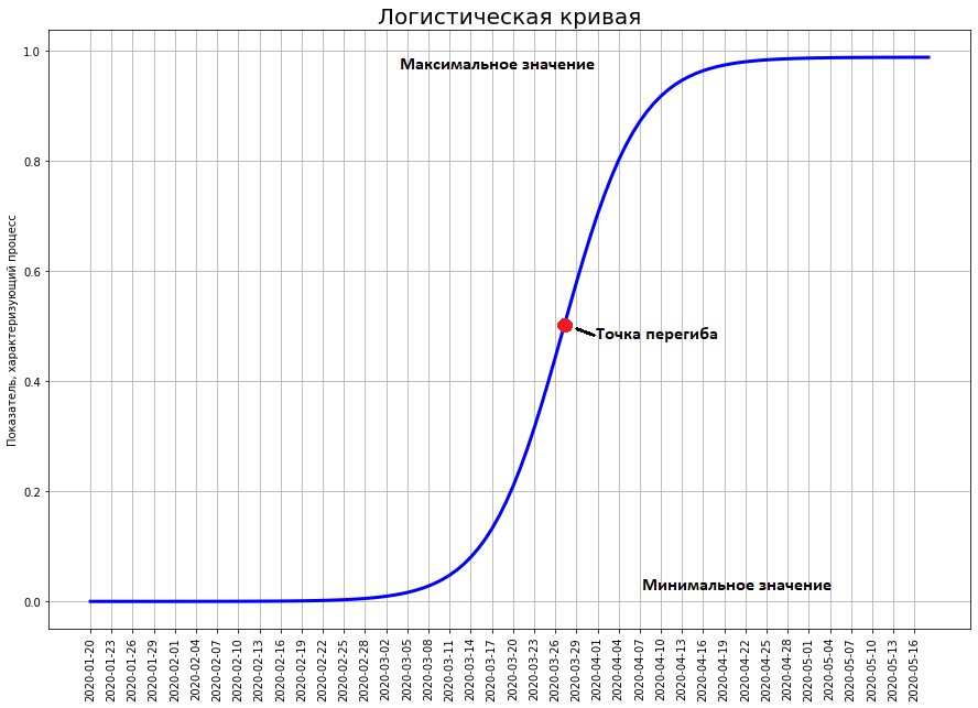
Insidious curve that breaks off the whole hype
The logistic curve shows the transition between two stable states. The lower state is traditionally considered equal to zero. The upper state is the maximum that, in principle, the investigated phenomenon can achieve. The curve approaches it arbitrarily close, but never reaches its maximum value.The most important point on the curve is the inflection point. It is located exactly in the middle between the minimum and maximum. It is at this point that the maximum growth rate of the curve. But an inflection occurs in it. To this point, the growth of the curve only accelerates. After - only fades.Usually at first no one notices a certain phenomenon (as the coronavirus was not noticed until the end of January). At this point, the value of the curve is close to zero. Gradually, the phenomenon is growing, they begin to notice it, a hype arises around it. Hype can be both positive (as, for example, at the time of Gagarin’s flight, people all over the world fell ill with space) and negative (the situation with the current coronavirus). At the time of hype, everyone predicts that the phenomenon will acquire incredible proportions and turn the world upside down. So, at the time of Gagarin’s flight, even professionals thought that the conquest of the solar system would occur in the twentieth century. And they did not expect at all that all the successes of astronautics would end in 1969 with the landing of a man on the moon.It is at the time of maximum hype that the curve reaches half of its future maximum. Then the growth fades and the phenomenon completely does not justify the hopes placed on it (as well as the fears).Chinese logistic curve
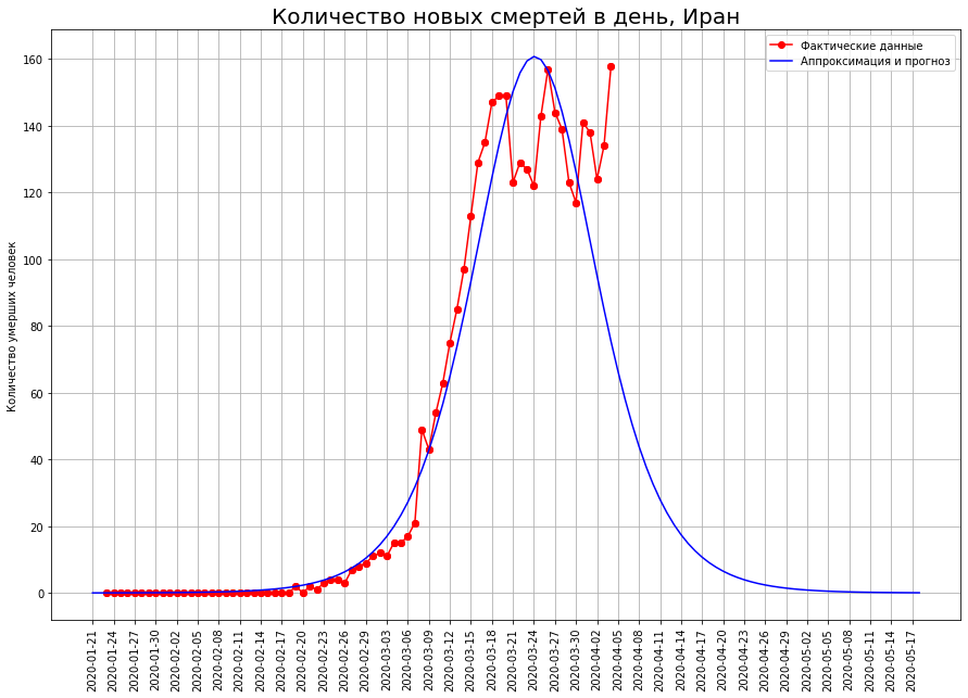
Let's see what happened in China.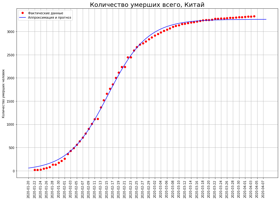 In the graph below, the red dots indicate the number of deaths from the virus on a given date. The blue curve is a logistic curve approximating real data. We see that the data falls on it almost perfectly. The graph below shows the number of deaths that occurred on a specific date. In fact, this is the difference between the values of the logistic curve for today and for yesterday. From a mathematical point of view, this is the first derivative of the logistic curve.
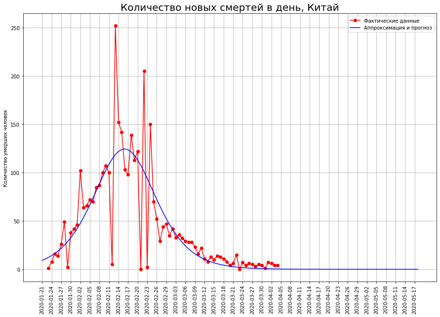 We see that at first the number of new deaths is growing almost exponentially. Then growth begins to slow down, the curve of new deaths reaches a maximum at the inflection point, when the logistic curve reaches half of its maximum value. Then the number of new deaths decreases, and rushes to zero. Red dots indicate new deaths, the blue curve is the derivative of the logistic curve approximating them.Note that the logistic curve is symmetric about the point of its inflection, and its first derivative is relative to the vertical line passing through this point. We also note that the real data ideally lies on the logistic curve, but they “dance” relative to its first derivative. The fact is that the death rate at a point is subject to high scatter, and the total death rate is the sum of such indicators. It is smoothed in accordance with the central limit theorem.So, we see that the logistic curve can be effectively used to predict deaths from coronavirus. An important property here is its symmetry. When the inflection point is reached, we can restore the other half with high accuracy from one half of the curve.In turn, in order to determine whether the inflection point is reached, you just need to look at the graph of the first derivative. As soon as he went down - the corresponding point was reached.
How will the Italian catastrophe end?
Let us turn our view of the three countries to the letter “I”: Italy, Iran and Spain. Looking at the death curves on a specific date, we see that, most likely, the peak of the catastrophe has been passed there, and it is time to take stock.

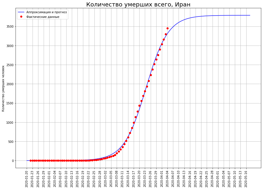
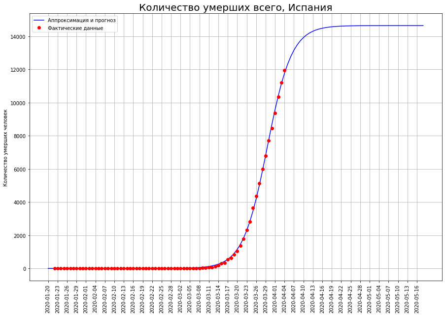
 According to our forecasts, only COVID-19 will die:in Italy - about 19 thousand people,in Iran - about 4 thousand people,in Spain - about 15 thousand people.
Halfway to Final Mortality
The epidemic in Germany seems to have reached its peak and the total number of deaths from coronavirus in this country will be about 2.6 thousand people.
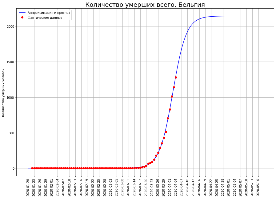
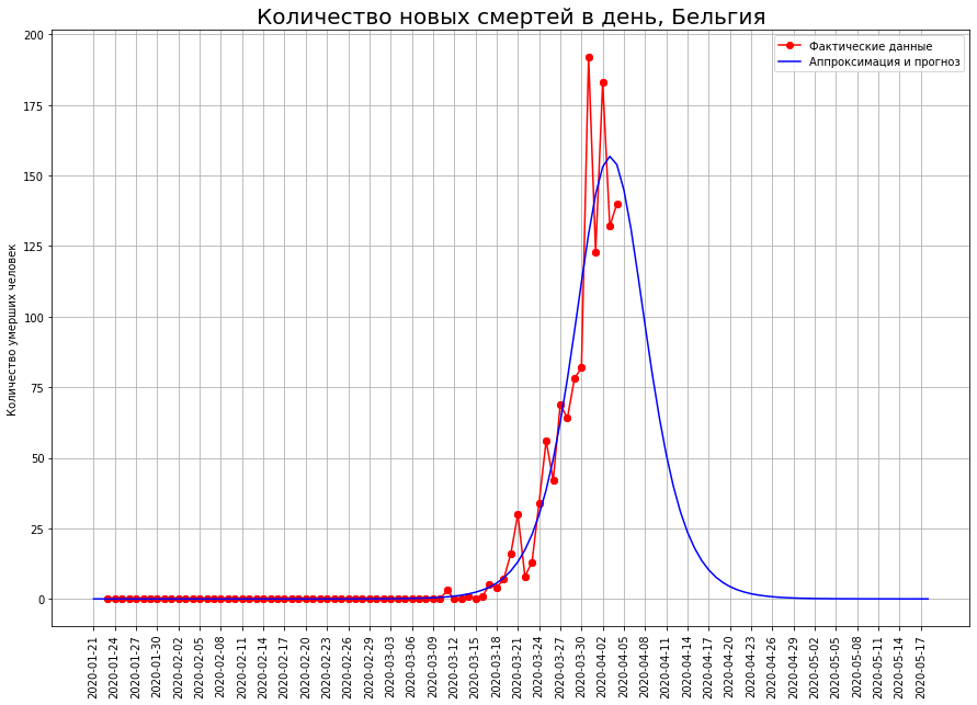
 In countries such as the Netherlands, Switzerland, and Belgium, mathematical modeling shows that the epidemic is at an inflection point. If this is so, then the expected number of deaths in them:in the Netherlands - about 2.5 thousand people,in Switzerland - about 1.1 thousand people,in Belgium - about 2.2 thousand people.


For someone, it’s only the beginning
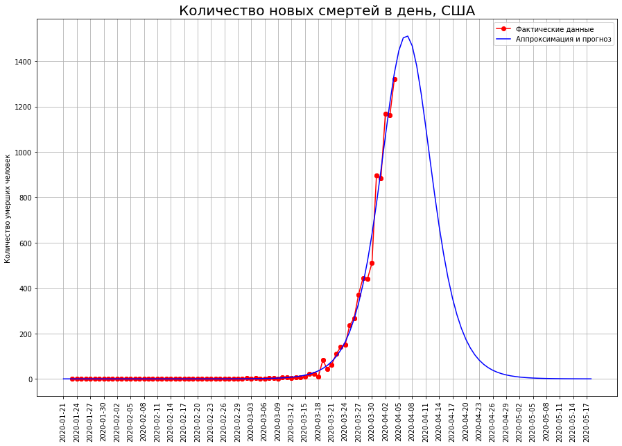
In the US, the inflection point has not yet been passed, so the forecast for them can be significantly adjusted. Currently, it is 23 thousand people.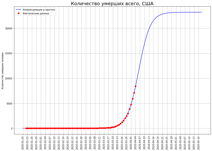
Is the UK a new epicenter of the tragedy?
Finally, there remains high uncertainty for the two countries in reaching the inflection point. These are the UK and France.

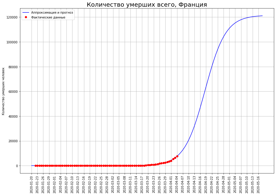
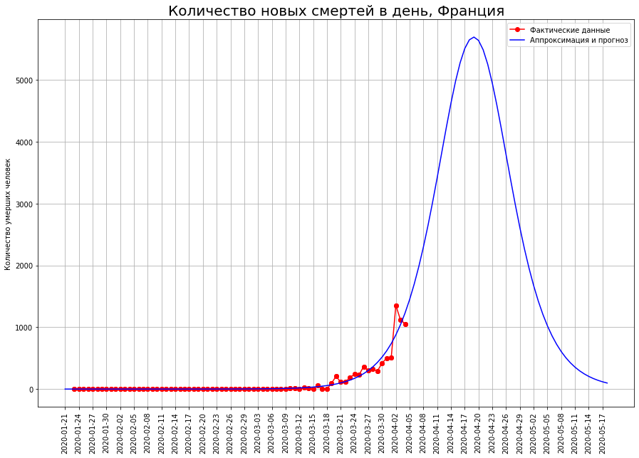 Forecasts of the final number of deaths are constantly increasing. They currently comprise:
- in the UK - about 33 thousand people
- in France - about 12 thousand people.
The author hopes that these forecasts are the result of random fluctuations, and in the coming days they will be adjusted downward.Of particular concern to the author is the United Kingdom. According to data as of March 25, the author predicted mortality in this country at the level of 1 thousand people, according to data as of 01.04 - at the level of 8 thousand, now the forecast shows already 33 thousand. Forecasts for no other country have such volatility.Perhaps the epicenter of the tragedy of coronavirus deaths is gradually moving to Britain. It is also possible that the development of the situation in the country is connected with the initially irresponsible policy of Boris Johnson, who until recently refused to impose strict restrictions and hoped for "immunization of the herd." In this case, the author hopes that citizens, whom Johnson expressed so disrespectfully, will remember him this policy at the next, but rather - extraordinary elections.Forecast for Russia
Since the epidemic in Russia is just beginning, it will not be possible to predict the number of deaths using the logistic curve. Below we will use a different forecasting method.And what on a global scale?
It's time to make a forecast for the whole world.
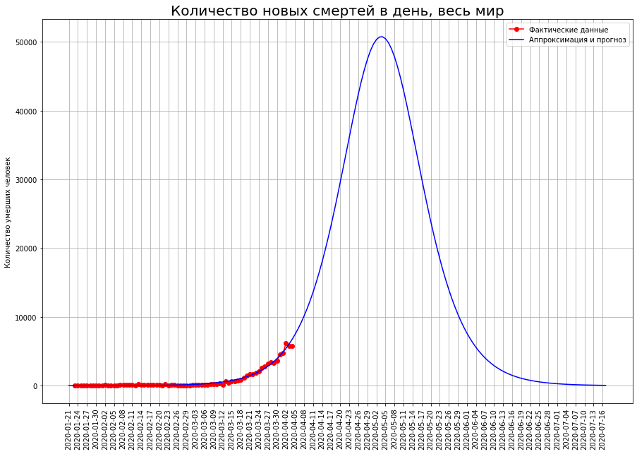 The logistic curve we constructed gives the following results: the peak of the crisis will occur in the first ten days of May, and the epidemic will end in mid-July. It will kill about 1 million 800 thousand people.Since the epidemic on a global scale is only flaring up, a forecast based on a logistic curve can give an incorrect result, so we will use an alternative forecasting method.Consider the countries for which we made forecasts.
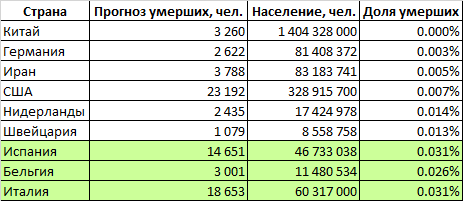 The table defines the proportion of the population of these countries that will die from the coronavirus (Great Britain and France are temporarily excluded due to the high uncertainty of the forecasts). We see that the two groups of countries are significantly different. In countries such as Italy, Spain and Belgium, mortality is projected at 0.029% of the population. In a more prosperous group of countries (China, Germany, Iran, the USA, the Netherlands, Switzerland), the mortality rate is expected to be around 0.007% - 4 times lower.It can be assumed that the world as a whole will be characterized by a higher mortality rate. The fact is that in our analysis we examined relatively rich countries with capable governments that have both financial and organizational resources to deal with the epidemic. But on Earth there are many states that have much more modest capabilities, both financially and organizationally. Many of these countries are very densely populated. It can be assumed that in these countries the epidemic will collect even a larger percentage of victims than in the wealthy Italy, Spain and Belgium. On the other hand, the proportion of the elderly population in such countries is lower, which reduces potential mortality.If we estimate world mortality at the level of the worst group of countries, then about 2 million 100 thousand people will die in the world. If you use average values - then about 900 thousand.Our pessimistic forecast for the number of deaths in the world, calculated on the basis of the share of the deceased population, was surprisingly close to the forecast calculated on the basis of the logistic curve.Thus, 1-2 million people will die in the world, and the figure of 2 million is more likely.
What will happen to the motherland and to us?
As for Russia, with a population of 148 million people, the optimistic forecast (based on the average for all countries except the top three outsiders) is 10 thousand people. And pessimistic (based on mortality at the level of Italy, Spain and Belgium) - 40 thousand.The figure of 10 thousand is much more likely. The fact is that Russia has several favorable factors: low population density, large distances between large cities, relatively low migration flows between regions (excluding the metropolitan region), decisiveness, adequacy and timeliness of the authorities' actions to combat the epidemic. These factors give hope to avoid developing the situation according to the Italian-Spanish-Belgian version.As for the timing of the completion of the epidemic in Russia, we turn to the chart below. On it, we depicted the logistic curves for different countries in one graph. In this case, we normalized all the curves in height so that the maximum value was one, and combined the inflection point, placing it at zero.The graph shows that the epidemic ends in 40-60 days. If we take March 30 as a starting point, then in Russia the epidemic will have to end by May 10-30.Are the victims justified?
And finally, the last question that was raised at the beginning of the article: how justified are the strict quarantine measures taken by the governments of most countries of the world?About 58 million people die every year in the world. 2 million who, according to a pessimistic forecast, will die from a coronavirus, will increase this figure by 3.5%. On the other hand, large-scale world quarantine threatens to escalate into the biggest economic crisis since the Great Depression. As a result, tens or even hundreds of millions of people will remain without work. Incomes of the population will fall, and many will die of starvation or the inability to pay for medical care.Opinions are often expressed, including by some world leaders, that it would be better to leave people to their fate and not ruin the economy. In the end, from 300 to 650 thousand people die from seasonal flu every year, but no one takes such destructive restrictive measures for the economy.Our model allows us to state the following: COVID-19 is not seasonal flu at all. This virus is incomparably more dangerous. The fact is that the inflection point of the logistic curve does not exist by itself. It is greatly affected by the conditions of the epidemic. The course of any epidemic is described by a logistic curve, but logistic curves are a whole family. We remember that the inflection point is exactly half the curve maximum. Therefore, the later the peak of mortality is passed, the greater the final number of deaths will be. We saw that near the inflection point the logistic curve grows as fast as possible. Therefore, if the peak of the disease is passed 10 days later, the number of victims may increase several times!The forecasts we received for the inflection points of the logistic curves already include all quarantine measures taken by the governments of the countries of the world. If there were no such measures, the inflection points were reached much later. In this case, mortality could reach the level of 0.4-0.5% of the entire world population.Why do we estimate the mortality rate from an unchecked epidemic at 0.4-0.5% of the population. We assume that in this case, in one form or another, the entire population of the Earth will be ill with the virus. However, in a significant number of people, the disease will be asymptomatic. Therefore, we use statistics from countries such as South Korea and Germany, which managed to organize the widest possible testing of the population for coronavirus and identify the majority of real cases. In other countries, in our opinion, the statistics are distorted precisely because the number of cases is greatly underestimated. Hence the super-high mortality rate of 3.5%.0.4-0.5% of the world's population is 28-35 million people. For all the wars that mankind has waged in its entire history, only the number of losses in World War II exceeds this figure. The fact that the governments of the vast majority of the countries of the world made unprecedented economic sacrifices in order to save people shows how much the price of human life has grown in the world. How widespread the ideas of humanism and the priority of the interests of the individual. And this inspires the author with pride in humanity and hope for a better future for all of humanity.The biggest drawback of this article
And here is the biggest drawback of this article. Unfortunately, classical statistics do not provide us with tools for estimating forecast errors based on a logistic function. This is due to the form of the function, which has an inflection. If this inflection were not, and the curve would be monotonic, we, with the help of the Box-Cox transformation, would first bring the function to a linear form. After that, using the error equation for linear regression, we would construct the upper and lower boundary of the errors, and then, using the inverse Box-Cox transformation, we would obtain curvilinear error boundaries, on the basis of which we would construct the maximum and minimum forecast for the number of deaths from coronavirus.Alas, the tools of classical statistics make it impossible to construct error boundaries in the case of a curve with an inflection. But machine learning methods may come to our aid. In the next article, I will show how the boundaries of errors are constructed in this case, and I will build the minimum and maximum forecasts of the number of deaths for each country considered above separately, and for the whole world.And now a lot of code and numbers
Well, now, in fact, mathematics for those who want to understand how we came to the conclusions stated above. Those who are not interested in boring calculations can not read further.The calculations were done in Python in the Jupiter environment using additional libraries scipy, numpy, pandas, datetime. For visualization, we used the matplotlib.pyplot package. The initial data on the number of deaths was obtained at this link and pre-processed in Excel. Information taken as of April 4. Here is a link to the file with the source information .So, we import the libraries, which we will use later:import numpy as np
import matplotlib.pyplot as plt
%matplotlib inline
import pandas as pd
from IPython.display import display
import scipy as sp
from datetime import datetime
from scipy.optimize import minimize
We read the source data and convert it to a DataFrame object. The variable labels are converted to a Timestamp object. In principle, we could restrict ourselves to simple numpy arrays, but we use a DataFrame for the convenience of storing data with their corresponding date, and Timestamp for visualization, to beautifully display these dates on graphs.corona = pd.read_csv ('D: /coronavirus.csv',sep= ";")
corona.set_index (' Date ', inplace = True)
corona.index = pd.to_datetime (corona.index)
Then, from a single DataFrame, we create variables of the Series type that correspond to the total mortality in each country. X is a variable equal to the day number from the beginning of the year. We will need it when forecasting.X = corona['X']
chi = corona['China']
fr = corona['France']
ir = corona['Iran']
it = corona['Italy']
sp = corona['Spain']
uk = corona['UK']
us = corona['US']
bg = corona['Belgium']
gm = corona['Germany']
nt = corona['Netherlands']
sw = corona['Switzerland']
tot = corona['Total']
After that, we calculate simple numpy arrays for mortality on a specific date. Note that the length of such an array is 1 less than the length of the corresponding Series variable.dchi = chi[1:].values - chi[:-1].values
dfr = fr[1:].values - fr[:-1].values
dit = it[1:].values - it[:-1].values
diran = ir[1:].values - ir[:-1].values
dsp = sp[1:].values - sp[:-1].values
duk = uk[1:].values - uk[:-1].values
dus = us[1:].values - us[:-1].values
dbg = bg[1:].values - bg[:-1].values
dgm = gm[1:].values - gm[:-1].values
dnt = nt[1:].values - nt[:-1].values
dsw = sw[1:].values - sw[:-1].values
dtot = tot[1:].values - tot[:-1].values
We introduce an additional variable for forecasting. This is an array that begins on January 20, and ends in 180 days on July 17. We also create a Timestamp object corresponding to this array to sign the axes.X_long = np.arange(20, 200)
time_long = pd.date_range('2020-01-20', periods=180)
We define the resLogistic function, the input argument of which is an array of 3 digits, and the output is the sum of the squares of the difference between the values of the logistic curve and the actual number of deaths from the epidemic in China.def resLogistic(coefficents):
A0 = coefficents[0]
A1 = coefficents[1]
A2 = coefficents[2]
teor = A0 / (1 + np.exp(A1 * (X.ravel() - A2)))
return np.sum((teor - chi) ** 2)
The number of deaths is taken on each date as an accumulated total. The logistic curve is determined by 3 components of the input vector. Zero (the count of array elements in Python starts from zero) of the component is responsible for the maximum value, the first characterizes the growth rate of the function, the second - the position of the inflection point on the time axis.teor - the number of deaths for each day, based on the input parameter vector, chi - the actual number of deaths in China. The function returns the sum of the squared differences between the theoretical and actual value.Now, using the minimize method of the scipy.optimize library, we find a vector that minimizes the sum of the squared deviations. The logistic curve constructed on the basis of this vector is the desired mortality forecast made on the basis of the method of minimum squares.We add that the minimize method requires a starting point. We select it based on the properties of the logistic function known to us (the maximum should be greater than any empirical number of deaths, and the inflection point should be near the maximum of the dtot curve characterizing the number of new deaths per day). Usually the results of the minimize method are independent of the starting point, but there are exceptions.mimim.x are the values of the minimizing vector.minim = minimize(resLogistic, [3200, -.16, 46])
minim.x
Now we display on the graph the actual number of deaths, approximating its logistic forecast curve, and also sign the time axis with dates.plt.figure(figsize=(15,10))
teorChi = minim.x[0] / (1 + np.exp(minim.x[1] * (X_long - minim.x[2])))
plt.plot(X,chi,'ro', label=' ')
plt.plot(X_long[:80], teorChi[:80],'b', label=' ')
plt.xticks(X_long[:80][::2], time_long.date[:80][::2], rotation='90');
plt.title(' , ', Size=20);
plt.ylabel(' ')
plt.legend()
plt.grid()
In the lower graph, we plot the first derivative of the logistic curve selected above (blue line), as well as the real curve of new deaths (red line).plt.figure(figsize = (15,10))
plt.grid()
plt.title(' , ', Size=20);
plt.plot(X[1:], dchi, 'r', Marker='o', label=' ')
plt.xticks(X_long[1:120][::3], time_long.date[1:120][::3], rotation='90');
plt.plot(X_long[1:120], teorChi[1:120] - teorChi[:119],'b', label=' ')
plt.ylabel(' ')
plt.legend()
We carry out similar calculations for each of the countries mentioned in the article.Then the author wrote a not very beautiful code. It was necessary to write one function for all countries and pass the number of real deaths to it through the parameters of the minimize method. But the author did not have time to deal with this mechanism, so he wrote his own function for each country, and inside the function he put an appeal to a variable containing information about the number of deaths in a given country.Below are the calculations for Iran, Italy, Spain, USA. To restore the calculations for other countries, the readers, I think, will not be difficult.def resLogisticIr(coefficents):
A0 = coefficents[0]
A1 = coefficents[1]
A2 = coefficents[2]
teor = A0 / (1 + np.exp(A1 * (X.ravel() - A2)))
return np.sum((teor - ir) ** 2)
minim = minimize(resLogisticIr, [3200, -.16, 80])
minim.x
plt.figure(figsize=(15,10))
teorIr = minim.x[0] / (1 + np.exp(minim.x[1] * (X_long - minim.x[2])))
plt.plot(X_long[:120], teorIr[:120],'b', label='  ')
plt.xticks(X_long[:120][::3], time_long.date[:120][::3], rotation='90');
plt.title('  , ', Size=20);
plt.plot(X,ir,'ro', label=' ')
plt.grid()
plt.legend()
plt.ylabel('  ')
plt.figure(figsize = (15,10))
plt.grid()
plt.title('    , ', Size=20);
plt.plot(X[1:], diran, 'r', Marker='o', label=' ')
plt.plot(X[1:], diran, 'ro')
plt.xticks(X_long[1:120][::3], time_long.date[1:120][::3], rotation='90');
plt.plot(X_long[1:120], teorIr[1:120] - teorIr[:119],'b', label='  ')
plt.ylabel('  ')
plt.legend()
def resLogisticIt(coefficents):
    A0 = coefficents[0]
    A1 = coefficents[1]
    A2 = coefficents[2]
    teor = A0 / (1 + np.exp(A1 * (X.ravel() - A2)))
    return np.sum((teor - it) ** 2)
minim = minimize(resLogisticIt, [3200, -.16, 46])
minim.x
plt.figure(figsize=(15,10))
teorIt = minim.x[0] / (1 + np.exp(minim.x[1] * (X_long - minim.x[2])))
plt.plot(X,it,'ro', label=' ')
plt.plot(X_long[:120], teorIt[:120],'b', label='  ')
plt.xticks(X_long[:120][::3], time_long.date[:120][::3], rotation='90');
plt.title('  , ', Size=20);
plt.ylabel('  ')
plt.grid()
plt.legend()
plt.figure(figsize = (15,10))
plt.grid()
plt.title('    , ', Size=20);
plt.plot(X[1:], dit, 'r', Marker='o', label=' ')
plt.xticks(X_long[1:120][::3], time_long.date[1:120][::3], rotation='90');
plt.plot(X_long[1:120], teorIt[1:120] - teorIt[:119],'b', label='  ')
plt.ylabel('  ')
plt.legend()
def resLogisticSp(coefficents):
    A0 = coefficents[0]
    A1 = coefficents[1]
    A2 = coefficents[2]
    teor = A0 / (1 + np.exp(A1 * (X.ravel() - A2)))
    return np.sum((teor - sp) ** 2)
minim = minimize(resLogisticSp, [3200, -.16, 80])
minim.x
plt.figure(figsize=(15,10))
teorSp = minim.x[0] / (1 + np.exp(minim.x[1] * (X_long - minim.x[2])))
plt.plot(X_long[:120], teorSp[:120],'b', label='  ')
plt.xticks(X_long[:120][::3], time_long.date[:120][::3], rotation='90');
plt.title('  , ', Size=20);
plt.plot(X,sp,'ro', label=' ')
plt.grid()
plt.legend()
plt.ylabel('  ')
plt.figure(figsize = (15,10))
plt.grid()
plt.plot(X[1:], dsp, 'r', Marker='o', label=' ')
plt.plot(X[1:], dsp, 'ro')
plt.xticks(X_long[1:120][::3], time_long.date[1:120][::3], rotation='90');
plt.title('    , ', Size=20);
plt.plot(X_long[1:120], teorSp[1:120] - teorSp[:119],'b', label='  ')
plt.ylabel('  ')
plt.legend()
def resLogisticUs(coefficents):
    A0 = coefficents[0]
    A1 = coefficents[1]
    A2 = coefficents[2]
    teor = A0 / (1 + np.exp(A1 * (X.ravel() - A2)))
    return np.sum((teor - us) ** 2)
minim = minimize(resLogisticUs, [3200, -.16, 100])
minim.x
plt.figure(figsize=(15,10))
teorUS = minim.x[0] / (1 + np.exp(minim.x[1] * (X_long - minim.x[2])))
plt.plot(X_long[:120], teorUS[:120],'b', label='  ')
plt.xticks(X_long[:120][::3], time_long.date[:120][::3], rotation='90');
plt.title('  , ', Size=20);
plt.plot(X,us,'ro', label=' ')
plt.grid()
plt.legend()
plt.ylabel('  ')
plt.figure(figsize = (15,10))
plt.grid()
plt.title('    , ', Size=20);
plt.plot(X[1:], dus, 'r', Marker='o', label=' ')
plt.plot(X[1:], dus, 'ro')
plt.xticks(X_long[1:120][::3], time_long.date[1:120][::3], rotation='90');
plt.plot(X_long[1:120], teorUS[1:120] - teorUS[:119],'b', label='  ')
plt.ylabel('  ')
plt.legend()