Good day, friends!What is a Houdini?
Houdini ( Houdini ) - a collection of browser APIs that significantly improve the web development process, including the development of CSS standards. Developers will be able to extend CSS using JavaScript, influencing CSS rendering and telling the browser how styles should be applied. This will provide a significant increase in performance and stability than the use of polyphiles.Houdini consists of two API groups - high-level APIs and low-level APIs.High-level APIs are associated with the rendering process (style - layout - drawing - composition). This group includes:- Paint API - allows you to extend CSS at the step (meaning the rendering stage) of rendering visual elements (color, background, borders, etc.).
- Layout API - allows you to extend CSS at the step of determining the size, position and alignment of elements.
- Animation API - “extension point” in the step of displaying and animating elements.
Low-level APIs are the foundation for higher-level APIs and include:- Typed Object Model API
- Custom Properties & Values API
- Font Metrics API
- Worklets
CSS future
Houdini, unlike regular CSS, allows developers to extend CSS in a more natural way. Does this mean that CSS specifications will cease to evolve and new standards be adopted? Not at all. Houdini's goal is to help develop new CSS features through the creation of working prototypes that can easily be standardized.In addition, developers can easily share open CSS worklets without worrying about compatibility.Typed Object Model (TOM) API
Before Houdini, the only way JS and CSS interacted was to cast CSS to a string and modify it. Manually parsing and redefining styles can be complex and error prone due to the need for double conversion of the value type (for example, from a number to a string and vice versa). You also have to manually specify the units of measure for the new value.selectedElement.style.fontSize = newFontSize + 'px'
console.log(selectedElement.style.fontSize)
TOM gives CSS properties a more semantic meaning by representing them as typed JS objects. This greatly improves performance, stability, and facilitates code support. CSS values are represented by the CSSUnitValue interface, which consists of the value and the “unit of measure” property.{
value: 20,
unit: 'px'
}
This interface can be used with the following new features:- computedStyleMap (): for parsing computed (not built-in) styles. This method is called before parsing or using other methods.
- attributeStyleMap: for parsing and modifying inline styles. This is an item property.
selectedElement.computedStyleMap().get('font-size')
selectedElement.attributeStyleMap.set('font-size', CSS.em(2))
selectedElement. attributeStyleMap.set('color', 'blue')
selectedElement.computedStyleMap().get('font-size')
selectedElement.attributeStyleMap.get('font-size')
Note how CSS types are used when assigning a new value. Using this syntax avoids the problems associated with types, and the resulting code becomes more secure.The API under consideration includes not only get and set, but also other methods, for example:- clear: removes all inline styles
- delete: deletes a specific CSS property and its value
- has: returns true / false depending on the availability of the specified property
- append: adds an extra value to a property that supports multiple values
Detection
let selectedElement = document.getElementById('example')
if(selectedElement.attributeStyleMap){
}
if(selectedElement.computedStyleMap){
}
Specification Status
Working draft : posted for community discussion.Support
Custom Properties and Values API
This API allows developers to extend CSS variables by defining type, initial value, and inheritance. In order to define a custom property, it is necessary to register it using the registerProperty method. This method determines how browsers should apply the property and handle errors.CSS.registerProperty({
name: '--colorPrimary',
syntax: '<color>',
inherits: false,
initialValue: 'blue',
})
An object with the following properties is passed to this method as an argument:- name: name of the custom property
- syntax: instruction for parsing. The predefined values are: <color>, <integer>, <number>, <length>, <percentage>, etc.
- initialValue: default value (before overriding, as well as when errors occur)
In the above example, a custom property of type <color> was defined. This property will be used to determine the gradient. Regular CSS does not support gradient transitions. Notice how the custom property will be used to define the transition..gradient-box {
background: linear-gradient(45deg, rgba(255, 255, 255, 1) 0% var(--colorPrimary) 60%);
transition: --colorPrimary 0.5s ease;
...
}
.gradient-box:hover {
--colorPrimary: red;
...
}
The browser does not know how to do the transition for the gradient, but it knows how to do it for the color. That is why we defined the property type as <color>. In a browser that supports Houdini, a gradient change will occur when you hover. The gradient position, measured in percent, can also be changed using the CSS custom property (registered as <percentage>).Probably in the future it will be possible to register a custom property directly in CSS.@property --colorPrimary {
syntax: '<color>';
inherits: false;
initial-value: blue;
}
Example
This simple example shows how you can change the color and control points of a gradient using custom CSS properties. An example code can be found here .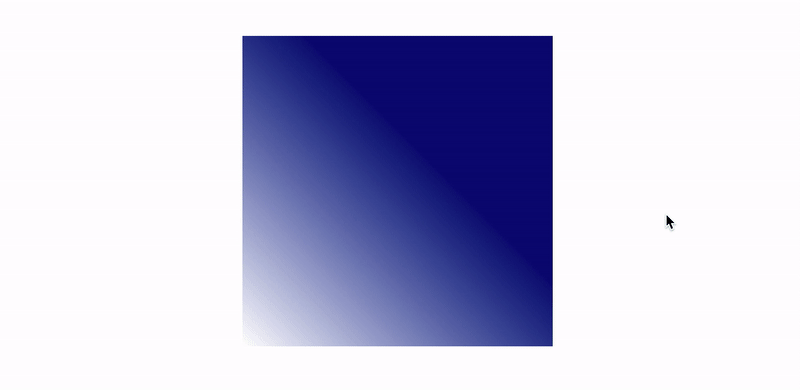
Detection
if(CSS.registeredProperty) {
}
Specification Status
Working draft : posted for community discussion.Support
Font Metrics API
This API is at an early stage of development, so the specification may change dramatically in the future. It currently provides methods for measuring the size of text elements displayed on the screen, allowing developers to influence the rendering of characters. The existing CSS features do not allow you to work with these values or make this work very difficult. One example of the use of this API is multi-line dynamic truncation of text.Specification Status
Collection of ideas : draft not published.Browsers are not supported.Vorkleta
Before moving on to the following APIs, you need to understand the concept of worklets. Vorklets are scripts that run during rendering and are independent of the underlying JS code. They expand the capabilities of the rendering engine, are designed for parallel execution (2 or more instances), do not block the main thread, have limited access to the global scope and are called by the engine as necessary. Vorklets can only be run through HTTPS (in production) or through localhost (for development and testing purposes).Houdini includes the following worklets that extend the browser rendering engine:- Paint Worklet - Paint API
- Animation Worklet - Animation API
- Layout Worklet - Layout API
Paint API
The Paint API allows developers to use JS functions to paint the background, borders, or contents of an element using the 2D Rendering Context, which is a subset of the HTML5 Canvas API. The Paint API uses the Paint Worklet to draw an image that depends on changes to the CSS (such as changes to CSS variables). Those familiar with the Canvas API will feel right at home with the Paint API.Creating a Paint Worklet consists of several steps:- Write and register a worklet using the registerPaint function
- Call a worklet in HTML or JS using CSS.paintWorklet.addModule
- Use the paint () method in CSS along with the name of the vorklet and the arguments passed
Let's look at the registerPaint function, which is used to register and determine the functionality of the Paint Worklet.registerPaint('paintWorkletExample', class {
static get inputProperties() { return ['--myVariable']; }
static get inputArguments() { return ['<color>']; }
static get contextOptions() { return {alpha: true} }
paint(ctx, size, properties, args) {
}
})
The registerPaint function consists of the following parts:- inputProperties: An array of custom CSS properties that the worklet is observing. This array represents the dependencies of the worklet.
- inputArguments: an array of arguments that can be passed from a function to external CSS
- contextOptions: color transparency. If false, all colors will be completely opaque
- paint: the main function taking the following arguments:
- ctx: a 2D drawing context that is almost identical to the 2D canvas context of the Canvas API
- size: an object with the width and height of the element. Values depend on the layout rendering process. Canvas size is same as actual item size
- properties: variables contained in inputProperties
- args: an array of arguments passed to the paint function
After registering the worklet, it must be called in HTML, indicating the path to the file.CSS.paintWorklet.addModule('path/to/worklet/file.js')
Vorklets can be added from any external source (for example, from CDN), which makes them modular and reusable.CSS.paintWorklet.addModule('https://url/to/worklet/file.js')
After calling the worklet, it can be used in CSS using the “paint” function. This function, as the first parameter, takes the registered name of the vorklet and all the arguments specified in inputArguments. From this moment, the browser knows when to call the worklet and what user actions lead to the change of certain values of CSS custom properties..example-element {
background: paint(paintWorkletExample, blue);
}
Example
The following example demonstrates the use of the Paint API, as well as the modularity and reuse of worklets. It uses the ripple worklet from the Google Chrome Labs repository . See example code here .
Detection
if(‘paintWorklet’ in CSS){
}
@supports(background: paint(paintWorkletExample)){
}
Specification Status
Recommendation : A stable working draft, ready to use.Support
Animation API
This API extends web animations through the processing of various events (scrolling, hovering, clicking, etc.) and improves performance by launching animations in its own stream through the animation worklet.Like any other worklet, a workout animation must first be registered.registerAnimation(‘animationWorkletExample’, class {
constructor(options){
}
animate(currentTime, effect){
}
})
This class includes two functions:- constructor: called when a new instance is created. Used for general setup.
- animate: The main function containing the animation logic. The following parameters are accepted:
- currentTime: timestamps on a specific timeline
- effect: an array of effects used in the animation
After registration, the worklet is included in the main JS file, animation (element, frames, settings) is added and attached to the timeline. The concept of timeline marks and the basics of web animation is in the next section.
await CSS.animationWorklet.addModule(‘path/to/worklet/file.js’)
const elementExample = document.getElementById(‘element-example’)
const effectExample = new KeyframeEffect(
elementExample,
[
{
)
new WorkletAnimation(
‘animationWorkletExample’
effectExample,
document.timeline,
{},
).play()
Time stamps
Web animations are based on timestamps — milestones for effects on the animation timeline. For example, we analyze a repeating linear animation, which consists of three frames (beginning, middle, end), starts 1 second after the page is fully loaded (delay) and lasts 4 seconds.The time stamps of the effects will look like this (for an animation lasting 4 seconds and without delay):effect.localTime with a value of 3000ms (given a delay of 1000ms) binds the animation to the average frame on the timeline (1000ms delay + 2000ms average frame). The same effect will be achieved when setting 7000ms and 11000ms, as the animation repeats every 4000ms.animate(currentTime, effect){
effect.localTime = 3000
}
With a constant value of effect.localTime, the animation will be locked on a specific frame. Therefore, the value of effect.localTime should change. This value should be a function bound to currentTime or another variable.Here's what the linear animation code looks like:animate(currentTime, effect){
effect.localTime = currentTime
}
Time stamps are not limited to 1: 1. The Animation API allows developers to manipulate marks through the animate function, using standard JS functions to create complex effects. Animations can also vary at each iteration (with repeatable animations).Animation can be tied not only to document loading, but also to user actions. A user action such as scrolling a page can be used in animation through a ScrollTimeline object. For example, an animation can start when you scroll 200px and end when you scroll 800px.const scrollTimelineExample = new ScrollTimeline({
scrollSource: scrollElement,
orientation: ‘vertical’,
startScrollOffset: ‘200px’,
endScrollOffset: ‘800px’,
timeRange: 1200,
fill: ‘forwards’
})
The animation automatically adapts to the scroll speed, while remaining smooth and responsive. Since the animation runs in its own stream and connects to the browser rendering engine, it starts smoothly and does not affect performance.Example
The following example demonstrates non-linear animation. It uses the Gaussian function with the same time rotation there and back. See example code here .
Detection
if(CSS.animationWorklet){
}
Specification Status
First public working draft : ready for community discussion, subject to change in the future.Support
Layout API
The Layout API allows developers to extend the layout rendering process by defining new modules for use in the CSS “display” property. This API introduces new concepts, is very complex and offers a large number of settings for developing custom algorithms for working with page layout.First things first, a worklet needs to be registered.registerLayout(‘exampleLayout’, class{
static get inputProperties() { return [‘--example-variable’] }
static get childrenInputProperties() { return [‘--exampleChildVariable’] }
static get layoutOptions(){
return {
childDisplay: ‘normal’,
sizing: ‘block-like’
}
}
intrinsicSizes(children, edges, styleMap){
}
layout(children, edges, constraints, styleMap, breakToken){
}
})
Registering a worklet includes the following methods:- inputProperties: an array of custom CSS properties that are watched by the worklet and that belong to the parent, the element that caused the layout to render. This array represents the layout dependencies
- childrenInputProperties: an array of custom CSS properties that are watched by the widget and which belong to the descendant
- layoutOptions: defines the following layout properties:
- childDisplay: The predefined values are block and normal. Defines how the item is displayed (block or line)
- sizing: The predefined values are block-like and manual. Determines the need for preliminary calculation of element sizes (if not specified)
- intrinsicSizes: defines how the container or its contents are displayed in the layout context:
- children: child of the element that caused the page layout to render
- edges: container borders
- styleMap: typed container style object model
- layout: the main function for working with the layout:
- children: child element
- edges: borders
- constraints: constraints imposed by the parent layout
- styleMap: typed container style object model
- breakToken: breakpoint for pagination or print layout splitting
Next, the worklet is added to the HTML or JS file.CSS.layoutWorklet.addModule(‘path/to/worklet/file.js’)
We make a link to the worklet in the file with styles..example-element {
display: layout(exampleLayout)
}
How the Layout API works with layout
In the previous example, we defined exampleLayout.An .example-element is called a parent layout, including indents, borders, and scroll sliders. A parent layout consists of children elements called current layouts. Current layouts are target elements whose layouts are “customized” using the Layout API. For example, when using “display: flex”, the descendants of the element are rearranged according to the flexible layout. This is similar to the operation of the Layout API.Each current layout consists of child layouts containing algorithms for rendering the layout of the child element - LayoutChild (including the pseudo-classes :: before and :: after). LayoutChild - a container generated by CSS tools containing data about styles (without data about the layout). LayoutChild elements are automatically created by the browser at the stage of applying styles. A child layout can create a Fragment containing instructions for rendering the layout.Example
This example also uses the Google Chrome Labs repository , but the text is replaced with images. See example code here .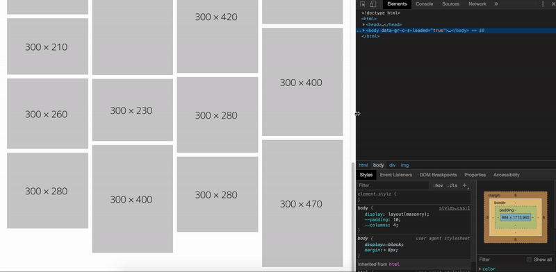
Detection
if(CSS.layoutWorklet){
}
Specification Status
First public working draft : ready for community discussion, subject to change in the future.Support
Houdini and progressive improvement
Despite the fact that Houdini currently does not have optimal browser support, it can be used for progressive improvement. If you are not familiar with the concept of progressive improvement, I advise you to take a look at this article . When using Houdini, the following should be considered:Always identify support to avoid errors.
Each Houdini API and Worklet has an easy way to check accessibility. This avoids the problems of using Houdini in browsers that do not yet support this technology.Use Houdini to improve display and visualization.
Users using browsers that do not support Houdini should have access to the content and basic functionality of the site. User experience and content display should not be dependent on Houdini.Use standard CSS as an alternative
For example, custom CSS properties can be used as an alternative to the custom properties and values API.Focus on developing productive and reliable applications, using Houdini for decorative purposes only as a progressive improvement.Conclusion
Houdini allows developers to use JS code to work with styles in the rendering process, increasing application performance and stability. The ability to embed code in the rendering process allows you to create CSS polyphiles that are easy to share with others, apply, and possibly even include in the specification. In addition, Houdini allows developers and designers to be less dependent on CSS restrictions when working with styles, layouts, and animations.Houdini can be used now, but only as a progressive improvement. This will allow browsers that do not support Houdini to display pages without errors, providing an optimal user experience.I can’t wait until the developer community can fully enjoy the capabilities of Houdini. Here are a couple of examples:CSS Houdini ExpirementsAn Interactive Introduction to CSS Houdini HoudiniExamples from Google Chrome LabsReferences
W3C Drafts of the HoudiniHoudini Specification (Chrome Dev Summit 2018)Animation Worklet - Google DevelopersThank you for your attention.