Hello, habrozhiteli! While our news is being printed in a printing house and the office is in a remote place, we decided to share an excerpt from Paul and Harvey Daytel’s book “Python: Artificial Intelligence, Big Data and Cloud Computing”Case Study: Machine Learning Without a Teacher, Part 2 - K Average Clustering
In this section, perhaps the simplest of machine learning algorithms without a teacher will be presented - clustering using the k average method. The algorithm analyzes unlabeled samples and tries to combine them into clusters. Let us explain that k in the “k means method” represents the number of clusters into which data is supposed to be split.The algorithm distributes the samples to a predetermined number of clusters using distance metrics similar to those of the clustering algorithm of k nearest neighbors. Each cluster is grouped around a centroid - the central point of the cluster. Initially, the algorithm selects k random centroids from among the data set samples, after which the remaining samples are distributed among clusters with the nearest centroid. Next, an iterative recalculation of centroids is performed, and the samples are redistributed among the clusters, until for all clusters the distance from the given centroid to the samples included in its cluster is minimized. As a result of the algorithm, a one-dimensional array of labels is created that designate the cluster to which each sample belongs, as well as a two-dimensional array of centroids representing the center of each cluster.Iris Dataset
We’ll work with the popular Iris dataset included with scikit-learn. This set is often analyzed during classification and clustering. Although the dataset is labeled, we will not use these labels to demonstrate clustering. Labels will then be used to determine how well the k-average algorithm clusters the samples.The Iris dataset is a toy dataset because it consists of only 150 samples and four attributes. The data set describes 50 samples of three types of iris flowers - Iris setosa, Iris versicolor and Iris virginica (see photos below). Characteristics of the samples: length of the outer perianth lobe (sepal length), width of the outer perianth lobe (sepal width), length of the inner perianth lobe (petal length) and width of the inner perianth lobe (petal width), measured in centimeters.14.7.1. Download Iris Dataset
Start IPython with the ipython --matplotlib command, then use the load_iris function of the sklearn.datasets module to get the Bunch object with the data set:In [1]: from sklearn.datasets import load_iris
In [2]: iris = load_iris()
The DESCR attribute of a Bunch object indicates that the data set consists of 150 Number of Instances samples, each of which has four Number of Attributes. There are no missing values in the dataset. Samples are classified by integers 0, 1, and 2, representing Iris setosa, Iris versicolor, and Iris virginica, respectively. We ignore the labels and entrust the determination of the classes of samples to the clustering algorithm using the k means method. Key DESCR information in bold:In [3]: print(iris.DESCR)
.. _iris_dataset:
Iris plants dataset
--------------------
**Data Set Characteristics:**
:Number of Instances: 150 (50 in each of three classes)
:Number of Attributes: 4 numeric, predictive attributes and the class
:Attribute Information:
- sepal length in cm
- sepal width in cm
- petal length in cm
- petal width in cm
- class:
- Iris-Setosa
- Iris-Versicolour
- Iris-Virginica
:Summary Statistics:
============== ==== ==== ======= ===== ====================
Min Max Mean SD Class Correlation
============== ==== ==== ======= ===== ====================
sepal length: 4.3 7.9 5.84 0.83 0.7826
sepal width: 2.0 4.4 3.05 0.43 -0.4194
petal length: 1.0 6.9 3.76 1.76 0.9490 (high!)
petal width: 0.1 2.5 1.20 0.76 0.9565 (high!)
============== ==== ==== ======= ===== ====================
:Missing Attribute Values: None
:Class Distribution: 33.3% for each of 3 classes.
:Creator: R.A. Fisher
:Donor: Michael Marshall (MARSHALL%PLU@io.arc.nasa.gov)
:Date: July, 1988
...
Checking the number of samples, features and target values
The number of patterns and attributes can be found in the shape attribute of the data array, and the number of target values can be found in the shape attribute of the target array:In [4]: iris.data.shape
Out[4]: (150, 4)
In [5]: iris.target.shape
Out[5]: (150,)
The array target_names contains the names of the numeric labels of the array. The expression target - dtype = '<U10' means that its elements are strings with a maximum length of 10 characters:In [6]: iris.target_names
Out[6]: array(['setosa', 'versicolor', 'virginica'], dtype='<U10')
The feature_names array contains a list of string names for each column in the data array:In [7]: iris.feature_names
Out[7]:
['sepal length (cm)',
'sepal width (cm)',
'petal length (cm)',
'petal width (cm)']
14.7.2. Iris Dataset Research: Descriptive Statistics in Pandas
We use the DataFrame collection to examine the Iris dataset. As with the California Housing dataset, we set the pandas parameters to format the column output:In [8]: import pandas as pd
In [9]: pd.set_option('max_columns', 5)
In [10]: pd.set_option('display.width', None)
Create a DataFrame collection with the contents of the data array, using the contents of the feature_names array as column names:In [11]: iris_df = pd.DataFrame(iris.data, columns=iris.feature_names)
Then add a column with the name of the view for each of the samples. The list transformation in the following snippet uses each value in the target array to search for the corresponding name in the target_names array:In [12]: iris_df['species'] = [iris.target_names[i] for i in iris.target]
We will use pandas to identify several samples. As before, if pandas outputs \ to the right of the column name, this means that the columns that will be displayed below remain in the output:In [13]: iris_df.head()
Out[13]:
sepal length (cm) sepal width (cm) petal length (cm) \
0 5.1 3.5 1.4
1 4.9 3.0 1.4
2 4.7 3.2 1.3
3 4.6 3.1 1.5
4 5.0 3.6 1.4
petal width (cm) species
0 0.2 setosa
1 0.2 setosa
2 0.2 setosa
3 0.2 setosa
4 0.2 setosa
We calculate some indicators of descriptive statistics for numeric columns:In [14]: pd.set_option('precision', 2)
In [15]: iris_df.describe()
Out[15]:
sepal length (cm) sepal width (cm) petal length (cm) petal width (cm)
count 150.00 150.00 150.00 150.00
mean 5.84 3.06 3.76 1.20
std 0.83 0.44 1.77 0.76
min 4.30 2.00 1.00 0.10
25% 5.10 2.80 1.60 0.30
50% 5.80 3.00 4.35 1.30
75% 6.40 3.30 5.10 1.80
max 7.90 4.40 6.90 2.50
Calling the describe method on the 'species' column confirms that it contains three unique values. We know in advance that the data consists of three classes, to which the samples belong, although in machine learning without a teacher this is not always the case.In [16]: iris_df['species'].describe()
Out[16]:
count 150
unique 3
top setosa
freq 50
Name: species, dtype: object
14.7.3. Pairplot dataset visualization
We will visualize the characteristics in this data set. One way to extract information about your data is to see how the attributes are related to each other. A dataset has four attributes. We will not be able to construct a diagram of correspondence of one attribute with three others in one diagram. Nevertheless, it is possible to construct a diagram on which the correspondence between the two features will be presented. Fragment [20] uses the pairplot function of the Seaborn library to create a table of diagrams in which each feature is mapped to one of the other features:In [17]: import seaborn as sns
In [18]: sns.set(font_scale=1.1)
In [19]: sns.set_style('whitegrid')
In [20]: grid = sns.pairplot(data=iris_df, vars=iris_df.columns[0:4],
...: hue='species')
...:
Key Arguments:- a DataFrame collection with a dataset plotted on a chart;
- vars - a sequence with the names of variables plotted on the chart. For a DataFrame collection, it contains column names. In this case, the first four columns of the DataFrame are used, representing the length (width) of the outer perianth and the length (width) of the inner perianth, respectively;
- hue is a column of the DataFrame collection used to determine the colors of the data plotted on the chart. In this case, the data is colored depending on the type of iris.
The previous pairplot call builds the following 4 × 4 diagram table: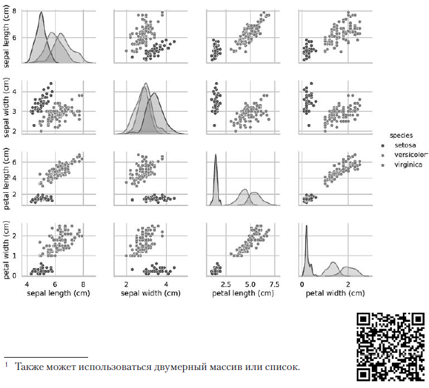 The diagrams on the diagonal leading from the upper left to the lower right corner show the distribution of the attribute displayed in this column with a range of values (from left to right) and the number of samples with these values (from top to bottom) . Take the distribution of the length of the outer perianth:
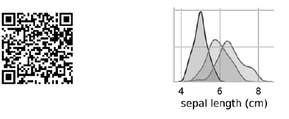 The highest shaded area indicates that the range of the length of the outer perianth lobe (along the x axis) for the species Iris setosa is approximately 4–6 cm, and for most Iris setosa samples, the values lie in the middle of this range (approximately 5 cm). The far right shaded area indicates that the range of the length of the outer perianth lobe (along the x axis) for the species Iris virginica is approximately 4–8.5 cm, and for most Iris virginica samples, the values are between 6 and 7 cm.In other diagrams, the column presents the data scatter diagrams of other characteristics relative to the characteristic along the x axis. In the first column, in the first three diagrams, the y axis shows the width of the outer perianth, the length of the inner perianth, and the width of the inner perianth, respectively, and the x axis shows the length of the outer perianth.When this code is executed, a color image appears on the screen, showing the relationship between different types of irises at the level of individual characters. Interestingly, in all diagrams, the blue dots of Iris setosa are clearly separated from the orange and green dots of other species; this suggests that Iris setosa is indeed a separate class. You can also notice that the other two species can sometimes be confused, as indicated by overlapping orange and green dots. For example, the diagram of the width and length of the outer perianth lobe shows that the points of Iris versicolor and Iris virginica mix. This suggests that if only measurements of the outer perianth lobe are available, then it will be difficult to distinguish between these two species.
Output pairplot results in one color
If you remove the hue key argument, then the pairplot function uses only one color to output all the data, because it does not know how to distinguish between the views in the output:In [21]: grid = sns.pairplot(data=iris_df, vars=iris_df.columns[0:4])
As can be seen from the following diagram, in this case, the diagrams on the diagonal are histograms with the distributions of all the values of this attribute, regardless of type. When studying diagrams, it may seem that there are only two clusters, although we know that the data set contains three types. If the number of clusters is not known in advance, then you can contact an expert in the subject area who is well acquainted with the data. An expert may know that there are three kinds of data in a dataset; this information can come in handy when conducting machine learning with data.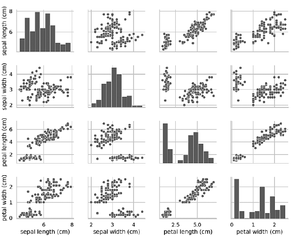 Pairplot diagrams work well with a small number of features or a subset of features so that the number of rows and columns is limited, and with a relatively small number of patterns so that data points are visible. As the number of features and patterns grows, the data scatter diagrams become too small to read the data. In large datasets, you can plot a subset of features on the chart and, optionally, a randomly selected subset of patterns to get some idea of the data.»More information about the book can be found and purchased on the publisher’s website