I posted in Open Source a new information panel for the distribution of Coronavirus COVID-19 , which allows you to analyze the dynamics (curvature of the graph) of the distribution of Coronavirus for different countries.
Reason for creating the panel
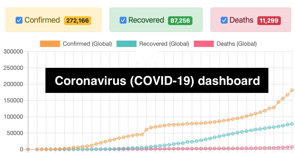
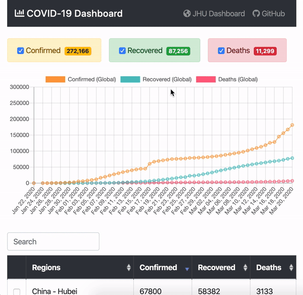
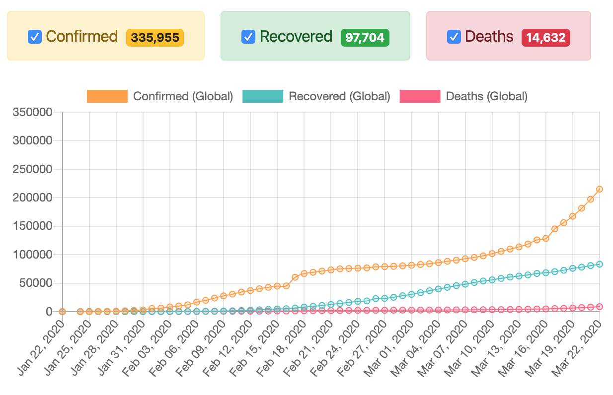
With the new information panel, I wanted to supplement the fairly well-known Panel from Johns Hopkins University with the ability to see graphs with the number of confirmed cases, cases of recovery and deaths from the COVID-19 virus for each country (state, region, region).
I was personally interested in questions like: "Is the growth curve slowing down (is the plateau coming soon)?" , "How can I compare the dynamics of growth curves between the two countries?" , "Which countries have applied the best quarantine measures to more quickly reach a plateau on the schedule?" etc.
The functionality of the panel is as follows:
Data Sources and Technology Stack
The panel uses the COVID-19 (2019-nCoV) Repository from Johns Hopkins University as a data source .
I tried to make the browser part of the panel as simple as possible by using the "clean" React.js (without JSXtranspiler, npmpackage manager and CreateReactAppstarter). The Charts.js library was used to display the data on the chart , and the Bootstrap Table library was used to display the data in the table , which made it possible to sort the data by columns, as well as search the country by its name.
Core functionality
"" ( - ), , .
, 23- :
, "" :

:

, :

, UX :
- Grouping of regions by country with the ability to view statistics across the country (for example, the USA, China and other countries).
- Ability to reset selected countries in one click.
- Adding selected countries to the URL for a further opportunity to share the link with pre-selected filters.