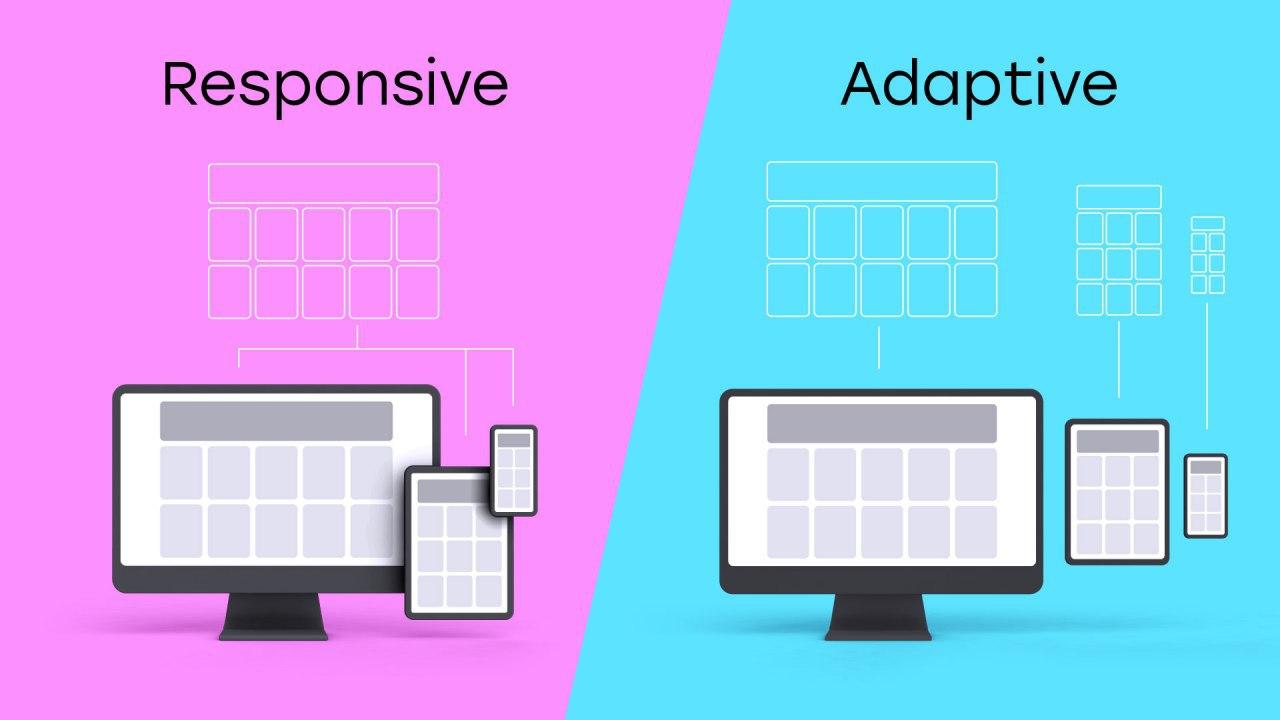
 In this article, we will understand the complexity of writing adaptive components, talk about code splitting, consider several ways to organize the code structure, evaluate their advantages and disadvantages, and try to choose the best one (but this is not accurate).First, let's deal with the terminology. We often hear the terms adaptive and responsive . What do they mean? What is the difference? How does this relate to our components?Adaptive (adaptive) is a complex of visual interfaces created for specific screen sizes. Responsive (Responsive) is a single interface that adapts to any screen size.Moreover, when the interface is decomposed into small fragments, the difference between adaptive and responsive becomes more and more blurred, until it disappears completely.When developing layouts, our designers, as well as developers, most often do not share these concepts and combine adaptive and responsive logic.Further, I will call components that contain adaptive and responsive logic as simply adaptive . Firstly, because I like this word more than “responsive” or, forgive me, “responsive”. And secondly, I find it more common.I will focus on two areas of display interfaces - mobile and desktop. By mobile display we mean width, for example, ≤ 991 pixels(the number itself is not important, it's just a constant, which depends on your design system and your application), and under the desktop display - the width is greater than the selected threshold. I will intentionally miss displays for tablets and widescreen monitors, because, firstly, not everyone needs them, and secondly, it will be easier to put it this way. But the patterns we are going to talk about expand equally for any number of "mappings."Also, I will almost not talk about CSS , mainly we will talk about component logic.
Frontend @youla
I’ll briefly talk about our stack in Yulia so that it is clear in what conditions we create our components. We use React / Redux , we work in monorep, we use Typescript and we write CSS on styled-components . As an example, let's look at our three packages (packages in the concept of monoreps are NPM packages that are interconnected, which can be separate applications, libraries, utilities or components - you choose the degree of decomposition yourself). We will look at two applications and one UI library.@ youla / ui- library of components. They are used not only by us, but also by other teams that need "Yulian" interfaces. The library has a lot of things, starting with buttons and input fields, and ending, for example, with a header or an authorization form (more precisely, its UI part). We consider this library an external dependency of our application.@ youla-web / app-classified - the application responsible for the sections of the catalog / product / authorization. According to business requirements, all interfaces here should be adaptive .@ youla-web / app-b2b is the application responsible for the sections of your personal account for professional users. The interfaces of this application are exclusively desktop .Further we will consider writing adaptive components using the example of these packages. But first you need to deal with isMobile.Mobility Definition isMobile && <Component />
import React from 'react'

const App = (props) => {
 const { isMobile } = props

 return (
   <Layout>
     {isMobile && <HeaderMobile />}
     <Content />
     <Footer />
   </Layout>
 )
}
Before you start writing adaptive components, you need to learn how to define “mobility”. There are many ways to implement the definition of mobility. I want to dwell on some key points.Determining mobility by screen width and user-agent
Most of you know well how to implement both options, but let's briefly go over the main points again.When working with the width of the screen, it is customary to set boundary points, after which the application should behave as a mobile or desktop one. The procedure is as follows:- Create constants with boundary points and save them in the subject (if your CSS solution allows). The values themselves may be what your designers find most appropriate for your UI system .
- We save the current screen size in a redux / mobx / context / any data source. Anywhere, if only the components and, preferably, the application logic had access to this data.
- We subscribe to the resize event and update the value of the screen width to the one that will trigger the chain of updates of the component tree.
- We create simple helper functions that, using screen widths and constants, calculate the current state (
isMobile,isDesktop ).
Here is the pseudo code that implements this model of work:const breakpoints = {
mobile: 991
}
export const state = {
ui: {
width: null
}
}
const handleSubscribe = () => {
state.ui.width = window.innerWidth
}
export const onSubscribe = () => {
window.addEventListener('resize', handleSubscribe)
}
export const offSubscribe = () =>
window.removeEventListener('resize', handleSubscribe)
export const getIsMobile = (state: any) => {
if (state.ui.width <= breakpoints.mobile) {
return true
}
return false
}
export const getIsDesktop = (state) => !getIsMobile(state)
export const App = () => {
React.useEffect(() => {
onSubscribe()
return () => offSubscribe()
}, [])
return <MyComponentMounted />
}
const MyComponent = (props) => {
const { isMobile } = props
return isMobile ? <MobileComponent /> : <DesktopComponent />
}
export const MyComponentMounted = anyHocToConnectComponentWithState(
(state) => ({
isMobile: getIsMobile(state)
})
)(MyComponent)
When the screen changes, the values in propsfor the component will be updated, and it will be correctly redrawn. There are many libraries that implement this functionality. It will be more convenient for someone to use a ready-made solution, for example, react-media , react-responsive , etc., and for someone it is easier to write your own .Unlike the screen size, user-agentit cannot dynamically change while the application is running (strictly speaking, maybe through the developer’s tools, but this is not a user scenario). In this case, we don’t need to use complex logic with storing the value and recounting, just parse the string once window.navigator.userAgent,to save the value, and you're done. There are a bunch of libraries to help you with this, for example, mobile-detect, react-device-detect , etc.The approach is user-agentsimpler, but just using it is not enough. Anyone who has seriously developed adaptive interfaces knows about the “magic twist” of iPads and similar devices, which in the vertical position fall under the definition of mobile, and in horizontal - desktop, but at the same time have a user-agentmobile device. It is also worth noting that in a fully adaptive / responsive application, user-agent it is impossible to determine mobility based on information about only if the user uses, for example, a desktop browser, but squeezes the window to the “mobile” size.Also, do not neglect information about user-agent. Very often in the code you can find such constants as isSafari,isIEetc. that handle the “features” of these devices and browsers. It is best to combine both approaches.In our code base, we use a constant isCheesySafarithat, as the name implies, defines membership user-agentin the Safari browser family. But besides this, we have a constant isSuperCheesySafari, which implies a mobile Safari corresponding to iOS version 11, which has become famous for many bugs like this: https://hackernoon.com/how-to-fix-the-ios-11-input-element -in-fixed-modals-bug-aaf66c7ba3f8 .export const isMobileUA = (() => magicParser(window.navigator.userAgent))()
import isMobileUA from './isMobileUA'
const MyComponent = (props) => {
const { isMobile } = props
return (isMobile || isMobileUA) ? <MobileComponent /> : <DesktopComponent />
}
What about media queries? Yes, indeed, CSS has built-in tools for working with adaptability: media queries and their analogue, method window.matchMedia. They can be used, but the logic of “updating” components when resizing will still have to be implemented. Although for me personally, using the syntax of media queries instead of the usual comparison operations in JS for application logic and components is a dubious advantage.Organization of component structure
We’ve figured out the definition of mobility, now let's reflect on the use of the data we have obtained and the organization of the component code structure. In our code, as a rule, two kinds of components prevail.The first type is the components, sharpened either under the cell phone, or under the desktop. In such components, the names often contain the words Mobile / Desktop, which clearly indicate that the component belongs to one of the types. As an example of such a component can be considered <MobileList />from @youla/ui.import { Panel, Cell, Content, afterBorder } from './styled'
import Group from './Group'
import Button, { IMobileListButtonProps } from './Button'
import ContentOrButton, { IMobileListContentOrButton } from './ContentOrButton'
import Action, { IMobileListActionProps } from './Action'
export default { Panel, Group, Cell, Content, Button, ContentOrButton, Action }
export {
afterBorder,
IMobileListButtonProps,
IMobileListContentOrButton,
IMobileListActionProps
}
This component, in addition to very verbose export, is a list with data, separators, groupings by blocks, etc. Our designers are very fond of this component and everywhere use it in the Ula interfaces. For example, in the description on the product page or in our new tariff functionality: And in N places around the site. We also have a similar component
 <DesktopList />that implements this list functionality for desktop resolution.The components of the second type contain the logic of both desktop and mobile. Let's look at a simplified version of the rendering of our component <HeaderBoard />, which lives in @ youla / app-classified.We have found for myself is very convenient to make all styled-component-s for a component in a single file and import it under the namespaces S, to separate the code from the other components: import * as S from ‘./styled’. Accordingly, “S” is an object whose keys are the names of styled components, and the values are the components themselves. return (
<HeaderWrapper>
<Logo />
{isMobile && <S.Arrow />}
<S.Wraper isMobile={isMobile}>
<Video src={bgVideo} />
{!isMobile && <Header>{headerContent}</Header>}
<S.WaveWrapper />
</S.Wraper>
{isMobile && <S.MobileHeader>{headerContent}</S.MobileHeader>}
<Info link={link} />
<PaintingInfo isMobile={isMobile} />
{isMobile ? <CardsMobile /> : <CardsDesktop />}
{isMobile ? <UserNavigation /> : <UserInfoModal />}
</HeaderWrapper>
)
Here isMobile, it is the component’s dependency, on the basis of which the component itself will decide which interface to render.For more convenient scaling, we often use the control inversion pattern in the reused parts of our code, but be careful not to overload the top-level abstractions with unnecessary logic.Let’s now abstract ourselves a bit from the “Yulian” components and take a closer look at these two components:<ComponentA />- with a strict separation of desktop and mobile logic.<ComponentB />- combined.
<ComponentA /> vs <ComponentB />
Folder structure and root index.ts file :./ComponentA
- ComponentA.tsx
- ComponentADesktop.tsx
- ComponentAMobile.tsx
- index.ts
- styled.desktop.ts
- styled.mobile.ts
import ComponentA  from './ComponentA'
import ComponentAMobile  from './ComponentAMobile'
import ComponentADesktop  from './ComponentADesktop'

export default {
 ComponentACombined: ComponentA,
 ComponentAMobile,
 ComponentADesktop
}
Thanks to the new technology tree-shaking webpack (or using any other collector), you can discard unused modules ( ComponentADesktop, ComponentACombined), even with this re-export through the root file:import ComponentA from ‘@youla/ui’
<ComponentA.ComponentAMobile />
Only the ./ComponentAMobile file code gets into the final bundle.The component <ComponentA />contains asynchronous imports using a React.Lazyspecific version of the component <ComponentAMobile /> || <ComponentADesktop />for a specific situation.We at Yule try to adhere to the pattern of a single entry point into the component through the index file. This makes finding and refactoring components easier. If the contents of the component are not re-exported through the root file, then we can safely edit it, since we know that it is not used outside the context of this component. Well, Typescript will hedge in a pinch. The folder with the component has its own “interface”: exports at the module level in the root file, and its implementation details are not disclosed. As a result, when refactoring, you can not be afraid of saving the interface.import React from 'react'
const ComponentADesktopLazy = React.lazy(() => import('./ComponentADesktop'))
const ComponentAMobileLazy = React.lazy(() => import('./ComponentAMobile'))
const ComponentA = (props) => {
const { isMobile } = props
return (
<React.Suspense fallback={props.fallback}>
{isMobile ? (
<ComponentAMobileLazy {...props} />
) : (
<ComponentADesktopLazy {...props} />
)}
</React.Suspense>
)
}
export default ComponentA
Further, the component <ComponentADesktop />contains the import of desktop components:import React from 'react'
import { DesktopList, UserAuthDesktop, UserInfo } from '@youla/ui'
import Banner from '../Banner'
import * as S from './styled.desktop'
const ComponentADesktop = (props) => {
const { user, items } = props
return (
<S.Wrapper>
<S.Main>
<Banner />
<DesktopList items={items} />
</S.Main>
<S.SideBar>
<UserAuthDesktop user={user} />
<UserInfo user={user} />
</S.SideBar>
</S.Wrapper>
)
}
export default ComponentADesktop
A component <ComponentAMobile />contains the import of mobile components:import React from 'react'
import { MobileList, MobileTabs, UserAuthMobile } from '@youla/ui'
import * as S from './styled.mobile'
const ComponentAMobile = (props) => {
const { user, items, tabs } = props
return (
<S.Wrapper>
<S.Main>
<UserAuthMobile user={user} />
<MobileList items={items} />
<MobileTabs tabs={tabs} />
</S.Main>
</S.Wrapper>
)
}
export default ComponentAMobile
The component is <ComponentA />adaptive: by the flag it isMobilecan decide which version to draw, can only download the required files asynchronously, that is, the mobile and desktop versions can be used separately.Let's look at the component now <ComponentB />. In it, we will not deeply decompose mobile and desktop logic, we will leave all the conditions within the framework of one function. Similarly, we will not separate the components of styles.Here is the folder structure. The root index.ts file simply re-exports ./ComponentB:./ComponentB
- ComponentB.tsx
- index.ts
- styled.ts
export { default } from './ComponentB'
The ./ComponentB file with the component itself:
import React from 'react'

import {
 DesktopList,
 UserAuthDesktop,
 UserInfo,
 MobileList,
 MobileTabs,
 UserAuthMobile
} from '@youla/ui'

import * as S from './styled'

const ComponentB = (props) => {
 const { user, items, tabs, isMobile } = props

 if (isMobile) {
   return (
     <S.Wrapper isMobile={isMobile}>
       <S.Main isMobile={isMobile}>
         <UserAuthMobile user={user} />
         <MobileList items={items} />
         <MobileTabs tabs={tabs} />
       </S.Main>
     </S.Wrapper>
   )
 }

 return (
   <S.Wrapper>
     <S.Main>
       <Banner />
       <DesktopList items={items} />
     </S.Main>
     <S.SideBar>
       <UserAuthDesktop user={user} />
       <UserInfo user={user} />
     </S.SideBar>
   </S.Wrapper>
 )
}

export default ComponentB
Let's try to estimate the advantages and disadvantages of these components. Total three pros and cons arguments sucked out of the finger for each of them. Yes, I noticed that some criteria are mentioned immediately in both advantages and disadvantages: this was done on purpose, everyone will delete them from the wrong group.
Our experience with @youla
We in our component library @ youla / ui try not to mix desktop and mobile components together, because this is an external dependency for many of our packages and others. The life cycle of these components is as long as possible, I want to keep them as slim and light as possible.There are two important points to note .Firstly, the smaller the assembled JS file, the faster it will be delivered to the user, this is obvious and everyone knows. But this characteristic is important only for the first download of the file, during repeated visits the file will be delivered from the cache, and there will be no code delivery problem.Here we move on to reason number two, which may soon become, or has already become, the main problem of large web applications. Many have already guessed: yes, we are talking about the duration of parsing.Modern engines like V8 can cache and the result of parsing, but so far it does not work very efficiently. Eddie Osmani has an excellent article on this topic: https://v8.dev/blog/cost-of-javascript-2019 . You can also subscribe to the V8 blog: https://twitter.com/v8js .It is the duration of parsing that we will significantly reduce, this is especially important for mobile devices with weak processors .In application packages @ youla-web / app- * the development is more “business-oriented”. And for the sake of speed / simplicity / personal preferences, the decision is chosen that the developer himself considers the most correct in this situation. It often happens that when developing small MVP features, it is better to first write a simpler and faster option (<ComponentB />), in such a component there are half the lines. And, as we know, the more code - the more errors.After checking the relevance of the feature, it will be possible to replace the component with a more optimized and productive version <ComponentA />, if necessary.I also advise you to take a peek at the component. If the UIs of the mobile and desktop versions are very different, then perhaps they should be separated, keeping some common logic in one place. This will allow you to get rid of the pain when writing complex CSS, problems with errors in one of the displays when refactoring or changing another. And vice versa, if the UI is as close as possible, then why do the extra work?Conclusion
To summarize. We understood the terminology of the adaptive / responsive interface, examined several ways to determine mobility and several options for organizing the code structure of the adaptive component, and identified the advantages and disadvantages of each. Surely a lot of the above was already known to you, but repetition is the best way to consolidate. I hope you learned something new for yourself. Next time we want to publish a collection of recommendations for writing progressive web applications, with tips on organizing, reusing and maintaining code.