In the last couple of years, I began to deal more with documentation. Write an explanatory text about how this or that system works - in general, it is quite simple. Draw a diagram on which all key objects will be displayed, the relationship between these objects is also quite easy.But the most problematic moment is to keep this documentation up to date. And okay, the text, but the diagrams ... Because all documentation is online, i.e. in html format, then gif / jpeg / png pictures are attached to the text, on which the diagrams are actually depicted. And the schemes are drawn in various programs such as Visio or online services a la draw.io. Then you export the diagram to a graphic format and attach it to html. Everything is simple.What is the problem?Schemes are usually simple. More precisely, not very complicated. Yes, the number of objects is ten or two, the number of connections is about the same. Plus signatures, some designations. Simple schemes can be described in words, but too complex, hmm ... (s) "they don’t understand, sir." There are a lot of schemes, changes in them need to be made periodically, periodically, i.e. constantly, because they follow the development of our products.You can embed the html service. Have you tried it?Yes of course. For example, I like gliffy.com graphics. But for changes you need to go to a third-party service, there to edit. And it’s more difficult to delegate amendments to a colleague.What to do?Recently, on a github, I came across the github.com/RaoulMeyer/diagram-as-code repository in recommendations. Chart as a code. Those. we describe on js the circuit we need. We write this js directly in the same html where the other documentation text is.By the way, but I'm not writing documentation in html at all. Typically, documentation is a set of files with markdown text, which is then converted into a full-fledged documentation site by some engine, for example wintersmith. Or a wiki system.It turns out very convenient: here we wrote the text, then the script tag is opened and the js code of the circuit is described in it.What's wrong again?I liked this repository, but this is not the only example when a diagram is drawn using code or a text view. (At the end of the article there will be links to projects and articles that googled on the topic diagram as code.)And I’m not the only one who corrects the documentation. Sometimes colleagues also make a contribution - correct the word, change the description, insert new pictures. Therefore, I would like to see the diagram in a readable understandable text format, which would not have taken a long time to learn. And in places it’s even easy to make copy-paste to speed up the addition of a new scheme. And another colleague noted that the code is, of course, good, but if you use the structure, everything can be very strict and expressive.Therefore, I tried to present the scheme as a set of several small arrays that describe nodes, connections, groups of nodes, as well as the location of nodes. It turned out, in my humble opinion, quite conveniently, although, of course, the taste and color ...How is the chart in the array?- Each node is described by an identifier that uniquely identifies the node.
- You can also add an icon to the node, add an inscription.
- You can specify a relationship between two nodes.
- For communication on the scheme, you can set the color, the inscription.
- The direction of communication is defined as from source to target. And the source and target are indicated by the identifiers of the node.
- One or more nodes can be added to the group.
- A link can also be specified from a group to a group.
Using these simple rules, we get such a scheme. Simply? Quite.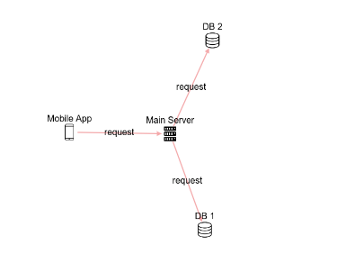 And it is described by the following js code. The main thing here is the elements object. In which nodes - nodes, edges - connections are indicated.
 const elements = {
nodes: [
{ id: 'client', type: 'smartphone', label: 'Mobile App'},
{ id: 'server', type: 'server', label: 'Main Server'},
{ id: 'db1', type: 'database', label: 'DB 1'},
{ id: 'db2', type: 'database', label: 'DB 2'},
],
edges: [
{ source: 'client', target: 'server', label: 'request' },
{ source: 'server', target: 'db1', label: 'request' },
{ source: 'server', target: 'db2', label: 'request' },
],
};
Diagram('scheme1', elements);
Of course, I didn’t think of drawing the circuit myself, but I used the cytoscape.js library , a very powerful visualization tool. Toliku opportunities which in my decision I use only. Clearly, this is a simple example. Can it be more complicated?Yes please. To indicate positions - we use positions, to indicate groups - we specify a list of groups in groups, and the elements themselves have a group attribute.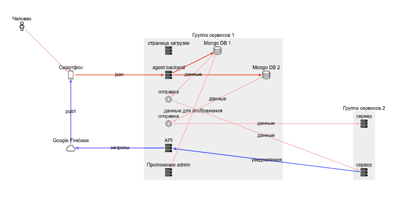 And this is the code:
<div id="scheme5" style="height:500px;width:800px;"></div>
<script>
  const elements5 = {
    groups: [
      { id: 'g1', label: '  1'},
      { id: 'g2', label: '  2'},
    ],
    nodes: [
      { id: 'man1', type: 'person', label: ''},
      { id: 'client', type: 'smartphone', label: ''},
      { id: 'agent-backend', type: 'server', group: 'g1', label: 'agent-backend'},
      { id: 'web', type: 'server', group: 'g1', label: ' admin'},
      { id: 'www', type: 'server', group: 'g1', label: ' '},
      { id: 'mongodb1', type: 'database', group: 'g1', label: 'Mongo DB 1'},
      { id: 'mongodb2', type: 'database', group: 'g1', label: 'Mongo DB 2'},
      { id: 'runner-integration1', type: 'worker', group: 'g1', label: ''},
      { id: 'runner-integration2', type: 'worker', group: 'g1', label: ''},
      { id: 'api', type: 'server', group: 'g1', label: 'API'},
      { id: 'server2', type: 'server', group:'g2', label: ''},
      { id: 'otherServer', type: 'server', group:'g2', label: ''},
      { id: 'firebase', type: 'cloud', label: 'Google Firebase'},
    ],
    edges: [
      { source: 'client', target: 'agent-backend', label: 'json', color: 'red' },
      { source: 'agent-backend', target: 'mongodb1', color: 'red' },
      { source: 'agent-backend', target: 'mongodb2',  color: 'red' },
      { source: 'mongodb1', target: 'runner-integration1', label: '' },
      { source: 'mongodb2', target: 'runner-integration2', label: '' },
      { source: 'mongodb1', target: 'web', label: '  ' },
      { source: 'runner-integration1', target: 'server2', label: '' },
      { source: 'runner-integration2', target: 'otherServer', label: '' },
      { source: 'api', target: 'firebase', label: '', color: 'blue', },
      { source: 'firebase', target: 'client', label: 'push', color: 'blue'},
      { source: 'server2', target: 'api', label: '', color: 'blue'},
      { source: 'man1', target: 'client', },
    ],
    positions: [
      { id: 'client', row: 2, col: 1,},
      { id: 'agent-backend', row: 2, col: 3,},
      { id: 'web', row: 6, col: 3,},
      { id: 'www', row: 1, col: 3,},
      { id: 'mongodb1', row: 1, col: 4,},
      { id: 'mongodb2', row: 2, col: 5,},
      { id: 'runner-integration1', row: 3, col: 3,},
      { id: 'runner-integration2', row: 4, col: 3,},
      { id: 'api', row: 5, col: 3,},
      { id: 'server2', row: 6, col: 7,},
      { id: 'otherServer', row: 4, col: 7,},
      { id: 'firebase', row: 5, col: 1,},
      { id: 'logger', row: 2, col: 7,},
      { id: 'crm', row: 5, col: 8,},
    ],
};
  Diagram('scheme5', elements5, {layout: 'grid'});
</script>
Such a scheme, on the one hand, is almost a couple of screens of code on the laptop, on the other hand, a la json structure allows you to fill in all the data by analogy, quickly and you can copy-paste.And why are the positions taken out separately from the nodes?This is more comfortable. First we specify nodes. Then we can indicate a couple of groups and indicate them in nodes. Then we denote the connection. And then, when the main objects and the connections between them are, we take up the location of these objects on the diagram. Or vice versa.Is it possible without positions?It is possible without positions. But it will be a little crumpled, in the examples you can see this option. This is due to the fact that for cytoscape there is an algorithm for the location of fcose nodes, which also takes into account the presence of groups. Specifying positions makes the scheme more controllable, but at the stage of the first draft of the scheme it is possible without positions.Also, positions can be specified in the style of naval battle. Those. one node is located in a1 and the other in d5. It especially helps that cytoscape forms objects on canvas movable, i.e. we can move them, look at different layout options, and then fix in the code your favorite arrangement of elements.In general, I see. You can also try? Of course, to quickly create schemes, I made myself a small editor , which updates the scheme itself and stores the last option in the browser (in localStorage).Have you tried it? You can now add to your page.Then again:1. We connect a script<script src="https://unpkg.com/@antirek/network-diagram@0.1.4/dist/code-full.min.js"></script>
2. Add to the html code<div id="scheme1" style="height:300px;width:800px;"></div>
<script>
const elements = {
nodes: [
{ id: 'client', type: 'smartphone', label: 'Mobile App'},
{ id: 'server', type: 'server', label: 'Main Server'},
{ id: 'db1', type: 'database', label: 'DB 1'},
{ id: 'db2', type: 'database', label: 'DB 2'},
],
edges: [
{ source: 'client', target: 'server', label: 'request' },
{ source: 'server', target: 'db1', label: 'request' },
{ source: 'server', target: 'db2', label: 'request' },
],
};
Diagram('scheme1', elements);
</script>
3. edit the code to the scheme we need (I think it’s easier than drawing an owl :)More details on the project page on the github.What is the result?I achieved my goals - to add inline schemas to the documentation, the format is quite simple and straightforward. It’s not suitable for superschemes, but for small circuits that explain the structure of connections, it’s even nothing. You can always quickly fix it and change something over time. Yes, and colleagues can correct something in the dock themselves, at least signatures to objects without special training))What can be improved?There are, of course, plenty of options. Make the addition of additional icons (all available are added inline to the script). Choose a more expressive set of icons. Make it possible to specify a link line style. Add background image.What do you think? I already have some ideas for implementation in issues, you also add yours in the comments.My solution is definitely applicable in a narrow range of tasks, and perhaps you will find a more convenient tool for drawing diagrams by simply encoding them - as they say 'show me your diagram as code'- Good selection
- Posh service (9 types of charts online editor)
- Of course mermaid.js
- And if you like super detailed and complex schemes, then this project will definitely delight you: go.drawthe.net