Hello, today I would like to talk about my experience in analyzing Sberbank shares. Sometimes they show slightly different dynamics - it became interesting for me to analyze the movement of their quotes.In this example, we will download quotes from the Finam website. Link to download regular Sberbank .For column operations I will use pandas, for matplotlib visualization.We import:import pandas as pd
import matplotlib.pyplot as plt
To prevent tables from shrinking, you must remove the restrictions:pd.set_option('display.max_columns', None)
pd.set_option('display.expand_frame_repr', False)
pd.set_option('max_colwidth', 80)
pd.set_option('max_rows', 6000)
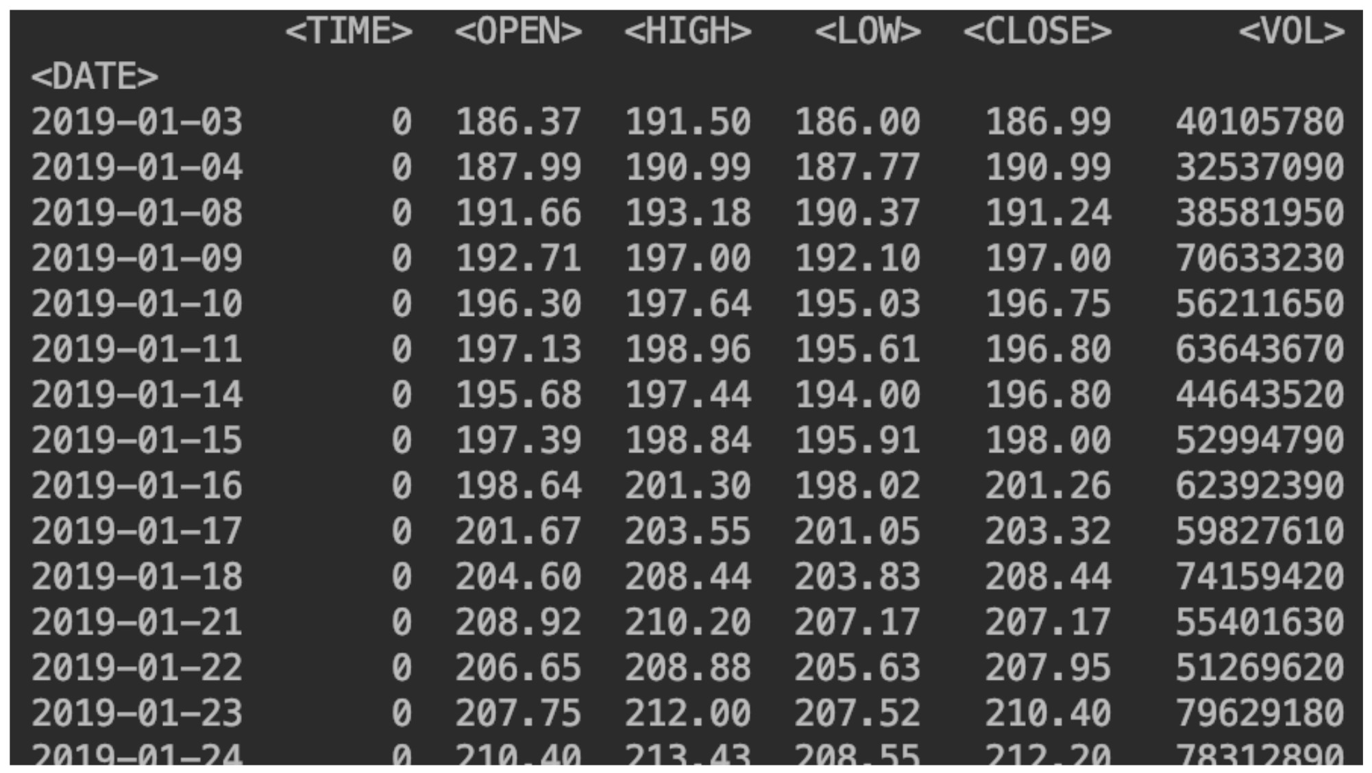
Read stock data
df = pd.read_csv("SBER_190101_200105.csv",sep=';', header=0, index_col='<DATE>', parse_dates=True)
(specify the separator, where the column names are located, which column will be the index, enable date parsing).Also indicate the sort:df = df.sort_values(by='<DATE>')
We display our data:print(df)
 Add a column with a change in price
df['returns']=(df['<CLOSE>']/df['<CLOSE>'].shift(1))-1
So it is possible to derive exactly the percentage:df['returns_pers']=((df['<CLOSE>']/df['<CLOSE>'].shift(1))-1)*100

Add a second share
Do it exactly the same way.df2 = pd.read_csv("SBERP_190101_200105.csv",sep=';', header=0, index_col='<DATE>', parse_dates=True)
df = df.sort_values(by='<DATE>')
df2['returns_pers']=((df2['<CLOSE>']/df2['<CLOSE>'].shift(1))-1)*100
df2['returns']=(df2['<CLOSE>']/df2['<CLOSE>'].shift(1))-1
print(df2)
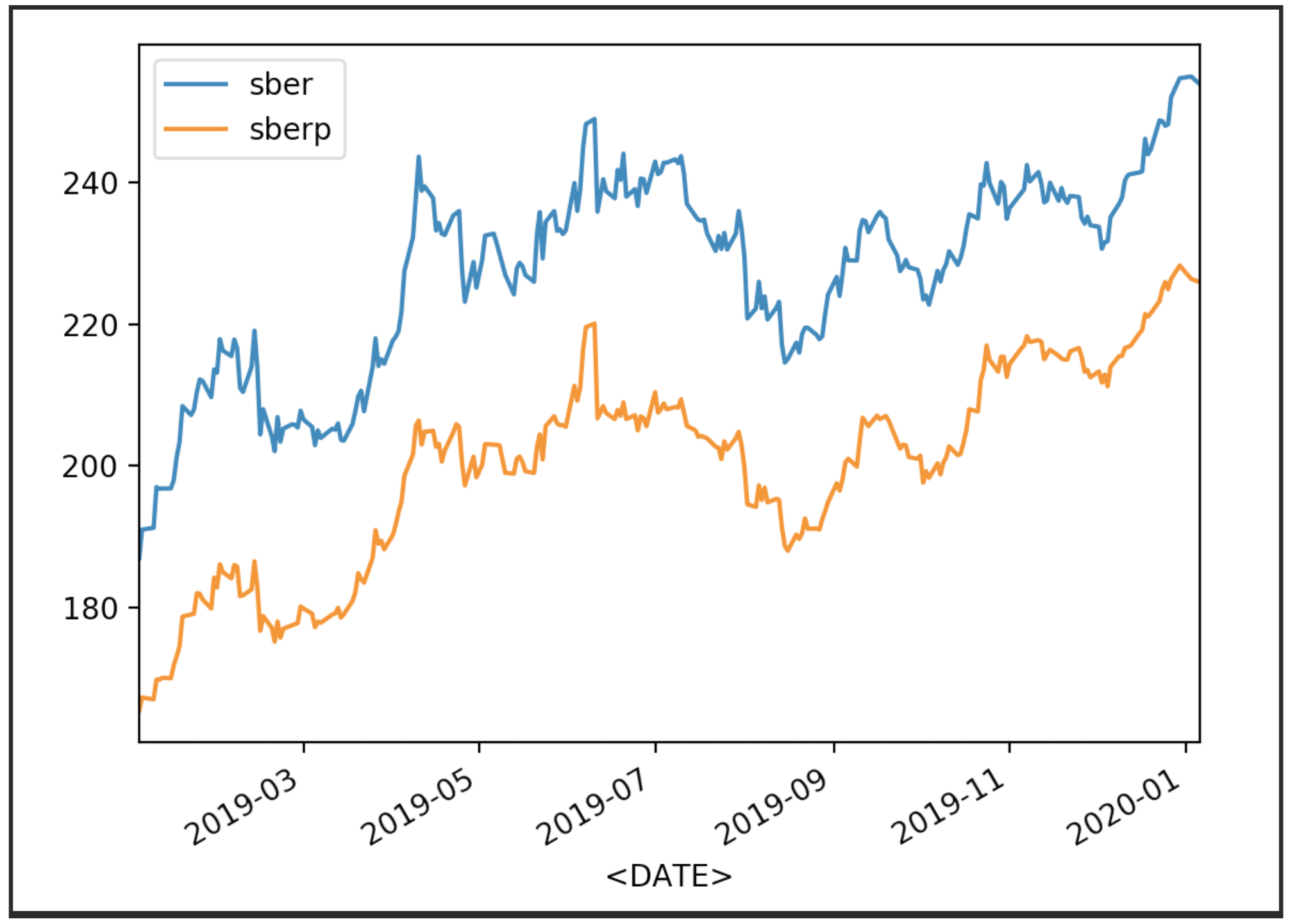
We visualize our stock quotes
df['<CLOSE>'].plot(label='sber')
df2['<CLOSE>'].plot(label='sberp')
plt.legend()
plt.show()
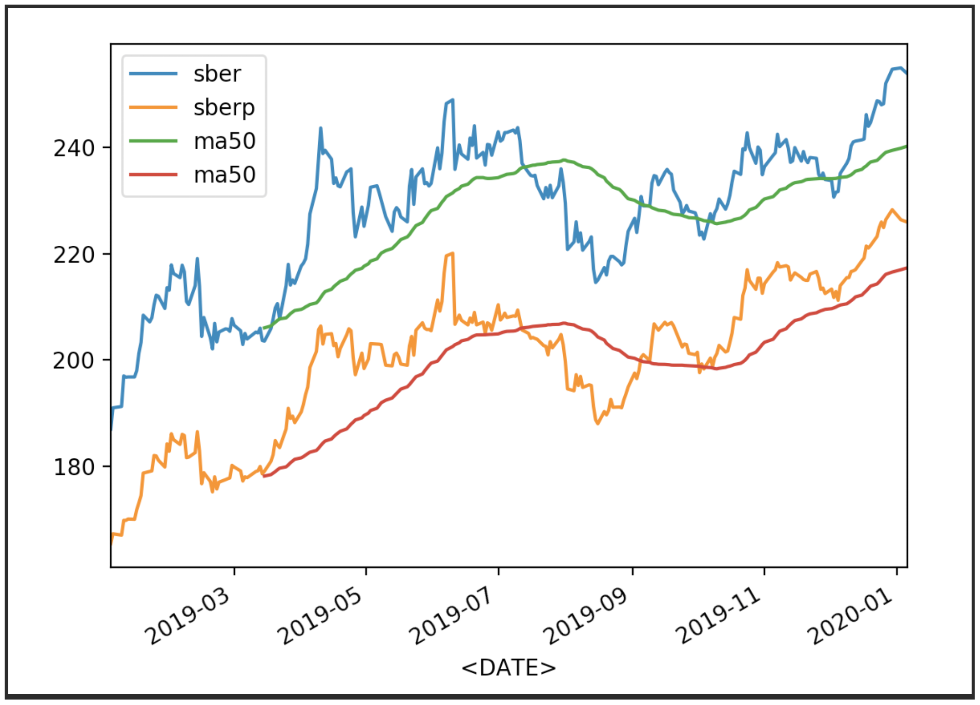
 Now display the quotes with their average (MA 50):
df['<CLOSE>'].plot(label='sber')
df2['<CLOSE>'].plot(label='sberp')
df['ma50'] = df['<OPEN>'].rolling(50).mean().plot(label='ma50')
df2['ma50'] = df2['<OPEN>'].rolling(50).mean().plot(label='ma50')
plt.legend()
plt.show()
 Other averages can also be displayed.
df['<CLOSE>'].plot(label='sber')
df2['<CLOSE>'].plot(label='sberp')
df['ma100'] = df['<OPEN>'].rolling(100).mean().plot(label='ma100')
df2['ma100'] = df2['<OPEN>'].rolling(100).mean().plot(label='ma100')
plt.legend()
plt.show()
 Now we will display the turnover for the shares:Add also the name of the Y axisand the size of the canvas
df['total_trade'] = df['<OPEN>']*df['<VOL>']
df2['total_trade'] = df2['<OPEN>']*df2['<VOL>']
df['total_trade'].plot(label='sber',figsize=(16,8))
df2['total_trade'].plot(label='sberp',figsize=(16,8))
plt.legend()
plt.ylabel('Total Traded')
plt.show()

Correlation analysis
Now let's take a closer look at the correlation. a matrix chartwill help us in this. Create a new table with columns for both stocks and give them names.all_sber = pd.concat([df['<OPEN>'],df2['<OPEN>']],axis=1)
all_sber.columns = ['sber_open','sberp_open']
print(all_sber)
 Now we import the necessary schedule
from pandas.plotting import scatter_matrix
And output it:scatter_matrix(all_sber,figsize=(8,8),alpha=0.2,hist_kwds={'bins':100});
plt.show()
It should be clarified that we need to add transparency (alpha = 0.2) to see the overlap of points.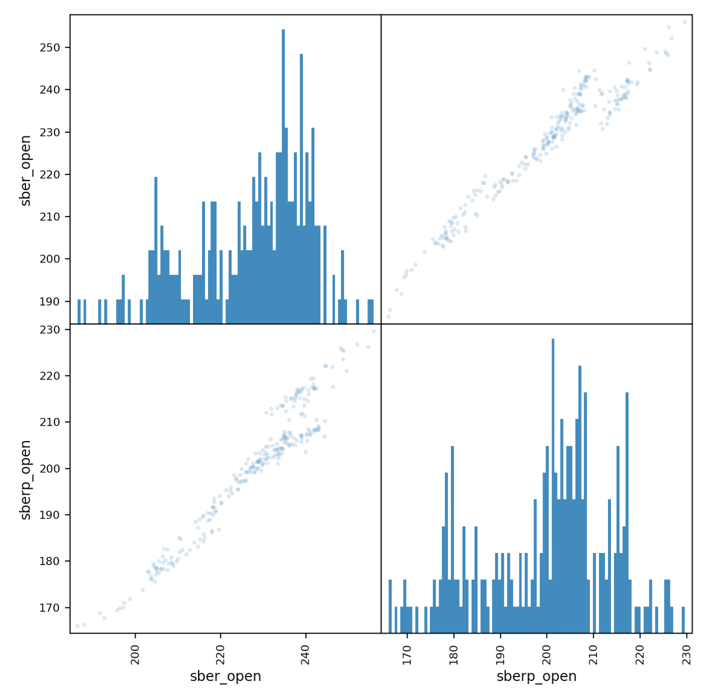 If the points “go” along the diagonal, a correlation is observed.
Securities Volatility Assessment
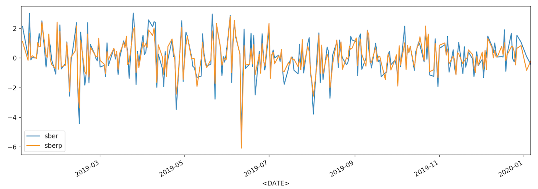
df['returns_pers'].plot(label='sber')
df2['returns_pers'].plot(label='sberp')
plt.legend()
plt.show()
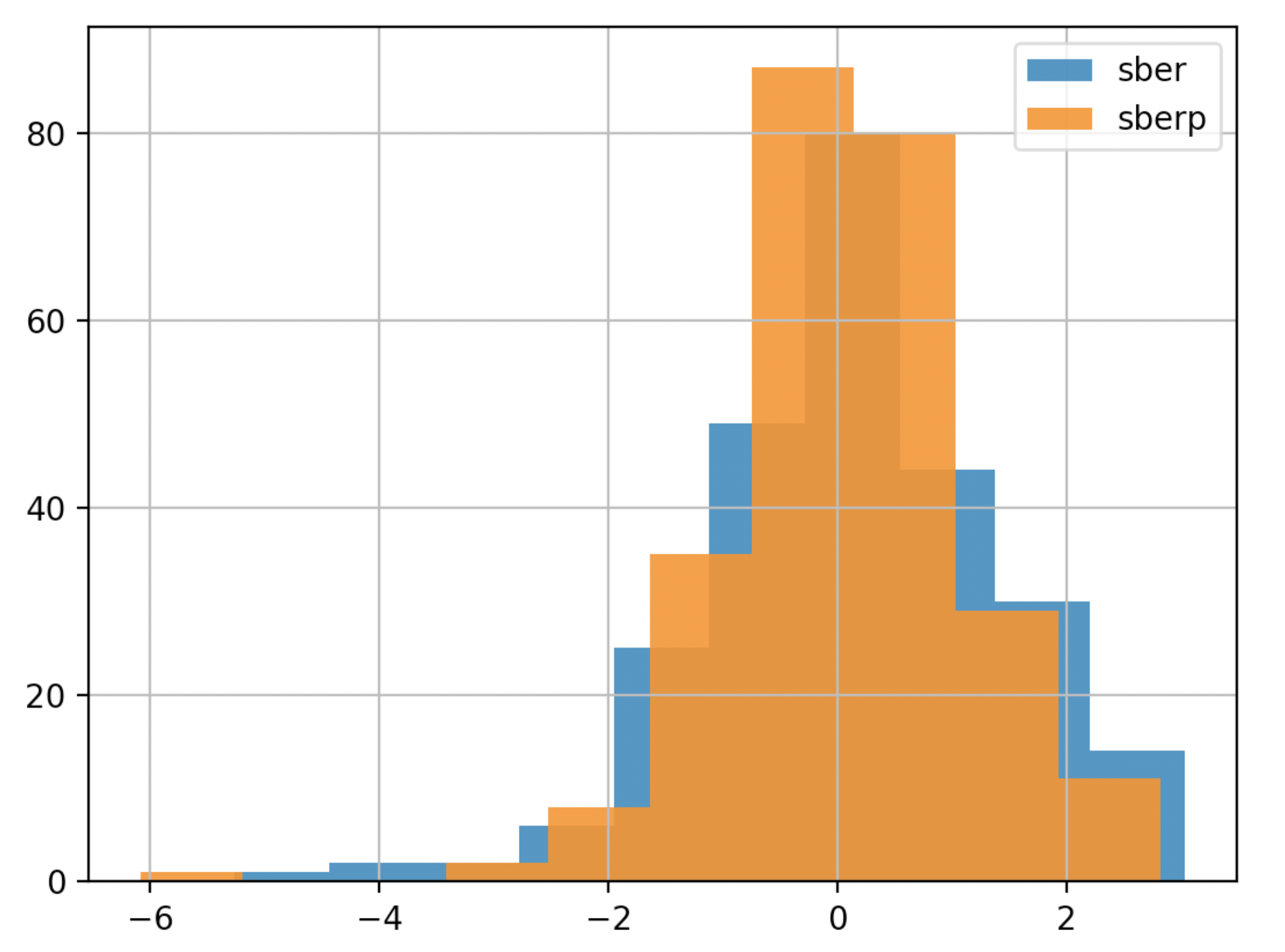
 For a better understanding, we will display the volatility on another chart - a histogram
df['returns_pers'].hist(bins=100,label='sber',alpha=0.5)
df2['returns_pers'].hist(bins=100,label='sberp',alpha=0.5)
plt.legend()
plt.show()
 To make a conclusion faster, you can simplify the schedule (we will make the chart less detailed and less transparent):
df['returns_pers'].hist(bins=10,label='sber',alpha=0.9)
df2['returns_pers'].hist(bins=10,label='sberp',alpha=0.9)
plt.legend()
plt.show()
Accumulated Revenue Analysis
Now we derive the percentage change in the value of the shares.To do this, enter the column with the accumulated income.df['Cumulative Return'] = (1+ df['returns']).cumprod()
df2['Cumulative Return'] = (1+ df2['returns']).cumprod()
print(df)
print(df2)
df['Cumulative Return'].plot(label='sber')
df2['Cumulative Return'].plot(label='sberp')
plt.legend()
plt.show()
 On the charts, we can see the time intervals when one of the stocks is underestimated or revalued relative to the other. In the current circumstances (ceteris paribus, please note) this will help us choose a stock to average when Sberbank's capitalization drops.