In the past few weeks, by coincidence at work and in third-party projects, I have learned a lot about web fonts, as well as a lot about Google Fonts in particular. Thanks to this, I can give a more detailed answer to a question that seemed simple to me in the past: should you store Google Fonts on your server?Objectively speaking, I admit that fonts are not my forte. I prefer a more practical approach and do not focus on design (look at this site and make sure that it is) and before that I did not feel the need to use non-standard fonts. Of course, they look a little nicer and “brand” the text. But for the main text there is little sense in them. I never rated the article (or related to its content differently), just because a beautiful font was used to submit it. However, I was fully aware of the negative impact of additional fonts on the performance and page loading speed, so maybe because of this I am biased.However, many may disagree with me, and the fonts, whether they are important to me personally or not, are regularly used by many other developers, and often they simply have no choice. Let's see what can be done so as not to lose in the speed of the site, and leave designers happy.Self-Hosted vs External Resources
A few years ago it was considered normal to use CDN to connect shared resources (for example, jQuery with code.jquery.com - and yes, they still use it very much ). To clarify, by CDN here I mean loading resources from someone else's domain, not your own CDN.The reason was that browsers supposedly limited the number of connections to each domain (usually to 6 connections), so using another domain gave you another 6 connections. This could be true in the past (especially when the restriction was <6 domains) and before HTTPS became the norm, significantly increasing connection costs . In addition, HTTP / 2actually benefits from using one connection (mostly!), so using other domains is often a loss in performance rather than an acquisition.Another way to achieve the same was by sharding the main domain with one or more technical subdomains (for example, assets.example.com), and in this case, fonts again do not appear on your main domain, where your web page is loaded from. Nevertheless, this method has the same connection problems, so this cannot be called a performance gain, even if it once was.Another advantage of a public CDN was the high probability that visitors already had this version of conditional jQuery in the cache. But, again, I am convinced that this is too much. There are so many libraries and their versions, andThe browser cache is smaller than it might seem, so such a match is very unlikely. In addition, Safari uses a unique HTTP cache for each domain visited, for privacy reasons (double-keyed cache), and Chrome will also introduce this function soon . Thus, there is nothing more to argue about.This topic smoothly turns into a conversation about the impact of third-party CDNs on privacy. You have no idea how and why they are tracking your users, which cannot happen with a self-hosted solution. And recent innovations in the law oblige many sites to explicitly list all cookies used on the site. Not the easiest task when using third-party CDNs.For a long time, I have been convinced that third-party CDNs or even sharding of your own domains are very far from the promised performance gain. Too often you can find sites where the main domain distributes only index.html, and then a lot of time is wasted wasting setting up new connections .This is not to mention the security implications of downloading resources from third-party sites. Yes, there is SRI , but it can cause unexpected problems , and I honestly don’t see the point. If it is a static resource (where you can use SRI), then store it locally, and if it is not static (because the contents may change), then you cannot use SRI.Also, the use of resources from third-party sources threatens that they will become a single point of failure (SPOF) and disable your site. This has happened more than once , and although it may seem unlikely that Google Fonts will fall, it may be blocked by company proxies or by entire countries .In general, more and more people are advising to keep their static resources at home , ideally on the domain from which you are distributing web pages. Fonts are static resources, so the same thing applies to them, right? Well, it turns out that everything is not so simple, because fonts have their own peculiarities and optimization techniques, which can make local storage a little more complicated ...Google Fonts and how they work
Google Fonts is an awesome resource if you like fonts. 977 free fonts that anyone can use for free. Commercial fonts are often ridiculously expensive and usually licensed rather than sold, that is, fees are charged based on the expected number of page views. Therefore, having so many free and so easy to use fonts in one collection is very useful.But that is not all. Google Fonts, like many resource providers for sites (see the jQuery example above), provides CDNs and stores fonts for everyone to use directly from their servers. This means that you can start using fonts by simply adding one line of code on your site to load the stylesheet:<link href="https://fonts.googleapis.com/css?family=Lato&display=swap" rel="stylesheet">
You can also add more properties and fonts in one line to load several fonts and variations of each of them:<link href="https://fonts.googleapis.com/css?family=Lato:400,400i,700,700i,900%7CPoppins:300,400,700,900&display=swap" rel="stylesheet">
The disadvantage is a drop in performance (the advantage is also in performance, but this is not so obvious, we will get to this). The problem is that your site (say www.example.com ) loads a stylesheet from fonts.googleapis.com, which returns some CSS with font-facé rules. Here is the source for the link in the example above:
@font-face {
font-family: 'Lato';
font-style: normal;
font-weight: 400;
font-display: swap;
src: local('Lato Regular'), local('Lato-Regular'), url(https://fonts.gstatic.com/s/lato/v16/S6uyw4BMUTPHjxAwXiWtFCfQ7A.woff2) format('woff2');
unicode-range: U+0100-024F, U+0259, U+1E00-1EFF, U+2020, U+20A0-20AB, U+20AD-20CF, U+2113, U+2C60-2C7F, U+A720-A7FF;
}
@font-face {
font-family: 'Lato';
font-style: normal;
font-weight: 400;
font-display: swap;
src: local('Lato Regular'), local('Lato-Regular'), url(https://fonts.gstatic.com/s/lato/v16/S6uyw4BMUTPHjx4wXiWtFCc.woff2) format('woff2');
unicode-range: U+0000-00FF, U+0131, U+0152-0153, U+02BB-02BC, U+02C6, U+02DA, U+02DC, U+2000-206F, U+2074, U+20AC, U+2122, U+2191, U+2193, U+2212, U+2215, U+FEFF, U+FFFD;
}
We will talk about what some of these settings mean later (and also about why there are two font-face rules), but for now this means that you can use this font in your styles like this:body {
font-family: 'Lato', sans-serif;
}
However, now you have to connect to fonts.googleapis.com, download CSS, and then connect to fonts.gstatic.com and download the fonts themselves (why Google cannot host both CSS and fonts on the same domain - I really don’t understand!).Fonts are often detected by the browser with a delay when loading the page (after all, you need to load CSS to find links to them). But Google Fonts are discovered even later, because CSS needs to be downloaded from another domain, and then fonts from the third domain and, as I mentioned, establishing an HTTPS connection is also not instant. This can be seen in the cascading diagram below generated by WebPageTest (note that all tests were run with Chrome - 3GSlow):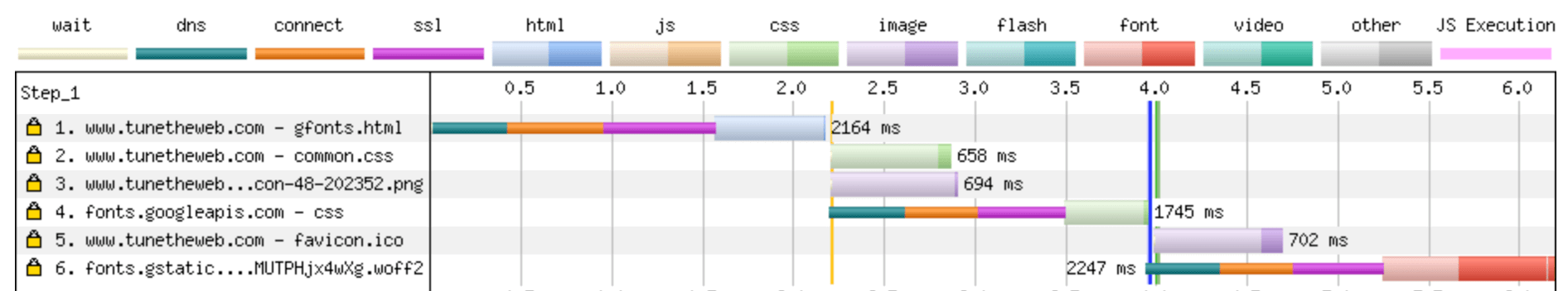 Line 1 shows that HTML is loaded first. Then, as soon as it is downloaded and read in less than 2 seconds, the browser detects the need to load the Google Fonts CSS and loads it in line 4. It takes a second to establish a connection, and then a file is downloaded for 3.5 seconds. Finally, the browser found out about the existence of our font and loads it on line 6, having lost another 1 ¼ second on the way to the connection with fonts.gstatic.com.Thus, using this font from Google Fonts costs us three whole seconds of productivity from the moment HTML is available, not taking into account the time to download the font itself!
Speeding up Google Fonts by preloading resources
You can mitigate this terrible performance hit when loading CSS and fonts from two different domains. The first domain (for CSS) should be located closer to the beginning of the index.html file so that the browser reads it as soon as possible, but the second is still hidden. However, we know what this domain will be like (fonts.gstatic.com), so we can open the connection in advance in order to save some time on the second connection later:
<link href="https://fonts.gstatic.com" rel="preconnect" crossorigin>
<link href="https://fonts.googleapis.com/css?family=Lato&display=swap" rel="stylesheet">
When re-testing, we see the following picture: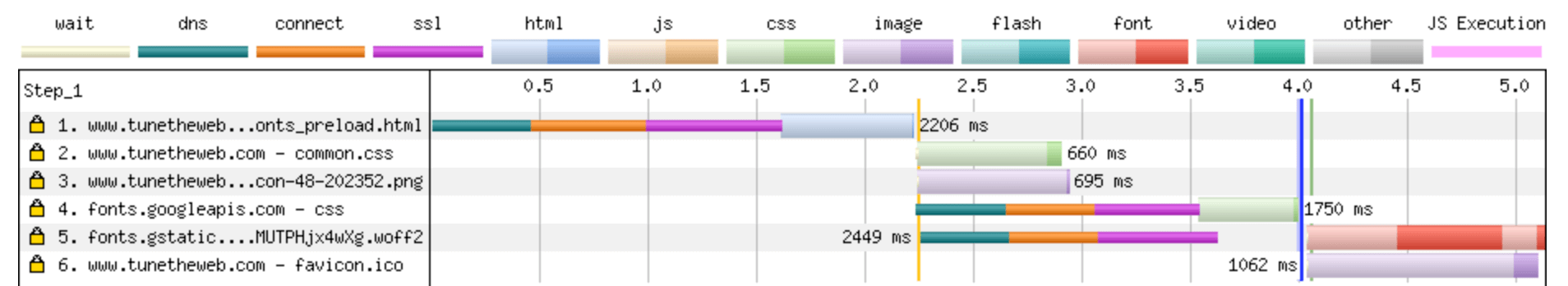 Here we see that the connection on line 5 is open in advance, before loading CSS. So we win more than one second (downloading fonts in 4 seconds, not 5.25), because we managed to avoid wasting time during the connection and the fonts are downloaded immediately after reading the CSS Google Fonts.You might think that you could go ahead and preload the entire font, instead of being content with only joining the domain, but Google Fonts calls fonts unique hashes. In the example above, the downloaded font is called S6uyw4BMUTPHjx4wXg.woff2, not lato.woff2, so preloading is not possible unless you want your site to crash one day when Google suddenly decides to change this hash.In any case, if you use Google Fonts and do not intend to do anything else after reading this note, add at least a preliminary connection to the domain, if it is not already. This is just one line of code and it should significantly improve the performance of your page.Actually, Google Fonts gives a similar command in HTTP headers when it renders CSS:
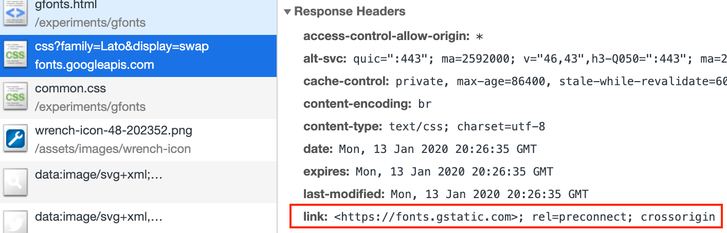 But in many cases this will not help much, because by the time you receive the HTTP response headers from the server with CSS, the browser already knows that you want to connect to this domain to download fonts. So it’s better for you to specify this in the HTML code so that the preload works earlier (it doesn’t matter that it is duplicated in this way, the second attempt will be simply ignored). However, if your page is still being processed by the time the headers from the Google Fonts CSS server are received, and the DOM is not ready (maybe this is a sign of too much JavaScript on your page?), This can help improve performance when it finally becomes clear which font to download.
Font Display: Swap
In the font-face code above, you can see the font-display: swap; line. This is a relatively new instruction. It can be added to the font declaration and it will tell the browser to use fallback first, i.e. the system font (sans-serif in this example), and then replace it with the real font after downloading it. This way you can avoid delays in loading content when the font has not yet been loaded and also improve performance well.Yes, this leads to an outbreak of unstyled text (FOUT) - the same “jumps” in content during page loading, but some people don’t like it (my opinion is agree, the content is more important than styling, but the text jumping across the page is annoying, though this can be mitigated by tweaking the spare font). An alternative is flash invisible text (FOIT). In this case, the text is hidden until the font appears, which obviously delays the download and can cause other problems if some text loads, but some don't !In any case, before the introduction of font-display: swap, different browsers dealt with this differently - some, like IE and Edge, used FOUT, others used FOIT, and they had different times until they waited for the fonts to wait. Because of this, if the font did not load, your content could remain invisible for a long time. The introduction of font-display: swap allowed website developers to decide for themselves how this would happen. Most browsers support font-display: swap, with the exception of IE and Edge, but as mentioned above, they use this by default anyway. Google fonts also support various font display options and offer font-display: swap by default.So, another tip if you use Google fonts is to check that you have the & display = swap parameter in the URL, and if not (it has only recently become supported), then add it:For example, replace this:
<link href="https://fonts.gstatic.com" rel="preconnect" crossorigin>
<link href="https://fonts.googleapis.com/css?family=Lato" rel="stylesheet">
On this:
<link href="https://fonts.gstatic.com" rel="preconnect" crossorigin>
<link href="https://fonts.googleapis.com/css?family=Lato&display=swap" rel="stylesheet">
You can also specify one of the other font display values , for example optional , if you wish.Unfortunately, this solves only half the problem. This instruction is in CSS, which returns Google Fonts, so it is only useful after you have downloaded the CSS file. Thus, it helps to cope with the delay while loading the fonts themselves, but it does not help while you are waiting for this CSS to load. So this is a good improvement (at least for those who prefer FOUT), but still not the whole solution as a whole.Google Fonts
I helped create Web Almanac (a fantastic look at the state of the Internet - see for yourself if you haven’t seen it yet) and the slow download of Google fonts on our site annoyed me and I wanted to fix it. Especially FOUT with font-display: swap. I was wondering if we could reduce the impact of this, and the local solution seemed to be storing files locally, possibly using preloading.We have already used the above techniques (preloading and font-display: swap;), but, of course, it would be better to get away from connecting CSS from the outside. We know what will be in this CSS. So, confidently choose self-hosted? This is where it gets interesting ...I found a convenient script on GitHub ( Google Font Download), which helped me download all the different font options (since there were a lot of them, up to 9 depending on the page), and then copied the CSS, which it displayed in our main stylesheet, and uploaded the fonts to the server. There are other online tools that do the same. It all seemed to work, and we got rid of the annoying CSS loading and the need to work with two domains.However, upon closer inspection, I noticed that the fonts were larger: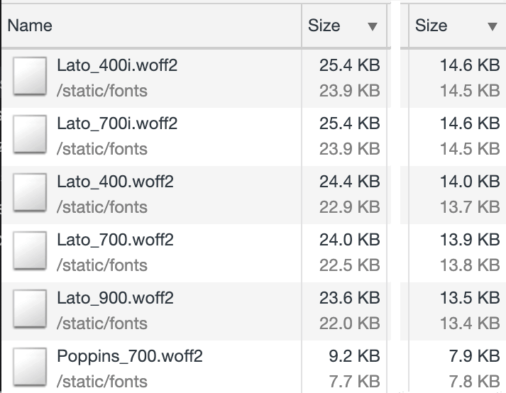 As you can see, there has been a significant increase in size (up to 74% extra for some of them!) In comparison with downloaded Google fonts (right) and locally placed fonts (left). Initially, I thought this was due to my local web server, for example, due to compression being turned off. But WOFF2 fonts are served without compression by the web server — or at least it should be — since the format includes Brotli compression. Also, the screenshot above shows the downloaded bytes (black at the top), as well as the uncompressed bytes (slightly lighter at the bottom) for each column (they are quite similar in both columns, since the fonts are really sent without compression by the web server, but the downloaded bytes include HTTP headers , so they are a bit larger), and there were differences in both compressed and uncompressed bytes, so that’s not the point.Comparison of font-face rules obtained using the tool with the original ones revealed one difference:From Google Fonts:
@font-face {
font-family: 'Lato';
font-style: normal;
font-weight: 400;
font-display: swap;
src: local('Lato Regular'), local('Lato-Regular'), url(https://fonts.gstatic.com/s/lato/v16/S6uyw4BMUTPHjxAwXiWtFCfQ7A.woff2) format('woff2');
unicode-range: U+0100-024F, U+0259, U+1E00-1EFF, U+2020, U+20A0-20AB, U+20AD-20CF, U+2113, U+2C60-2C7F, U+A720-A7FF;
}
@font-face {
font-family: 'Lato';
font-style: normal;
font-weight: 400;
font-display: swap;
src: local('Lato Regular'), local('Lato-Regular'), url(https://fonts.gstatic.com/s/lato/v16/S6uyw4BMUTPHjx4wXiWtFCc.woff2) format('woff2');
unicode-range: U+0000-00FF, U+0131, U+0152-0153, U+02BB-02BC, U+02C6, U+02DA, U+02DC, U+2000-206F, U+2074, U+20AC, U+2122, U+2191, U+2193, U+2212, U+2215, U+FEFF, U+FFFD;
}
From the download tool:@font-face {
font-family: 'Lato';
font-style: normal;
font-weight: 400;
src:
local('Lato Regular'),
local('Lato-Regular'),
url('Lato_400.woff2') format('woff2'),
url('Lato_400.woff') format('woff');
}
The first difference is that we lost the font-display: swap line, but this can be fixed without problems. Much more interesting is the fact that Google Fonts distributes two fonts - and includes different Unicode ranges in them. This is due to font-subsetting and reduces font files.Font subsetting
Font subsetting is the removal of characters that you are not going to use to reduce the size of the font file. Typically, most Westerners use only Latin characters, and downloading a font with all the characters that you probably won't use is irrational. I had heard about this before, but I never thought how significant this could have! Google Fonts automatically renders a font-face with a set of Latin characters, and also, where possible, connects a second font for extended Latin characters (for example, Ā), which will be downloaded only if necessary.In fact, you can also request a special font that contains only those characters that you need with the text parameter:https://fonts.googleapis.com/css?family=Lato&text=ABCJudging by further observations, the font-loading tool that I used apparently supports font subsetting, but only for the whole “language” (Latin or extended Latin), and it combines both subsets of characters into a single file. In the end, I returned to using what my browser used and stopped using this tool. This gave similar file sizes (with a slight difference due to the HTTP headers in my development environment), but I soon found that it was not just font subsetting.Google Fonts smartly distributes fonts
Google Fonts do not always render the same CSS and it depends on the user-agent used . For example, for Internet Explorer 11, it sends the following:@font-face {
font-family: 'Lato';
font-style: normal;
font-weight: 400;
font-display: swap;
src: local('Lato Regular'), local('Lato-Regular'), url(https://fonts.gstatic.com/s/lato/v16/S6uyw4BMUTPHjx4wWA.woff) format('woff');
}
Here you can see that it provides only the WOFF format, since IE 11 does not support WOFF2 , and for the same reason unicode-range is not specified. It gives font-display: swap (as I pointed out in the URL for CSS), although the browser does not support it, but it does not harm.It's not just the manufacturer and version of the browser. Font hintingincludes additional instructions in the font file, which are then used to provide the best display of the font - especially on low resolution screens or for really small sizes. Font hinting is used on Windows, but not on MacOS, so depending on which OS you work with when receiving Google Fonts, using a browser (even if you use Chrome on each platform), you may get font files with hinting or without him. If you download the Windows version and use it for yourself, you will actually make MacOS users suffer from the need to process large font files full of unused hinting, and if you do the opposite, you will potentially make Windows users suffer from worse font display, without font hinting.When I used Google Fonts, and when I downloaded fonts for local use, I did it on my Mac, so I got smaller files. When I used the tool, I got full fonts, with hinting. So that was another reason for the big size difference!Is font hinting still relevant, because high-definition screens have become more common - this is a good question, and many fonts are initially delivered without hinting, since it takes a lot of time to create it. When it is present - it can significantly increase the font size. In the case of Lato, the size is doubled. Is it worth the extra workload you'll encounter by abandoning Google Fonts and locating fonts locally? This is another decision that you need to make for yourself.So, Google Fonts CDN is supported by a smart script that gives away the most suitable fonts, optimizing them to maintain maximum performance. Switching to the local storage of fonts you will have to configure all this yourself, and there is a chance to lose the correct display of your fonts in some browsers if you do not.For Web Almanac, we looked at statistics on visitors' browsers and decided to support only WOFF2, and also use versions of MacOS without hinting, since they weigh half as much. This simplified CSS (especially since unicode-range is supported by all browsers that support WOFF2), and users of IE 11 and other old browsers see sans-serif by default, which doesn’t look very good, but in our opinion, fonts are a progressive improvement, and even without them the site is still more than usable. In addition, older browsers may even benefit from using system default fonts, as they are likely to be used on older, low-powered machines.You can also make other adjustments to your fonts if you want (check the licenses first!), But copying the default Google fonts used in Chrome on MacOS is probably enough for most of us if you want to support only WOFF2 browsers without hinting .Nevertheless, if we settled on Google Fonts, then we would have WOFF (and even older formats) and hinting where necessary, without the need for deep configuration of substitution of the correct font depending on the browser. Thus, using Google Fonts for fonts still has certain advantages, and choosing local storage you refuse them. This also applies to any future enhancements to Google Fonts .Future Fonts Enhancements
Since I delved into the topic of fonts, and warned that you could lose any future benefits of Google Fonts by going to local storage, I want to move away from the main topic a bit and talk about other interesting things that I discovered. What are the upcoming big changes in the font world? Well, there are two changes that are currently being actively discussed and which may affect fonts in the future (and therefore may be supported by Google Fonts, possibly by default if you chose to use this service): variable fonts and progressive font enrichment .Variable fonts
Variable fonts allow you to use different font styles without having to download individual files. I mentioned earlier that Web Almanac uses up to 9 different font files, but in reality it is only 2 fonts. The reason is simple - the site also uses bold, italics, bold, and even thinner versions of one or both of them. So many variations of the same font may seem inappropriate and you might think that the browser itself will cope with the task of changing the thickness of the text or writing italic. Yes it is possible. But each browser does this a little differently, and the results can be radically different , so many call them “artificial fonts”.The only way to ensure the same display is to use a “real font” specifically for each style you need.Variable fonts standardize the display of various font variations and the need for additional files disappears. Theoretically, we could replace these 9 fonts with 2 when their variable font versions become available.This opens up a ton of possibilities for using fonts on the Internet. Although it may seem to me that the 9 options for the two fonts are too much, in reality it is not too much, while variable fonts would allow endless variations. On mobile devices, you can set a slightly different thickness for the "bold" than on desktops and tablets. Variable fonts with a few simple CSS instructionsallow this without the cost of resources for downloading an additional font. Recently at DotCSS, Jason Pamental talked about variable fonts and demonstrated how you can get a beautifully designed page with what seems to be a lot of different fonts - all using one file!Using variable fonts also means loading all font variations at the same time , avoiding the confusion caused by the problems mentioned earlier. This also leads to fewer redraws of the layout: without variable fonts, the page will be redrawn by the browser again and again as each individual font variant loads.Variable fonts have good supportin modern browsers, but their drawback is the large size, because storing different font variations requires more space, as is the case with font hinting. It depends on the font, but usually they are twice as large after compression, so to justify their use, you must need at least two styles. Even so, you might be better off preferring one smaller file that is uploaded to display critical text, rather than one larger file for displaying all text. And again, can using font-display: swap be a less problematic solution? This is up to each site owner to decide!Progressive Font Enrichment
Progressive Font Enrichment , in essence, takes subsetting to a new level and allows you to download additional character definitions as needed in the form of a stream of additional information that complements the currently loaded font, but does not add an additional one. This may seem like a small advantage for us Westerners, but for other languages - especially in the Far East - font files can be very massive (for example, 2Mb ), due to the huge number of characters in these languages. For this reason, web fonts are less commonly used in such countries and progressive font enrichment can have a positive effect on the situation.Progressive Font Enrichment, as I understand it, is at a much earlier stage than variable fonts, but there areonline demo . In any case, this is another potentially interesting change related to fonts.Will Google Fonts continue to improve?
Given how Google Fonts works, it’s easy to imagine that it can continue to grow with new enhancements, such as those described in this article (or many others!), Just by changing the CSS you give. And he can do it wisely. For example, determining if your browser supports new technology (as it does now with the font format - WOFF or WOFF2), or in other ways. For example, if you request more than two fonts, and giving variable font less resource-intensive, then you can automate and link to the same font file in several font-face ads, and if you request only one option, then refer to a more lightweight one, traditional font. Sounds far-fetched? They already did it with one font.(Oswald)! Honestly, I don’t know if the same is possible with the Progressive Font Enrichment, because I don’t fully understand the principle of its work, but it will be interesting to see.Also, it is worth mentioning that using Google Fonts, when updating fonts, for example, to add new character sets or correct errors in glyphs, you get new fonts automatically. With local storage, this will not work - at least not without one-hand intervention. Perhaps you could look in the direction of proxying requests through your domain and thus take the best of both options, but this will most likely be slower and require additional configuration and management.On the other hand, local storage provides stability, as some updates may affect your design, for example, if a title in one line starts to stretch to two due to a font change. There is a category of people who are very upset because of thisBenefits of local font storage
So, we have discussed a lot of theory, and although there are obvious potential benefits of local storage, there are also difficulties to consider, and so using Google Fonts also has some obvious benefits. So is self-hosted worth it? It depends on the real amenities in a particular situation. If the difference in performance is insignificant, it may be worth continuing to use Google Fonts, if large, respectively.For Web Almanac, we recently selected Google Fonts local storage , and testing showed dramatic changes: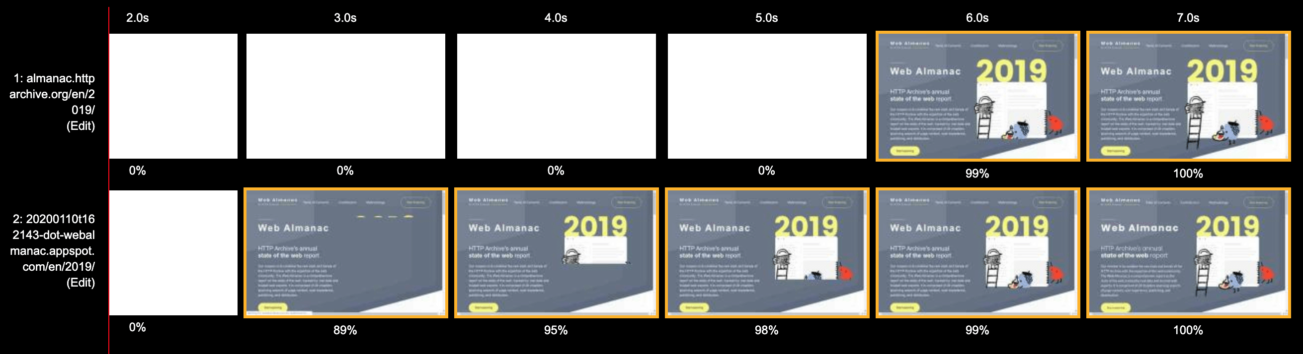 The lower image contains local fonts on our test server, and you can see that the download time was halved - from 6 to 3 seconds! After a deeper analysis, I saw that productivity increased even more (3 ⅓ seconds of savings)!What is not so obvious (but what we will see later) - at this point the fonts are not fully loaded on any of the images - with local storage it takes 7.5 seconds and 10.5 seconds when using Google Fonts. However, the fonts used are pretty similar to the standard ones, and there are no noticeable jumps in layout. This can be seen in the diagram below:
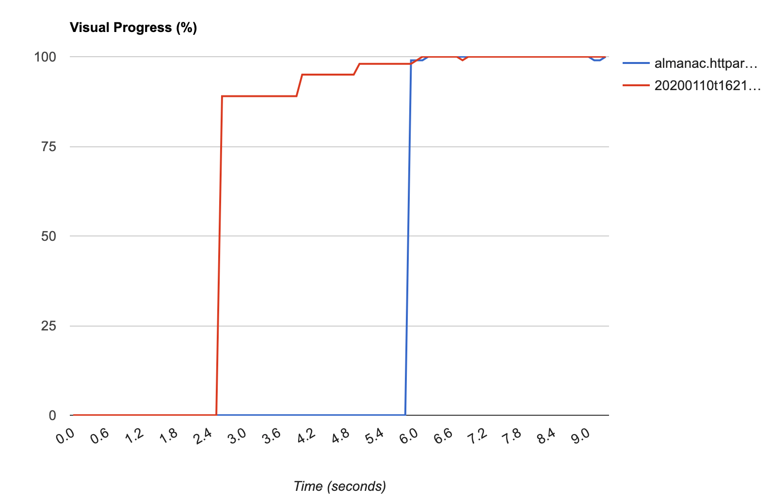 The diagram shows that the page with local storage (in red) is almost completely loaded in 2.4 seconds, and then is updated several more times as the images load, after which the fonts are also displayed. Yes, I would like to make everything even smoother, but still it’s impossible to optimize some font download costs.The reason that the improvements are really tangible is because of one more thing that I didn’t take into account at first: CSS blocks rendering. So if there is a link to Google Fonts CSS, the browser does not just delay the display of text - it delays the display of the entire content of the page! The font is a progressive improvement, so we can safely render the rest of the page, and even the text itself (with standard / fallback fonts), but the browser doesn’t - it just sees that there is some CSS and tries to load it, postponing the download the rest of the page. There is no asynchronous loading for CSS- but perhaps it should be for such cases? Nevertheless, we risk that in case of problems connecting to Google Fonts, your entire site will be inaccessible until the browser stops trying to process the link!
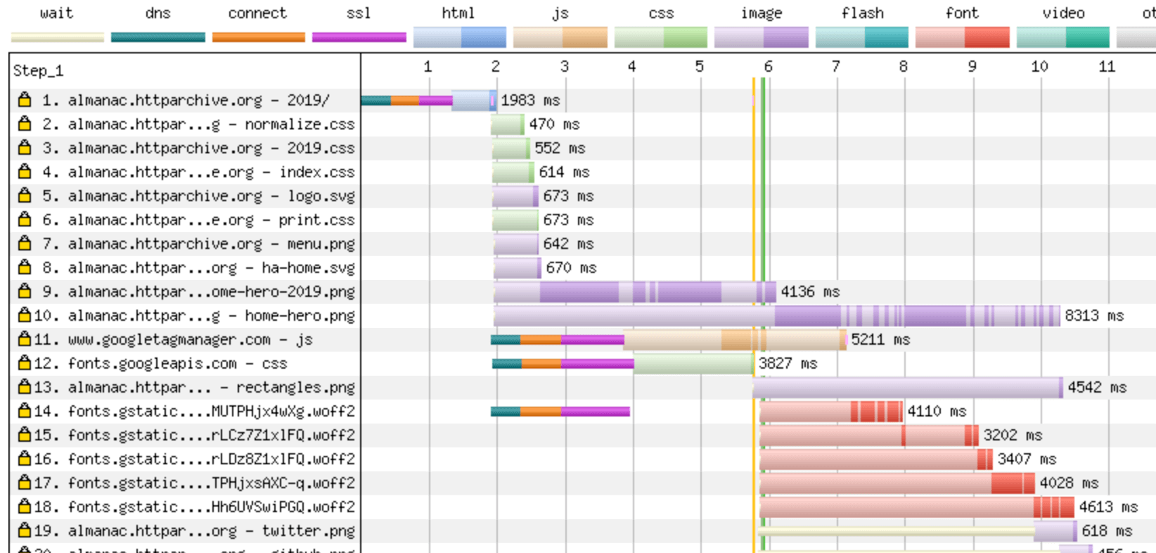 In the comparison chart above, the vertical green line Start Render occurs as early as 6 seconds - since it has to wait until Google Fonts CSS loads on line 12, spending half the time connecting to the domain and the other half actually loading.Compare this with the local version:
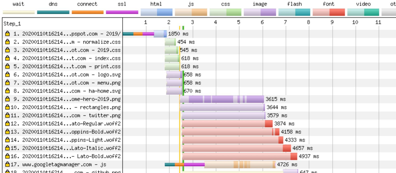 Here we can start rendering as soon as the CSS of the site is loaded and processed in 2.5 seconds. This is because there is no delay in connecting to the Google Fonts domain.In both cases, we see that the start of rendering happens before the fonts are loaded, and thanks to the magic of font-display: swap, the text is still visible. Therefore, at least when using font-display: swap, it would be better if Google Fonts were not loaded using CSS blocking rendering, but, for example, loaded via asynchronous JavaScript, which inserts CSS fonts into the page only after how they are downloaded. If the process were implemented like this, rendering delays would not occur, however, there are still delays when connecting and a long wait for the text to be displayed correctly.UPD: I created an issue on GitHub Google Fonts with a proposal to add a way to download Google Fonts without blocking the render - vote if you want it too!Zach Leatherman advocates this approach to reduce the number of redraws , and shows that this is also possible with JavaScript alone, without the need for a CSS file. Then it shows other advantages of managing your fonts with JavaScript, for example, you can refuse to download fonts at all if the site is open from a slow network (using the Network Information API ), or if the user has Save-Data or Prefers-Reduced-Motion settings enabled . Interesting features!
Preloading Fonts
Once you’ve moved away from Google’s hashed URLs, you’ll be able to preload the font to further improve performance. However, this option has some potential flaws, as Andy Davies discussed in the article Preloading Fonts and the Puzzle of Priorities . Basically, by preloading fonts and moving them up in the priority order, you implicitly lower the priority of other critical downloads (for example, CSS), and due to an error in Chrome, fonts can even jump above some of them.In addition, preloading when the font will not be used will cause unnecessary undue load - for example, if the local version exists and can be used with priority, or if the browser does not support this font format (although all browsers that support preloading also support WOFF2 ) Along with the recommendation to use pre-loading, Google clearly warns you about this , and it's nice to see that they pay attention to it.When using the font-display: swap function, the need for preload may not be as strong. Although in this case, you can still gain time by downloading the minimum required number of fonts and thus avoiding FOUT and redrawing. At the moment, we do not use preloading in Web Almanac and before we start, we need a few more tests, but for now I am satisfied with what is.Conclusion
Answering a question in the title of the article: yes, it’s worth it, since the performance gain is significant. Of course, your results may vary, because it all depends on the particular site, so test, test, and test again. But, I think, this is still the best option, in terms of performance, for most sites.However, Google Fonts is not just a repository of hundreds of free fonts - it’s also a smart delivery mechanism that uses many of the latest optimization techniques to render the most suitable fonts with minimal effort on the part of the site owner. Switching to self-hosted, you should ideally re-implement many useful improvements, such as font-display: swap, removal of font hinting (at least for some browsers), or otherwise, you can only harm the performance of heavy ones font files.This is not an easy task (and Google Fonts does it for you, yes). But since now using only the WOFF2 format is the only realistic option, and browsers well support most optimization techniques, everything has become much easier than before. Nevertheless, it’s worth having some knowledge about web fonts before setting it all up (I hope this post helped!), And at the same time keep an eye on new changes in the font world, as there will undoubtedly be further improvements.Well, maybe we were too keen on optimization and with local storage we can afford to use the full font, without subsetting and with hinting? On the Google Fonts website, you can download any font and it is relatively simple, although it is strange that the archive does not include the WOFF and WOFF2 formatswhen using this loading method, which is completely incomprehensible to me! However, if you are really interested in improving performance (and you should be interested!), Then you should try to do the right thing. This article only shows that it is a little more complicated than just downloading and placing fonts on your site, as I always expected.Wow, something text turned out to be longer than I expected! But I hope that you were just as interested in understanding the topic as you are and you now have a couple of new ideas for speeding up font downloads on your site. I highly recommend you follow Jason and Zach on Twitter to learn more about fonts, and Andy to learn more about overall web application speed.