I became interested in web design and development in the late 90s. Damn it, how long ago. And how terrible it was. I mean, creating a website and publishing it was a tricky business, and customers could be counted on the fingers.It seemed to me that most developers remember those days, or at least the next decade, but no. Recently I came across a tweet , the author of which was surprised at the technique of setting up rounded corners before appearing border-radius(make a separate picture for each rounded corner and precisely position it). I still remember how we waited with bated breath when it border-radiusbecame the standard and the prefix in browsers was removed from it.On the other hand, many have only slightly tried web design in the old days and believe that nothing has changed since then.This article is for everyone. The history of CSS and web design, as I remember it.(Please keep in mind that memories and research are closely intertwined in this article. Therefore, I can’t guarantee that everything is really set out correctly, especially regarding causation. You can read the official CSS history from W3C , which is much shorter, better matches reality and contains significantly less curses).(In addition, the article would greatly benefit from more illustrations, but just writing the text took me too much time).First days
There was no CSS in the beginning.It was very bad.My favorite artifact of the era is O'Reilly’s book, which I studied HTML: The Definitive Guide . Several editions of this guide were published in the mid and late 90s. The book really only talks about HTML, without any mention of CSS at all. I don’t have it anymore and cannot find scans on the Internet, but there is a page from the newer edition of this book HTML & XHTML: The Definitive Guide (we'll talk about XHTML later). Here are tips for cutting-edge 90s web design:“Clearly highlight the header and footer with horizontal lines.”No, that's not itborder-top. That<hr>. The page title is almost certainly centered with<center>.The page has a standard background, font and text color. Partly because this guide first introduces the initial concepts; partly because it is a black and white book, and partly because it reflected reality - to color something on a page was a huge hemorrhoids.Lets say you want to make all headers red. To do this, put the following tags:<H1><FONT COLOR=red>...</FONT></H1>
... for each headline . I hope you never decide to switch to blue!Oh, and HTML tags were custom written in capital letters. I don’t remember why we all decided it was a good idea. Perhaps this was before the syntax highlighting appeared in text editors (I was 12 years old and I used Notepad), and the heading tags are easier to distinguish from the main text.Thus, maintaining the site was a real nightmare. Many decided that it was easier not to use any design, just the default settings. In a sense, it was even nice: browsers allow you to change these default values, so you can read the text on the Internet in the form you want.I remember how an interesting alternative solution appeared on many Geocities sites: a completely new look for every new web page. Damn it, right? Just do what you want on every new page.Perhaps this was the pinnacle of web design.Hell, I miss those days. Completely open web, no twitter, no facebook. If you have something to say, you should create your own website. That was awesome. No one knew what he was doing; I bet that the vast majority of web designers at that time were ignorant amateur teens (like me) who copy pages from other ignorant amateur teens. Half of the Internet was fan-made portals about animorphs, with inexplicable warning screens that the site works best with a screen resolution of 640x480 (presumably every 12-year-old with insufficient screen resolution should buy a new monitor). All the cool guys use Internet Explorer 3 - the most advanced browser. However, some losers are still sitting in Netscape Navigator, so on the main page you need to place the animated GIF “Best in IE”.It was also the era of “Internet-safe colors” - a palette of 216 colors, where each channel equaled00, 33, 66, 99, ccOr ff, because some still remained 256-color monitor! Today we do not think about it, taking for granted 24-bit color.In fact, much of what we now take for granted was then incomprehensible and difficult. Want the same navigation on every page of the site? Okay, no problem: copy / paste the navigation code on each page. If you update this code, be sure to refresh each page - but most likely you will forget to do this on some pages, and the site will look like an archaeological site, with several layers of pages from different “eras”.It's much easier to use frames.when the browser window is broken into a grid and a separate page is loaded in each cell ... but then people get confused if they get to a separate page without frames, as is often the case when they come from a search engine such as AltaVista (I can’t believe that I explain frames, but no one really used them since 2001 ... do you know what iframes is? Here the letter 'i' means inline , that is, built-in frames to distinguish them from regular frames on the whole screen).PHP hasn't even gotten that name yet, and no one has heard of it. This strange mix of Perl and CGI was really hard to understand, and it didn't work on your own computer, errors were hard to find and diagnose, and Geocities didn't support it anyway. If you are really a lucky and advanced developer, then your host worked on the Apache web server, and then you can use its built-in dynamic assembly language Server Side Includes and write something like this:<BODY>
<TABLE WIDTH=100% BORDER=0 CELLSPACING=8 CELLPADDING=0>
<TR>
<TD COLSPAN=2>
</TD>
</TR>
<TR>
<TD WIDTH=20%>
</TD>
<TD>
(actual page content goes here)
</TD>
</TR>
</TABLE>
</BODY>
It's fine. Apache will see special comments and insert the contents of the referenced files. The disadvantage is that you couldn’t check anything on your computer, all the navigation was missing, because here your web browser interpreted these instructions as normal HTML comments. Of course, installing Apache at home was impossible, because you have a computer , not a server .Unfortunately, all the old sites have long disappeared and become covered in the ashes of history, in which everything that has not been done this week is already outdated and long forgotten. The web was supposed to make information eternal, but instead, much of it became ephemeral. I miss those times when almost all my friends had their own sites. Your Twitter and Instagram as an online presence is a poor substitute.... So, let's look at the Space Jam website.
Example: Space Jam
If you don’t know, Space Jam is the greatest movie of all time. He talks about the extremely short-lived basketball career of the rabbit Bugs Bunny, who, together with the living Michael Jordan, save the planet from some kind of threat from aliens. Then came a series of very successful and extremely funny sequels to this film.And we are really very lucky that 24 years after its launch, the Space Jam website is still working ! Right here and now we have the opportunity to study the best web design achievement of the 1996 model.First, note that each page of the site is static. And this is a static page with an extension .htm, not.htmlbecause before Windows 95 we were still tied to 8.3 file names (eight characters for the name, three characters for the extension). I don’t know why this mattered in the URL, because no one was running Windows 3.11 on a web server, but okay.Here is the CSS for the main page:<body bgcolor="#000000" background="img/bg_stars.gif" text="#ff0000" link="#ff4c4c" vlink="#ff4c4c" alink="#ff4c4c">
Haha, I'm just kidding! What the hell kind of CSS? “Cosmic jam” was released a month earlier than this standard was published (in fact, there is one line in the source code of the page, but I am sure that it was added much later to stylize some links to the rules that needed to be inserted because legal obligations).Pay attention to the extremely precise location of the hyperlinks for navigation. This feat was accomplished in the same way as everyone did in 1996: using tables.In fact, tables have one functional advantage over CSS in layout, which was very important in those days, because with Ctrl pressed you could select a celltables or even a few. Such a peculiar “retro-debugger” shows how the cells are located in the layout. It was great because the first normal Firebug debugger came out only in 2006 - a whole decade later!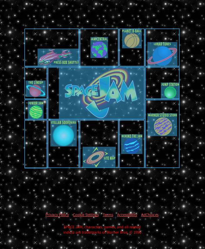 The markup of this table for some unknown reason is filled with blank lines, but if you delete them, it looks like this:
<table width=500 border=0>
<TR>
<TD colspan=5 align=right valign=top>
</td></tr>
<tr>
<td colspan=2 align=right valign=middle>
<br>
<br>
<br>
<a href="cmp/pressbox/pressboxframes.html"><img src="img/p-pressbox.gif" height=56 width=131 alt="Press Box Shuttle" border=0></a>
</td>
<td align=center valign=middle>
<a href="cmp/jamcentral/jamcentralframes.html"><img src="img/p-jamcentral.gif" height=67 width=55 alt="Jam Central" border=0></a>
</td>
<td align=center valign=top>
<a href="cmp/bball/bballframes.html"><img src="img/p-bball.gif" height=62 width=62 alt="Planet B-Ball" border=0></a>
</td>
<td align=center valign=bottom>
<br>
<br>
<a href="cmp/tunes/tunesframes.html"><img src="img/p-lunartunes.gif" height=77 width=95 alt="Lunar Tunes" border=0></a>
</td>
</tr>
<tr>
<td align=middle valign=top>
<br>
<br>
<a href="cmp/lineup/lineupframes.html"><img src="img/p-lineup.gif" height=52 width=63 alt="The Lineup" border=0></a>
</td>
<td colspan=3 rowspan=2 align=right valign=middle>
<img src="img/p-jamlogo.gif" height=165 width=272 alt="Space Jam" border=0>
</td>
<td align=right valign=bottom>
<a href="cmp/jump/jumpframes.html"><img src="img/p-jump.gif" height=52 width=58 alt="Jump Station" border=0></a>
</td>
</tr>
...
</table>
These are the first two lines, including the logo. You got the idea. Everything is positioned inside the cells with alignand valign; often applied rowspanand colspan, there is little <br>to adjust the vertical positioning on one line, where necessary.Other fantastic artifacts can be found on the page, including a header that contains the Apache SSI syntax! It must have quietly broken for everyone when the site moved to hosting for many years of its life. Now it is hosted on Amazon S3. Well you know Amazon? Book Shop?<table border=0 cellpadding=0 cellspacing=0 width=488 height=60>
<tr>
<td align="center"></td>
<td align="center" width="20"></td>
<td align="center"></td>
</tr>
</table>
Okay, look at the Jam Central page . For authenticity, I reduced the resolution in the browser to 640 × 480 (although for a complete immersion I should have reserved a little more vertical space for the title bar, taskbar, and five to six IE toolbars).Pay attention to the frames: the logo in the upper left corner leads back to the landing page, correctly saving a place on the screen so as not to repeat all this navigation, and in the upper right corner there is a fucking advertising banner that was blocked in seven different ways. All three parts are separate pages.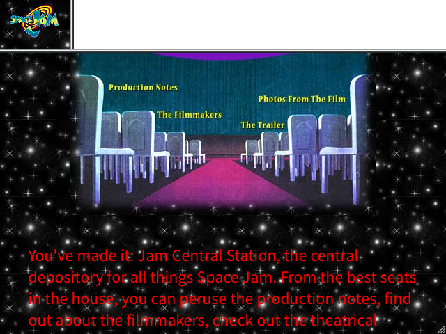 Also note the completely unreadable red text on a textured background, one of the surest signs of 90s web design. You may ask, why not use a normal background for text? You're an idiot. How to do it? After all, the attribute
 backgroundis only with <body>! You can put a table, but the tables only support a solid background, it will look boring!But wait, what is this new navigation widget? How did you manage to hang all the links? Another table? Well, no, although often designers filled the table with pieces of a sliced image. But here we have imagemap , a long-forgotten HTML function. Just show you the source:<img src="img/m-central.jpg" height=301 width=438 border=0 alt="navigation map" usemap="#map"><br>
<map name="map">
<area shape="rect" coords="33,92,178,136" href="prodnotesframes.html" target="_top">
<area shape="rect" coords="244,111,416,152" href="photosframes.html" target="_top">
<area shape="rect" coords="104,138,229,181" href="filmmakersframes.html" target="_top">
<area shape="rect" coords="230,155,334,197" href="trailerframes.html" target="_top">
</map>
I think everything is more or less clear here. The attribute usemapattaches an image map, which is defined as a set of clickable areas beautifully encoded by some coordinates.And it still works! In HTML! You can use it right now! Although, probably not.Thumbnail Grid
Consider another random page. For example, "Photo from the movie." (Wait, photo ? At that time, did not know the words “frame” and “screenshot”? Well, okay ...)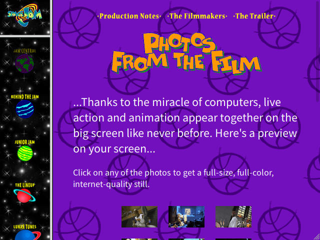 Another set of frames, but differently arranged.
<body bgcolor="#7714bf" background="img/bg-jamcentral.gif" text="#ffffff" link="#edb2fc" vlink="#edb2fc" alink="#edb2fc">
Here, the developers did an important thing: they indicated not only the background image (opaque), but also the background color. Otherwise, white text would come out on a white background if the background image did not load.(Another interesting difference from modern development. Today, many designers assume that all resources will be downloaded, and sometimes they present the download as some inconvenience that needs to be circumvented. But not all the same they are sitting on a fiber optic connection from San Francisco ten meters from the main channel).But back to the page itself. Thumbnail grids were a classic web design problem of the time. The main problem is that you want to place pictures side by side, and HTML by default stacks them in one large column. At that time, the designer had only one tool: a table. On our site, it is structured as follows:<table cellpadding=10>
<tr><td align=center><a href="..."><img src="..."></a></td>...</tr>
<tr>...</tr>
<tr>...</tr>
<table>
A 3 × 3 thumbnail grid formatted at the discretion of the browser (the last image on a separate line is not really part of the table). The number of columns does not depend on the width of the screen, but in those days everyone had tiny screens, so this did not bother the designer too much. Here the pictures do not have captions, but since each of them is placed in a separate cell, they can easily be added.This was the most advanced thumbnail display approach in 1996. We will return to this little UI puzzle a few more times; You can see real examples (and source code with sample markup) on a separate page .Let's take a look at the size of the “full-size, full-color, Internet-quality” frames from the movie for the sake of interest. Hey, yes they are less than 16 KB! This picture will load faster than in nine seconds!(I remember the problem with the embedded video, it could not be solved until the HTML5 tag appeared
 <video>a few years later. Until then, I had to use some proprietary plug-in, and they were all terrible).(Yes, by the way: a color frame was added to the images inside the links by default. Here, the presence of the link is obvious, so the frame looks redundant and annoying. Before CSS, they should be disabled for each individual image using the attribute <img border=0>).The usual layout of those times
That's where we started, and it sucked. If you wanted a common style on more than a few pages, your possibilities were very limited, and copy-paste remained the only tool. The Space Jam website chose not to worry about design consistency at all - like so many others.Then came CSS. It was a real miracle . All these code repeats on every page have disappeared. Want to make all the top-level headlines of a particular color? No problem:H1 {
color: #FF0000;
}
Bam! And it's all. No matter how many headings there are <h1>in your document, each of them will be scorching red, and you will never have to think about it again. Even better: you can put this fragment in your own file and apply this dubious aesthetic choice to every page of your site with almost no effort! The same applies to your magnificent tile background, link color, and font size in tables.(Just remember to wrap the contents of the tags <style>in HTML comments, otherwise older browsers without CSS support will display them as text).It’s not necessary to apply tags to everything in a row. CSS introduced the concepts of “classes” and “ID”, so the style only extends to specially marked elements. Type selectorP.importantapplies only to paragraphs of the class <P CLASS="important">, but #headeronly affects <H1 ID="header">(the difference is that identifiers must be unique in the document, and classes can be used any number of times). Using these tools, you effectively create your own tags, getting an individual version of HTML unique to your site!It was a huge leap forward, but at that time no one (probably) thought about using CSS for layout. When CSS 1 recommendation was published in December 96th , it hardly touched on layout at all, it only separated existing HTML functions from tags to which they are attached. We had font colors and background thanks to <FONT COLOR>and<BODY BACKGROUND>. The only thing that at least remotely affected the location of objects on the page was the floatequivalent property <IMG ALIGN>, which pulled the image to the side and included text flow around it, as in a newspaper. Not so impressive.But this is not surprising. There were no real layout tools in HTML except tables, and table properties are too difficult to generalize in CSS or relate to the tag structure, so there was nothing to add to CSS 1. We just automated a little, for example, the use of tags <FONT>, so web design became less tedious and less error prone, page code became cleaner and much easier to maintain. A pretty good step forward, and everyone happily accepted it, but the tables remained the main tool for layout.However, that was normal. By and large, your blog only needs a headline and a sidebar. Tables do just fine with this, and this basic structure is suitable for most situations. It is not so difficult to copy / paste a few lines <TABLE BORDER=0>and <TD WIDTH=20%>.For several years, this was the standard. Tables for layout, CSS for ... well, for style. Colors, sizes, bold, underline. There was even such a stupid trick when a link was emphasized only when the mouse cursor was over it. The beauty!(Fun fact: HTML code for most email services has not yet come from that era).(And then I came to the industry, at the mature age of 11 years old, without a clue what I was doing, and basically studied with other 11-year-olds who also had no idea what they were doing. A huge piece of the Network was created by 11-year-olds children making their own websites, and that was great. Why go to a commercial site if you can get acquainted with a very specific hobby of some guy or girl from the other side of the planet?)Dark times
A year and a half later, in the middle of 1998, we were presented with CSS 2 (by the way, I love the background on that page). This was a modest update, which eliminated some shortcomings in various areas, but the most interesting was the addition of a pair of positioning primitives: the property positionallowed you to place the element in exact coordinates, and the display mode inline-blockallowed you to arrange blocks in a row one after another.Such a tantalizing fruit, but inaccessible! The use positionseemed normal, but the exact positioning in pixels seriously contradicted the flexible HTML design, and when the screen was resized, everything necessarily fell apart or other serious flaws arose. This humble inline-block seemedquite interesting; nevertheless, he solved the main problem of HTML-layout, which consisted in placing objects in a row. But at first, no browser implemented this property, so the designers ignored it.I can’t say for sure for what reason - maybe due to the appearance of positioning or under the influence of some other factor, but around that time, enthusiasts decided to try to make layout using CSS. Ideally, you could completely separate the content of your page from its appearance. There was even a CSS Zen Garden website (he’s still alive), which took this idea to the extreme. On it, the same HTML code is converted into completely different projects after applying different style sheets.The problem was that early CSS support was pretty damn buggy. Looking back, I suspect that browser developers simply duplicated the processing of HTML tags and ended up with this. The RichInStyle website still has an extensive list of CSS bugs in browsers of those years. Here are some of my favorites:- IE 3 ignores all <style> tags in the document except the last.
- IE 3 ignores pseudo-classes, so it
a:hoverreads like
- IE 3 and IE 4 treat borders
autoas null. In fact, this bug persisted almost to version IE 6. But this was normal, because IE 6 was also used incorrectly text-align: centerfor block elements.
- If you specify an absolute URL for the background image, IE 3 will try to open the image in the local program, as if you downloaded it.
- Netscape 4 ,
#id, h1#id .
- Netscape 4 — ! — .
- Netscape 4 <li> , .
float clear ( ), Netscape 4 Mac .
That's what we had to work with. And did people want to make a whole page layout in CSS? Ha.However, the popularity of this idea was growing. It even became a kind of unifying slogan for the advanced part of the designer elite - the best practice, which was cited as the only true argument in the debate. Using tables for layout is bad, they said. Tables confuse screen readers (screen readers), they are semantically incorrect, interact poorly with CSS positioning! All this is true, but it was very difficult to accept.Well, back to that in a minute. First, let's look at some of the atmosphere in which web development developed in the 2000 area.The end of browser wars and subsequent stagnation
The short version is this: Netscape made money selling the Navigator browser (paid for business, free for personal use), and then Microsoft came to the market with completely free Internet Explorer, and then Microsoft had the audacity to connect IE with Windows. Can you imagine? Operating with a browser ? That was a big deal. Microsoft sued , she lost, but as a result, almost nothing has changed.Microsoft did what it wanted anyway, and it worked. She practically destroyed Netscape. Both browsers were hellishly buggy, but buggy in different ways. Therefore, a site tested in one browser will almost certainly fall apart in another. This meant that when Netscape's market share fell, web designers paid less attention to it, so that fewer websites opened normally in it, as a result of which Netscape Navigator's share fell even more.Probably not very good news for users on operating systems other than Windows. Which is funny because there was IE 5.5 for the Mac, and it was generally less buggy than IE 6 (by the way, Bill Gates at that time was not so much a brilliant geek as an aggressive and ruthless businessman who made a fortune to intentionally destroy any competition that stands in the way, which ultimately caused damage to the entire industry, this is so, by the way).When Windows XP with Internet Explorer 6 came out in mid-2001, Netscape Navigator turned from a huge Juggernaut into a tiny midget for niche applications.And then, having completely and completely seized the market, Microsoft stopped. Since its inception, Internet Explorer has been released every year or so, but after IE 6 there has been a delay of more than five years. It still remained buggy, but in the absence of competitors it was not evident. Thus, Windows XP also looked good enough to capture the desktop market, and the next version of Windows also did not come out about the same time.Also stopped the work of the W3C consortium, which accepts standards (not to be confused with W3Schools, SEO leeches). In the mid-90s, HTML was revised several times, and then it was frozen as HTML 4. CSS was updated from the first to the second version in just a year and a half, but it also froze on this. Minor CSS 2.1 updatewill not reach the status of “candidate recommendation” until the beginning of 2004, and it took another seven years to accept the final version.In this situation of complete dominance of IE 6, it seemed that the entire Network seemed to be frozen in time. Standards did not matter, because in fact there was only one browser. Everything he did became the de facto standard. As the Internet grew in popularity, IE's strangulation grip also made it difficult to use any platform other than Windows, as IE was only available for Windows. It was never possible to guarantee that the website will work in any other browser.(There is an idea that monopolies are bad. There must be some kind of law against them!)At the same time, Netscape has worsened its position, having started a large-scale alteration of the engine. As a result, a much more consistent Netscape 6 standard was released, and the price was a few years of absence from the market, where at that time IE continued to increase its share. The Netscape 6 browser will never reach even 10%, while IE will peak at 96%. On the other hand, the new engine came out with open sources as part of the Mozilla Application Suite, which later will play a role.But before that there were a few more years, but for now ...Compatibility Mode
All early CSS implementations in browsers were full of bugs. Perhaps the most notorious of them is a bug with the container model (box model).You see, a container (the rectangular space occupied by an element) has several dimensions: its own width and height, then padding, then an optional border, and then the field that separates it from neighboring containers. CSS indicates that all of these distances stack together. For example, a container with the following styles: width: 100px;
padding: 10px;
border: 2px solid black;
... will take 124 pixels wide, from border to border.However, IE 4 and Netscape 4 took a different approach: they viewed width and height as a dimension from border to border, from which borders and margins are subtracted to get the width of the element itself. The same field in these browsers will have a width of 100 pixels from border to border, and 76 pixels will remain for the content.IE 6 decided to correct this contradiction with the specification. Unfortunately, just making changes would break the design of a number of websites that worked fine in both IE and Netscape.Therefore, the IE team came up with a very strange compromise: they declared the old behavior (along with several other major errors) as the “compatibility mode” (quirks mode, literally “working with quirks”) and turned it on by default . To switch to the new "strict" or "standard mode", it was necessary to specify "doctype" at the beginning of the document, before the tag <html>. It looked something like this:<!DOCTYPE html PUBLIC "-//W3C//DTD HTML 4.01//EN" "http://www.w3.org/TR/html4/strict.dtd">
For many years, everyone had to insert this stupid line at the beginning of each HTML document (later HTML5 would simplify it to <!DOCTYPE html>). If you think about it, this is a really weird way to choose the right CSS behavior. The doctype declaration has been part of the HTML specification since the mid-90s , but no one has used it. I guess Microsoft's idea was to allow the choice without introducing proprietary extensions. Using such a declaration can avoid behavior that was initially wrong. Convenient exit for the IE team!The funny thing is that the compatibility mode with "quirks" still exists. And it is still installed by defaultin all browsers, twenty years later! The exact list of "quirks" has changed over time. In particular, neither Chrome nor Firefox use the IE container model even in this mode, but many other errors are emulated.Modern browsers also have an “almost standard” mode that emulates only one quirk. Perhaps this is the second most scandalous function: if a table cell contains only an image, then the space below is deleted. In accordance with the usual CSS rules, the image is in the (empty) line of text, which requires some space below - for interlinear elements of letters, such as "y". Early browsers could not handle this normally, however, some websites created after about 2000 relied on this feature, although everything else was fully compliant. For example, they cut a large image into pieces, which were placed in the cells of the table close to each other. If, in accordance with the standard, add empty space, then the picture will fall apart.But back to the past. Although the standards formally prevailed, it created a new problem. Since IE 6 dominated the Web, and DOCTYPE declarations were optional, it was not necessary to think about supporting these standards in the "strict mode" of the browser. Other browsers eventually emulated it, and custom behavior became the de facto standard. Web designers who cared about such things (to our credit, there were many of us) launched a high-profile campaign to enable strict mode, as this was an absolutely necessary first step to ensuring compatibility with other browsers.XHTML Rise and Fall
Meanwhile, W3C has lost interest in HTML in favor of XHTML. This is an attempt to redesign the HTML using XML syntax rather than SGML.(What is SGML, you ask? I don’t know. Nobody knows. This is the grammar on which HTML is built, and this is the only thing that is known about it).To the credit of the consortium, at that time there were reasonably good reasons for such a decision. As a rule, HTML was written manually (as it is now), and this means the mandatory presence of random errors. Browsers did not reject the buggy HTML, but involved various methods for fixing errors - and, as in everything else, different browsers handled errors differently. The slightly distorted HTML seemed to work fine in IE 6 (where "worked fine" means "did what you expected from it"), but it completely fell apart in other browsers.The W3C consortium chose XML because in the early 2000s they saw XML as a universal solution to all problems. If you don’t know, XML has a much more explicit and aggressive approach to error handling - if your document contains a parsing error, then the entire document is invalid. This means that if you selected XHTML and made one typo, then nothing will be displayed in the browser at all . Just a mistake.It sucks. At first glance, everything seems normal, but keep in mind: universal XML is usually assembled dynamically using libraries that treat the document as a tree that you manipulate, and at the end turn it into text. This is great for general use of XML for serializing data when your data is already a tree and most of the XML structure is simple and repeatable, so it's easy to hide in functions.HTML is not like that. An HTML document has little reliable repeating structure; even this article on the page is formatted mainly by tags <p>, but also contains unexpected <em>inside the main text and random<h3>between paragraphs. It's not very fun to encode this in the form of a tree. And this is important, because at about the same time, server-side rendering was gaining momentum, and the generated HTML then and now! - Delivered with templates that consider it as a text stream.If HTML pages were purely static documents, then XHTML could work - you write a document, see it in a browser and know that everything works. No problem. But to create a document dynamically and risk that in some borderline situation the whole site will be cheated, and the visitor will see just an error in the browser? This sucks.Of course, the spread of the new-fangled Unicode standard around that time also played a role. Then it was not always clear how to use it, and one bad sequence of UTF-8 was enough to consider the entire XML document as distorted and "invalid"!So, after some pampering, we almost forgot about XHTML. He left behind only two tracks:- Everyone stopped using tag names in uppercase! Bye
<BODY>, hello <body>! XML is case sensitive and all XHTML tags were lowercase, so the title tags simply didn't work (fun fact: the JavaScript API still passes the names of the HTML tags in upper case). This is probably due to the growing popularity of syntax highlighting; we no longer write in Notepad, as in 1997.
- . , HTML : ,
<p>...</p>, <br>. <br> , </br>. XML : , <br/>, <br></br>.
XHTML , - , <br/> HTML-. XML ; HTML5 , . , <script/> <script> — HTML !
I miss only one thing in XHTML. There you could use the XSLT metalanguage to make the template “inside the browser” (that is, insert the contents of the page into the general layout of the site) without writing scripts. It was the only possible way to do this, and it was damn cool if everything worked. But some small glitch could ruin everything.The appearance of CSS layout
Back to CSS!You are a beginner web designer, and for some reason you want to try using CSS styles for layout, although they are clearly intended only for colors and other things. What to do?As I mentioned, the main problem is the horizontal position of objects next to each other . Vertical positioning is not a problem - this is normal HTML behavior. The only reason everyone uses tables is because they can break the material down into cells and arrange them side by side in columns.CSS 2 introduced some display modes that correspond to parts of the table. But to use them, you need the same three levels of nesting as in real tables: the table itself, then the row, then the cell. They are not here, and in any case, IE will not soon begin to support such modes.There is more position, but he constantly seeks to lay objects on top of each other. HmmWhat is left?In fact, only one tool: float.I said that it floatallows you to make newspaper flow around the image with text, but this is a very general description. In principle, it can be applied to any element. If you need a sidebar, you can lean it to the left edge, assign a width of 20% of the page, and get something like this:+ --------- +
| sidebar | Hello, and welcome to my website!
| |
+ --------- +
Unfortunately, the properties floatare such that the text will flow around it. Thus, if the text on the page is longer than the sidebar, it will appear below - and the illusion will be destroyed. But it can be circumvented. The CSS specifications clarify that content floatcannot flow around each other, so just putting one more is enough float!+ --------- + + ----------------------------------- +
| sidebar | | Hello, and welcome to my website! |
| | | |
+ --------- + | Here's a longer paragraph to show |
| that my galaxy brain CSS float |
| nonsense prevents text wrap. |
+ ----------------------------------- +This approach worked, but its limitations were much worse than table limitations. For example, if you add a footer, it will climb to the right of the main text, because for the browser the “cursor” is still at the top, to the right of the float blocks. Therefore, you need to use clearit to nail an element under all the floats. And if you made the sidebar at 20% of the page width, and the body at 80%, then any space between them will push the page off the screen and show an ugly horizontal scroll bar. You always need to remember this stupid arithmetic. If you have borders or backgrounds set on both sides, then they will be of different heights, so you have to do really grotesque things so thatfix it. And screen readers will read the entire sidebar before moving on to the main text, which is pretty rude for users. Therefore, you need to use an even more complex setup with three columns, of which the middle first appears in HTML.As a result, we get a design that looks beautiful, works well and scales correctly, but is described by extremely chaotic CSS code. Nothing that you wrote actually corresponded to what you wanted - and these are the main parts of the design, and not the side frames! It was difficult to understand how the CSS code is connected and what appears on the screen. And then the situation will become much worse before it finally improves.Thumbnail Grid − 2
Armed with a new toy, we can improve our miniature grid. The original table layout was incredibly tedious, even if you didn't provide tag semantics. Now you can do better!<ul class="thumbnail-grid">
<li><img src="..."><br>caption</li>
<li><img src="..."><br>caption</li>
<li><img src="..."><br>caption</li>
...
</ul>
This is ideal: HTML stores page content in some reasonable form, and then CSS describes what it actually looks like.Unfortunately, the implementation on floatwill be a little rude. This new version adapts better to different screen sizes, but requires some hacks: the cells must be of a fixed height, centering the entire grid is quite difficult, and the grid effect disappears with wider elements. It becomes clear that we got almost the same table, but with a flexible number of columns. We are just trying to imitate it.You also need this strange spell clearfix, notorious in that era. Since float does not move the "cursor", then<ul>with float elements zero height. It ends exactly where it starts, and all float thumbnails get enough sleep from below. Worse, since all subsequent elements have no adjacent floats, they will completely ignore the thumbnails, continuing to render under an empty “grid” - creating a mess!The solution is to add a dummy element at the end of the list, which does not take up space, but with a CSS attribute clear: both, which omits it under all floats. This effectively pushes the latter <ul>under the thumbnails, and it neatly adheres to them from below.Later, browsers will begin to support pseudo-elements of “generated content” ::beforeand::after, which will completely abandon the dummy element. Style sheets from the mid-2000s often included the following lines:.thumbnail-grid::after {
content: '';
display: block;
clear: both;
}
And yet it was better than tables.DHTML
As a brief digression into the world of JavaScript, the new-fangled property has position truly enabled a somewhat dynamic layout. I wholeheartedly oppose such a heresy, not least because no one has ever done it right, but it was fun to play.Thus began the era of “dynamic HTML,” that is, HTML with JavaScript effects. Now this term has completely gone out of fashion, because now we can’t make even a fucking static blog without JavaScript. It all started much more harmlessly: teenagers inserted glitters on the page that followed the mouse cursor, or a small analog clock that ticked in real time.The most popular collection of such scripts was Dynamic Drive. - This site miraculously still exists. It probably contains hundreds of toys that have not been updated since the early 2000s.If you do not want to delve into this collection, here is an example: every year (except the current one, when I forgot, sorry) on my birthday, I like to add confetti and other nonsense to my blog. I am very lazy, so I started the tradition with the help of this script, which I found somewhere . It was originally intended for snowflakes and placed on the page a bunch of pictures with position: absolute, and then repeatedly changing their coordinates.Compare this to the version I wrote from scratch a couple of years ago : here is only tiny JS codeto customize the images, and then the browser animates them using CSS. This is a slightly less functional script, but it allows the browser to do all the work, possibly even with hardware acceleration. That's how far we've come.Web 2.0
Dark times cannot last forever. A series of events took place that pulled us into the light.One of the main events was the release of Firefox - or, for the most advanced, initially Phoenix, and then Firebird. Version 1.0 appeared in November 2004 - and began to nibble IE well. The browser worked on the rewritten core of Netscape 6, which is extracted from the heart of the Mozilla Suite to a separate application. It was fast, simple, and much better in maintaining standards, although absolutely none of this mattered.The real thing was that Firefox had tabs. In IE 6 they were not. If you wanted to open a second web page, you opened a new window. That damn sucks guys. Firefox has become a real miracle.Of course, Firefox was not the first browser with tabs; in the full browser from the Mozilla Suite, they also existed, and in the advanced Opera they have been around for ages. But for various reasons, it was Firefox that took off, not least due to the fact that it didn’t have a giant damn advertising panel at the top, like Opera.Of course, designers promoted Firefox in connection with standards support, but this argument attracted only other designers, not their parents. One of the most popular and spectacular demonstrations was the Acid2 test , designed to test modern web standards. He showed a nice smiley, if the standards were worked out correctly, and a hellish picture in IE 6 . Acid2 test result in IE 6 browserEarly Firefox was not perfect. But of course, he supported the standards much better, and you could see progress until the browser completely passed all the tests with the release of Firefox 3.Firefox was also helped by the faster JavaScript engine: this was before JIT. It was much, much faster than IE. For example, as far as I remember, IE 6 implemented
 getElementByIditerating through the entire document, even in the case of unique identifiers. Take a look at the old jQuery release announcements , they were usually accompanied by performance graphs, and there all browsers are an order of magnitude faster than IE 6-8.Oh, and then IE 6 was a giant walking security hole, especially with native support for arbitrary binary components that only needed to click “Yes” on the abstruse dialog box to get full and unlimited access to your system. This probably did not contribute to IE's reputation.In any case, with the advent of the slightest alternative to IE, even the most vicious designers could not just optimize the site for IE 6 and end there. Now there was a reason to use strict mode, there was a reason to care about compatibility and standards, and Firefox made constant efforts to comply with them as much as possible, while IE 6 remained in stagnation.(I would say that this effect opened the door for OS X, as well as for the iPhone. I'm not joking! Think about it: if the iPhone browser didn’t actually work with anything, because everyone still made sites for IE 6, it would remain just an expensive alternative to Palm. Remember that at first Apple did not even want to release its own applications - it relied on the Internet).(By the way, Safari was released in January 2003, based on the KHTML fork from the KDE Konqueror browser. I think I used KDE at the time, so it was very interesting, but nobody really thought about OS X with it ridiculous market share of 2%).Another important factor appeared on April 1, 2004, when Google announced Gmail. Haha It’s ridiculous. Convenient web interface for mail? Good joke, google.Oh shit. They are not joking.How does this interactive thing work?Today, every web developer knows the answer - this is XMLHttpRequest, so named because no one has ever used it for XML queries. It was invented by Microsoft for Exchange mail, and then cloned by Mozilla (I just quote from Wikipedia ).The important thing is that XMLHttpRequest allows you to make an HTTP request from JavaScript. Now you can refresh only part of the page with the new data, completely in the background, without reloading. No one had heard of this thing before, and when Google rolled out an entire email client on it, it was absolute magic.Perhaps all this is a mistake that will lead to a hellish future where static pages load three paragraphs of text in the background using XHR for no apparent reason, but this is the topic for another article .In a similar vein, jQuery, a similar miracle, was released in August 2006. He not only described the differences between the “JScript” IE APIs and the standard approaches adopted by all the others (which was done earlier by other libraries), but also greatly simplified working with entire groups of elements at the same time, which historically remained a huge pain in the ass. Now it's pretty easy to apply CSS everywhere from JavaScript! This is a bad idea, but in that situation there was no better option!I hear you mind: JavaScript again! Is this an article about CSS?You are absolutely right! I mention the growing popularity of JavaScript, because it was it that directly led to the modern state of CSS, thanks to another great factor:Ambition
Firefox has shown that browsers can grow quite quickly - every new improvement in Acid2 was exciting. Gmail showed us that the web is capable of more than just displaying plain text with falling snowflakes.And people began to fantasize .The problem was that browsers didn't get any better. Firefox was in some respects faster and more accurately adhering to the CSS specification, but it basically did nothing new. Only the toolbox has improved , and this has mainly affected JavaScript. CSS is a static language, so you could not write a library to improve it. Creating CSS using JavaScript was possible, but damn it, it's always a bad idea.Another problem was that CSS 2 is really only good at styling rectangles. It was wonderful in the 90s, when every OS had a rectangular-style interface. But the time has come for Windows XP and OS X, where everything has become brilliant, glossy and rounded. It was a little awkward that rounded corners and neat checkmarks with shadows are in your file browser , but nowhere on the Internet.So the dark times returned.The CSS Hack Age
Designers wanted a lot of what CSS simply could not offer.But all these are purely aesthetic considerations. If you were interested in layout, well, the appearance of Firefox immediately made your life both much easier and much more complicated.Do you remember inline-block? Firefox 2 actually supports it! It was buggy and hidden behind the vendor prefix, but it more or less worked, which allowed designers to try to use it. And then Firefox 3 came out, which supported it more or less normally, which seemed like a miracle. The third version of our thumbnail grid is no more complicated than width and inline-block:.thumbnails li {
display: inline-block;
width: 250px;
margin: 0.5em;
vertical-align: top;
}
The general idea inline-blockis that the inside acts like a block, but the block itself is placed in plain text, like an image. Thus, each thumbnail is placed in a container, but all these containers lie next to each other, and because of their equal width, they go into the grid. And since it is functionally a line of text, there is no strange effect on the rest of the page, as it was with float.Of course, there were some drawbacks. For example, nothing can be done with the remaining space, so there was a risk of a large field appearing on the right on non-standard large screens. There was also the problem of mesh breaking by a wide cell. But at least it is not a float.One small problem remained: IE 6. It technically supportedinline-block, but only on naturally built-in elements such as <b>and <i>, but not <li>. That is not how you really want (or think) to use inline-block. Eh.Fortunately, at some point, absolute genius discovered an hasLayoutinternal optimization in IE that marks whether the element has ... uh ... markup. Listen, I don’t know. Basically, it changes the rendering path for elements - so these are not these but other bugs that appear , like the compatibility mode based on each element! As a result, it turns out that all of the above works in IE 6, if you add a couple of lines:.thumbnails li {
display: inline-block;
width: 250px;
margin: 0.5em;
vertical-align: top;
*zoom: 1;
*display: inline;
}
The asterisks at the beginning make the property invalid, so browsers should ignore the entire string ... but for some unknown reason, IE 6 ignores the asterisks and accepts the rest of the rule (almost any punctuation worked, including a hyphen or - my personal favorite - underscore). A property zoom is a Microsoft extension that scales everything, with the side effect of setting the layout property to the element. And it display: inline should force each element to insert its contents into one large line of text, but IE processes the element inlinewith the property “markup” something like inline-block.And here we see the true potential of CSS hacks. Browser-specific rules, with intentionally poor syntax that one browser would ignore, reproduce an effect that is still incomprehensible from what you are writing. Entire textbooks explained how to make something simple, such as a grid, but for this to work in most browsers of the time. You will also see * html, html > /**/ bodyand all sorts of other nonsense. Here is the complete list ! And remember the hack “clearfix”? The full version , compatible with all browsers, is slightly worse:.clearfix:after {
visibility: hidden;
display: block;
font-size: 0;
content: " ";
clear: both;
height: 0;
}
.clearfix { display: inline-block; }
* html .clearfix { height: 1%; }
.clearfix { display: block; }
Is it any wonder people started complaining about CSS?It was an era of blind copy-paste in futile attempts to make this damn thing work. Example: someone (I once unearthed the source code, but I can’t find it now) had the strange idea of always installing body { font-size: 62.5% }, since relative units are supposedly “good”, out of a desire to override the default default browser font size of 16px (which, it turns out right) and the need to deal with IE errors. After some time, he stopped doing this, but the damage was done, and thousands of websites have acted in this way, considering it "best practices." This means that if you want to change the default font size of your browser in any direction, you get nonsense - if you reduce it and a bunch of web pages become microscopic, if you increase it, then everything will remain small if you increase it even more , then sites that respect your decision will become huge. At least today we have better scaling, I think.Yes, and remember: StackOverflow has not yet appeared. All knowledge was passed from mouth to mouth. If you're lucky, you know about some sites with tips like QuirksMode and Eric Meyer's.Actually, check out Mayer's css / edge site . There are some wild examples that people did, even with just CSS 1, back in 2002. I still think that complexspiral is a pure genius, although these days it's all done with opacityand only one image. Methods from raggedfloat only received native CSS support just a few years ago, with the advent of shape-outside! This author also gave us a CSS reset , eliminating the differences between the default browser styles.(Eric Meyer's role in CSS is hard to overestimate. When his little daughter Rebecca died six years ago, she was immortalized with her own CSS color, rebeccapurple, a unique case. That's how much his online community appreciates! Well, now I have to cry a little over this story.)The future is coming, but gradually
Designers and developers gradually pushed the boundaries of what browsers are capable of. Browsers so far have managed somewhat poorly. All fixes, workarounds, and libraries were secret, fragile, error prone, and / or heavy.Obviously, browsers needed new functionality. But just releasing it was not enough; Microsoft did a lot of this, and basically it led to a new mess.But several desperate attempts took place. Since the W3C's head was still sitting in its own bum - rejecting even the proposed HTML improvements in favor of XML - some of the active browser developers (Apple, Mozilla and Opera) decided to establish their own club. In June 2004, the WHATWG working group was formed, and it began work on the HTML5 standard. Ultimately, it completely eliminates the need for XHTML and eliminates a number of security issues when working with regular HTML. In addition, it provided some new benefits, such as native support for audio, video, and form controls for dates and colors. And other things that are clumsily supported by JavaScript controls. And, um, they are still clumsily supported there.Then came CSS 3. I don't know at what point this happened. He appeared slowly, with all his might, like a chick hatched from an egg and not in a hurry, damn it, to go nowhere.I can make a lot of reasonable assumptions. I think it started with border-radius. Specifically, with -moz-border-radius. I don’t know when it was first introduced, but the Mozilla bug tracker mentions it back in 1999.See, Firefox's own user interface is rendered using CSS. If Mozilla wanted to do something that couldn't be done with CSS, she added her own property with a prefix -mozto indicate that it was their own invention. And if there is no real harm in this, then it made the property available for websites.I guess the push for CSS 3 really began when Firefox took off - and the designers discovered the property -moz-border-radius. Suddenly built-in rounded corners appeared! No more fuss in Photoshop, just write one line! Almost overnight, round and round corners were sawn in everywhere.And from there everything rolled like a snowball. Common problems were solved one by one with the help of new CSS functions, which were combined into a new version of CSS - CSS 3. The main ones solved the design problems mentioned earlier:- Rounded corners with
border-radius.
- Gradients using
linear-gradient(), etc.
- The multiple background in itself was not a problem, but facilitated some other things.
- Transparency using
opacityand alpha channel in colors.
- Shadows at containers.
- , CSS 2, 2.1 .
- (border image), , .
- jQuery ( JS ).
:nth-child(), CSS.
- . , ? SVG, , . , , , CSS! . .
- Web fonts that have been in CSS for some time, but implemented only in IE and only with some dumb DRM-loaded fonts. Now we are not limited to the four bad fonts that come with Windows and which no one else has!
It was just great! These features didn’t solve any layout problems, but they did solve aesthetic problems that designers used to work around clumsily using a lot of images and / or JavaScript. This meant less downloads and fewer pictures that were used instead of text, which was pretty good for the web.The great irony is that these design effects went out of fashion almost immediately, and now we are back to flat rectangles.Hell vendor prefixes in browsers
Alas! The world was still not all right.Some of these new gizmos were originally developed by browser makers and are prefixed. Some of the later ones were developed by the CSS committee, then implemented by browsers when the design was still under development. So there were prefixes here too.And the hell of prefixes began , which continues to this day.Mozilla was -moz-border-radius, therefore, when Safari implemented it, it called it -webkit-border-radius(“WebKit” is the name of the Apple fork KHTML). Then the CSS 3 specification standardized it and named it simply border-radius. This meant that if you want to use rounded borders, you actually need to spell out three rules:element {
-moz-border-radius: 1em;
-webkit-border-radius: 1em;
border-radius: 1em;
}
The first two actually included the effect in current browsers, and the last one is registered for the future: when browsers implement the real rule and drop the prefixes, it will take effect.You had to do this every damn time, because CSS is not a programming language and does not have macros, functions, or the like. Sometimes Opera and IE introduced their own implementations with prefixes -o-and -ms-, as a result, the total number of lines reached five. With gradients it got a lot worse; the syntax went through a number of serious incompatible revisions, so you couldn’t even rely on copying / pasting and changing the name of the property!And many designers, well, screwed up. I can't blame them too much; I mean, it sucks. But many pages indicated only prefix forms, not the final, so browsers had to maintain prefix forms longer than they would like to not break anything. And if the prefix form still works, and you are used to using it, then perhaps you don’t really need a universal option.Worse, some will only use the form that works in their favorite browser. Things got especially bad with the rise of mobile web browsers. The built-in browsers on iOS and Android are Safari (WebKit) and Chrome (originally WebKit, now fork), so you only need the -webkit- prefix. Which made Mozilla more difficult when it released Firefox for Android.Remember that failure with IE 6? Here we are again! The situation was so crappy that Mozilla ultimately decided to implement a number of features -webkit-that are still supported even on desktop Firefox. The situation is so stupid that Firefox now only supports some effects through these properties, such as -webkit-text-stroke , which is not standardized.Moreover, the current forked Chrome engine is called Blink, so technically it should not use properties -webkit-. And yet they are. At least this is not as bad as confusing user agent strings .Now the creators of browsers have largely abandoned prefixes; instead, they hide the experimental functions behind the flags (therefore, they will only work on development machines that force them on). New features should theoretically be smaller and easier to stabilize.This whole mess has probably become a huge motivating factor for the development of Sass and LESS , the two languages that produce CSS (preprocessors) code. They have very similar goals: both add variables, functions and some forms of macros to CSS, which allows you to exclude many repetitions, browser hacks and other nonsense from your code. Hell, I still use SCSS myself , although the industry’s overall use is gradually decreasing.Flexbox
But then, as if an angel came down from heaven ... flexbox .Flexbox has existed for a very long time - partial support allegedly was back in Firefox 2, already in 2006! He went through several incompatible revisions and it took him forever to stabilize. Then IE could not implement support for years, and you don’t want to rely on layout that works for only half of your audience. Only relatively recently (2015? Later?) Flexbox got enough broad support for safe use. And I can swear that I still encounter people whose Safari does not recognize it at all without prefixes, although Safari seems to have dropped the prefixes five years ago ...In any case, flexbox is a CSS implementation of a fairly common GUI layout tool: you have a parent with several children, and the parent has some free space, and it is automatically shared between the children. And that puts the objects next to each other .The general idea is that the browser calculates how much free space the parent has and the “initial size” of each child, calculates how much extra space there is, and distributes it according to the flexibility of each child. Imagine a toolbar: you can give each button a fixed size (flex 0), but add spacers that divide the remaining space equally, so give them flex 1.Once this is done, you will also have several options for convenient options: you can distribute additional space between the children, you can stretch them to the same height or align them in different ways, you can even transfer them to several rows if all do not fit!With this, we can further optimize our thumbnail grid :.thumbnail-grid {
display: flex;
flex-wrap: wrap;
}
.thumbnail-grid li {
flex: 1 0 250px;
}
This is just a miracle. You can immediately forget inline-block. This code expresses very clearly what we need.…nearly. He still has a problem that too wide cells will tear the grid, since this is still a horizontal row, transferred to several independent lines. But this is still pretty cool and solves a number of other layout problems. This is probably enough. If only ...I would say that the massive introduction of flexbox ushered in the modern era of CSS. There was only one unsolved problem. ...Slow, painful death of IE
IE 6 left the market for a very long time. Until the beginning of 2010 or so, it could not have fallen below 10% of the market (still a huge chunk).Firefox reached version 1.0 at the end of 2004. IE 7 came out only two years later, it offered only modest improvements, suffered from compatibility issues with sites for IE 6, and many IE 6 users (mostly inexperienced users) did not see a reason for the update at all. Vista comes with IE 7, but Vista turned out to be a kind of failure - I don't believe that ever in my whole life it was close to overtaking XP.Other factors included corporate IT policies, which often take the form of “never update anything” - and often for good reason, because I heard endless stories about internal applications that only worked in IE 6 for all kinds of terrifying reasons. Then there was all of South Korea , which was legally required to use IE 6 because they enshrined in the law some security requirements that could only be implemented using the ActiveX control in IE 6.Therefore, if you supported the website that was used - or worse, requiredfor use - by people from business or from other countries, you are pretty much stuck with support for IE 6. People making small personal tools and websites immediately abandoned IE 6 compatibility and displayed increasingly unpleasant banners for websites on IE 6 users ... But if you are a businessman, how to explain the instant loss of 20% of the potential audience? Just work harder!Over the years, stress has grown as CSS has become increasingly functional and IE 6 has remained an anchor. He still did not understand PNG alphawithout workarounds, and in the meantime, we had more and more important functions, such as native video in HTML5. Workarounds became more and more confusing, and the list of functions that you just couldn't use was getting longer. I would show what my blog looks like in IE 6, but you are unlikely to even connect to it - the TLS it supports is so ancient and broken that it is already disabled on most servers!Separate requests came from individual developers from the YouTube team. Without asking anyone for permission, in July 2009 they added a warning banner pleading with IE 6 users to switch to somethinganother, as legacy browser support will end soon. Within one month, the global share of IE6 traffic fell by more than 10%. Not all heroes wear raincoats.I would mark the beginning of the end of IE6 that day when YouTube really turned off support for IE 6. This happened on March 13, 2010, almost nine years after the release of this version of the browser. I don’t know how much YouTube affects corporate users or the South Korean government, but a large web company’s refusal to support an entire browser sends a pretty strong message.Of course, there were other versions of IE, and many of them were in themselves a different headache. But each following became less painful, and now you do not need to think too much about testing in IE (now Edge). It's time for Microsoft to abandon its own rendering engine and switch to the Chrome clone.Now
CSS is very good right now. You don't need weird hacks to just place objects nearby. Browser development tools are now built-in and damn amazing - Firefox started to specifically warn you when some CSS properties do not take effect due to the values of other properties! Unclear implicit side effects like "stacking contexts" can now be set explicitly - like properties isolation: isolate.In fact, let me just list everything that comes to mind about modern CSS features. This is not a guide to all the possible uses of styles, but if your CSS knowledge has not been updated since 2008, I hope this will boost your appetite. And all this is just CSS! So much that was previously impossible, painful, or required awkward plug-ins is now supported initially - audio, video, freehand drawing, 3D rendering ... not to mention the huge ergonomic improvements to JavaScript.Layout
The grid container can do almost everything the tables did, and even more, including automatically determining the number of columns. This is damn amazing. More on this below.The flexbox container decomposes its children into a row or column, allowing everyone to declare their default size and how much space they want to use. You can wrap these containers, rearrange the children without changing the order of the source, and align the children in several ways.Columns can split text, well, into multiple columns.Propertybox-sizingallows you to select the IE container model for individual elements if you want the entire element to occupy a fixed amount of space, and borders and indents are subtracted from the total width .display: contentsdumps the contents of an element to its parent element, as if it were not there at all. display: flow-root- This is basically automatic clearfix, only a decade later.widthcan now be set to min-content, max-contentor a function fit-content()for more flexible behavior.white-space: pre-wrapretains spaces, but breaks lines where necessary to avoid overflow. Also useful pre-line, which collapses spaces to one, but preserves literal newlines.text-overflowcuts off verbose text using ellipsis (or a custom character) when the limit is exceeded, and not just truncates it. Also in the specifications is the function of smoothly hiding text (fade out), but it has not yet been implemented.shape-outsidechanges the shape of the text flow. It can even use the alpha channel of the image as a form.resizegives an arbitrary element a resize descriptor (if it has overflow).writing-modesets the direction of the letter. If your design has to operate in several modes, some CSS properties support this, you can use them as an alternative to the standard properties: inset-blockand inset-inlinefor positioning, block-sizeand inline-sizefor the width / height, border-blockand border-inlineto the borders, and similar properties to indent.Aesthetics
CSS Transitions smoothly interpolates a value whenever it changes, whether due to a type effect :hoveror, for example, a class added from JavaScript. CSS animations are similar, but play predefined animations automatically. Both can apply a number of different “smoothness” functions .border-radiusrounds the corners of the container. All corners can be of different sizes, and can also be round or elliptical. The curve also applies to the border, background, and any shadows of the rectangle.Shadows of containers can be used for the obvious effect of creating shadows. You can also use multiple shadows and shadows insetfor various smart effects.text-shadowdoes what it says, although you can also add a few shadows to create some kind of text outline.transformallows you to apply an arbitrary multi-stage transformation to an element - that is, scale, rotate, tilt, move and / or perform a perspective transformation without affecting the layout.filter(different from IE 6) offers several special visual filters that can be applied to an element. Most of them change color, but there is also blur(), and drop-shadow()(unlike box-shadow, it is applied to the external element mind, and not to its container).linear-gradient(). radial-gradient(), new and less supported conic-gradient(), their optionsrepeating-* - All of them create gradient images and can be used anywhere in CSS where the image is expected, usually like background-image.scrollbar-colorchanges the color of the scroll bar, with an unpleasant side effect of significantly lower scroll speeds in current browsers.background-size: coverandcontain they will proportionally scale the background image so that it becomes either large enough to completely cover the element (even if it is cropped), or small enough to fit inside (even if the element does not cover the entire background).object-fit Is a similar idea, but for other objects like <img>. Appropriate object-positionworks like background-position.It is possible to use several backgrounds, which is especially useful for gradients - you can stack several gradients, other background images and a solid color at the bottom.text-decorationbecame more bizarre than before; Now you can set the color of the line and use several different types of lines, including dashed, dotted and wavy ones.CSS counters can be used for arbitrary numbering of arbitrary elements, providing the possibility of using <ol> on any set of elements.The pseudo-element ::markerallows you to stylize the marker container of a list item or even completely replace it with a custom counter. Browser support is incomplete but is improving. Similarly, the rule@counter-styleimplements a completely new counter style (for example, 1 2 3, i ii iii, ABC, etc.) which you can use anywhere, although so far only Firefox supports it.image-set()provides a list of possible images and allows the browser to select the most suitable one based on the pixel density of the user's screen.@font-facedefines a font that can be downloaded from an external source, although you can use Google Fonts .pointer-events: nonemakes the element completely ignore the mouse; it does not respond to guidance, and clicks go right through it to the element below.image-renderingmay change the interpolation method of the image to nearest-neighbor, although browser support is still heterogeneous, and you may also need to enable some browser-specific properties.clip-pathtrims an element to an arbitrary shape. There is also maskan arbitrary alpha mask, but browser support is not uniform, and this is generally a rather complicated procedure.Syntax and stuff
@supportsallows you to write different CSS-code depending on what the browser supports, although at present it is far from being as useful as it would be in 2004.A > Bselects immediate children. A + Bpicks brothers and sisters. A ~ Bselects immediate (by element) brothers and sisters. Square brackets can do a bunch of things to choose based on attributes; the most obvious is input[type=checkbox], although interesting things can be done with the corresponding parts <a href>.Now there are a whole bunch of pseudo-classes. Many of them are for form elements: :enabledand :disabled; :checkedand :indeterminate(also applies to <option>); :requiredand :optional; :read-writeand :read-only; :in-range/ :out-of-rangeand :valid/:invalid(for use with HTML5 client-side form validation); :focusand :focus-within; and :default(which selects the default form button and any predefined checkboxes, radio buttons and <option>').For application to specific elements within a set of related elements have :first-child, :last-childas well as :only-child; :first-of-type, :last-of-typeand :only-of-type(where “type” means the name of the tag); is :nth-child(), :nth-last-child(), :nth-of-type()and :nth-last-of-type()(to select each of the second, third, and so forth elements).:not()inverts the selector. :emptySelects elements without children and without text. :targetselects the element to which the URL fragment jumped (for example, if the address bar displaysindex.html#foo, at the same time, the element whose identifier is equal to is selected foo).::beforeand ::afternow with two colons to indicate that they create pseudo-elements, and not just define the area of the selector to which they are attached. ::selectionadjusts how the selected text is displayed; ::placeholderChanges how the replacement text should look like (in text fields).Media queries do just a whole bunch of things so that your page can adapt depending on how it is viewed. The media query prefers-color-schemeinforms whether the user’s system is installed on a light or dark topic, so you can automatically configure it accordingly.You can write translucent colors like #rrggbbaaor#rgba, as well as using the functions rgba()and hsla().Angles can be described as fractions of a full circle with turn. Of course, degand rad(and grad) are also available.CSS variables (officially “custom properties”) allow you to set custom named values that can be used anywhere. You can use this to reduce the amount of CSS manipulation needed in JavaScript (for example, to repaint a complex part of a page by setting a CSS variable instead of manually setting a number of properties), or to have a generic component that responds to variables set by the parent component.calc()computes an arbitrary expression and automatically updates it (although the need for such calculations partially eliminatesbox-sizing)vw, vh, vmin, Andvmax allow you to specify the length as a percentage of the width or height of the viewport, or whichever is greater / less.Fuh! I am sure that I have forgotten a lot, and my colleagues will supplement the list in the comments. Now I can escape from viewing MDN and go to the last, fun part of the article.Modern grid of thumbnails
In the end, we come to the final and objectively correct way to build a thumbnail grid: using the CSS grid . The right choice can be understood even because it has a grid in the name. The modern CSS features are pretty good: they let you say what you want - and it will work the way you said, rather than using obscure voodoo spells.And here is how simple it is:.thumbnail-grid {
display: grid;
grid: auto-flow / repeat(auto-fit, minmax(250px, 1fr));
}
Done! It gives us a grid . And you have a myriad of other options to play with them, just like flexbox, but this is the main idea. You do not even need to style the elements themselves; most of the layout work is done in the container.The Shorthand property gridlooks a little intimidating, but only because it is flexible. He says: fill the grid one line at a time, generating as many lines as necessary; make as many 250px columns as fit and divide the remaining space between them equally.CSS grids are also convenient for placing <dl> 's, which has historically been a huge headache: one <dl> contains any number of <dt>, followed by any number of <dd> (including zero). Previously, the only way to style it wasfloat, which meant a fixed width. Now you can just specify <dt> in the first column and <dd> in the second, and the CSS grid will take care of the rest.How does it look on a real page? That story with the sidebar? See how simple it is:body {
display: grid;
grid-template:
"header header header"
"left-sidebar main-content right-sidebar"
"footer footer footer"
/ 1fr 6fr 1fr
;
}
body > header {
grid-area: header;
}
#left-sidebar {
grid-area: left-sidebar;
}
Done. Easy. It also does not matter in which order to list the details in the markup.On the other hand
The web is still a bit of a disaster. Many do not even know that flexbox and grid are now supported almost universally ; but given how long it took to go from an early specification to a wide implementation, I can't blame them. Just yesterday I saw a brand new small site, which consisted mainly of a huge list of “thumbnails” of various widths, and it used floats! Not even inline-block! I do not know who taught them these tricky hacks and why he did not say a word about flexbox.But much worse is that I still regularly come across sites that make the entire layout using JavaScript . If you use uMatrix script blockerYour first experience is a bunch of text overlapping another bunch of text. Is this really a step back? What is it that the title and sidebar are correctly positioned only when the script is executed? This is not like loading a page without CSS - in plain HTML, nothing can overlap by default! You must intentionally indicate to do so!And then there is the mobile web, which, despite all the good intentions, turned out to be essentially a bad idea. The idea was to use CSS media queries on the screen of a mobile phone that match a regular site, but instead most major sites have completely separate mobile versions. This means that either the mobile site does not have a bunch of important functions, and you have to clumsily navigate it on your phone, or the full version of the site is full of crap that no one really needs.Even in versions of Google Docs / Sheets / etc. for Android, for example, only 5% of the capabilities of the web versions. I don’t know what to do with it.Unfulfilled options for the future
I don’t know how CSS will develop further, especially now that flexbox and grid have solved all our problems. I am vaguely aware that some work is underway on more extensive mathematical support, and possibly some functions for changing colors, as in Sass. There is a Painting API that allows you to generate a background on the fly using JavaScript using the Canvas API, which is ... pretty cool. Apparently, in the specification already got attr()to calculate the value of any property. It seems cool and may even allow you to implement HTML tables entirely in CSS, but you can do the same with variables. I mean, well, "custom properties" (official name). I'm more concerned :is()with matching selector lists and subgridfor nested subnets.It is much easier to list things that were in the plans, but have not been implemented.- display: run-in has been part of CSS since version 2 (back in 98th), but it is mostly not supported. The idea is that one block is inserted into the next. For example, this code:
<h2 style="display: run-in;">Title</h2>
<p>Paragraph</p>
<p>Paragraph</p>
Corresponds to such an output:
Title Paragraph
Paragraph
And, hmm, I'm starting to understand why this is not supported. It used to exist in WebKit, but it was probably so inoperable that it was removed six years ago.
- « » 2000-, , . , ( ), . , , , , .
, Chrome , .
- , CSS , CSS -. 2 :
… , .
, . . Firefox userContent.css URL- , .
, , Stylish, , (, - , . Stylus).
- (, ) .
:checked. :
<label><input type="checkbox"> Description of what this does</label>
… CSS <label>, . () jQuery :has():
label:has(input:checked) {
font-weight: bold;
}
CSS 3, , , , . , , , , “”. :
label:subject input:checked {
    font-weight: bold;
}
!:
!label input:checked {
    font-weight: bold;
}
, , , , … :has()! , JavaScript, , , . , , .
<style scoped> , CSS <style> . , (, ) CSS . , , DOM .
- , -, , HTML… , JavaScript , , . JS. .
<blink> <marquee>. RIP. , CSS-.
You're still here? It's all over now. Time to go home.And, perhaps, make your contribution to the confrontation with the Blink monoculture using Firefox , including on the phone , if for some reason you are not using an iPhone, which generally prohibits other browser engines. It's a lot worse than anything Microsoft has ever done, but we just accept it for some reason ...