Hello, Habr! Recently, I talked about adapting applications for blind and motionless people. And didn’t finish it!Today I will tell you how to change the behavior of controls with the help accessibilityTraitsand make the life of the blind a little more convenient. Knowing the work of these traits is important so as not to write your crutches.
Adaptation of the iOS application is a big topic, everything did not fit into one article, so I release them in a series.
- Voice Control and VoiceOver: how to adapt the application for the blind or still .
- VoiceOver on iOS: Each control behaves differently.
- VoiceOver on iOS: Solving Common Problems.
- The difference between the implementation of VoiceOver, Voice Control and UI tests. (In progress)
In the first part, we began to deal with the adaptation of applications for the blind using VoiceOver: signed controls, grouped them, fixed navigation. In this article, we will go further and consider the “features” that can be given to controls in order to improve their work for blind people and generally improve the usability of the application.Control Features - Trait collection
VoiceOver has a standard set of “features” UITraitCollectionthat you can apply to controls. It is important to know about them in advance so as not to come up with your own solutions. I divided them into three types:- Type of control.
- The state of control.
- Special properties of controls.
I will immediately show on an example of a screen with a pizza card:
Type of control
VoiceOver knows a few basic element types. Some of them are already configured in your project, but I’ll tell you about them anyway.The types of controls are used for navigation: you can quickly navigate through them using the rotor ..staticText- for inscriptions that do not change. The text is easy to read..header- heading: Add to pizza, heading..button- button. The main way to sign active controls: Change the composition, button..image - picture..link- link. A rare guest in applications, frequent on sites..searchField - Search.
We look at an example:
- Indicate the title.
.staticTextset automatically for all labels, but .headerfor the title you need to put it manually. When this need and .headerand .staticText. - Mark the place under the picture. Last time we hid all small pictures from VoiceOver, we did not lose informational content. This time the picture is large, it is not so easy to hide: the place will become empty, this is strange. We mark the picture as we
.imagesign it .accessibilityLabel = " ".
Of course, the close buttons and the basket must be signed, this was in the last article.Control status
The control can have three states: normal, selected, and disabled. It is interesting that they are pronounced at different times and can be selected at the same time: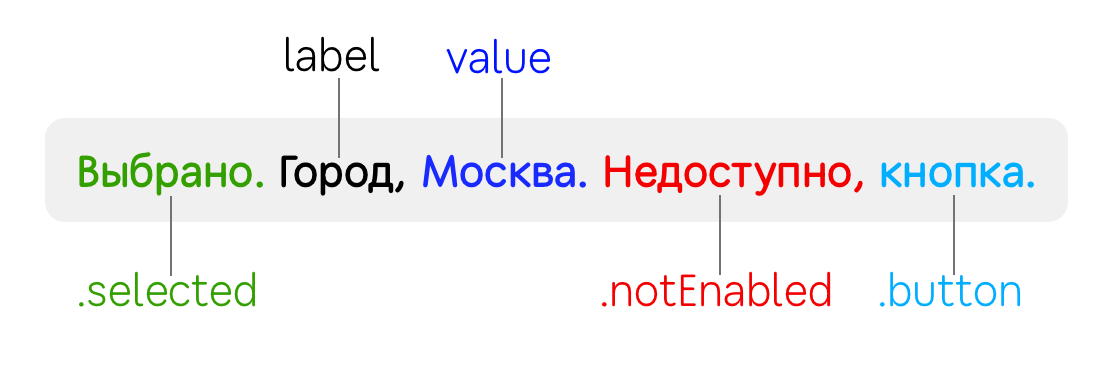
.selected- adds “selected” in front of the name of the control. Suitable for all switches and checkboxes..notEnabled- adds “unavailable”. This setting is not visible in Interface Builderand is only controlled programmatically.
An example of adding toppings to pizza: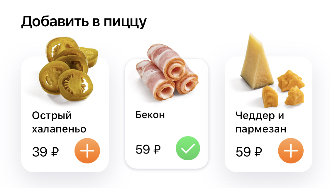 Using states, you can explain to the user that topping has been added. It’s convenient to fix right inside the cell.
 accessibilityTraitsthis OptionSetis why insert .formUnionand delete methods can be applied to it .formIntersection:class ToppingCell: UICollectionViewCell {
override var isSelected: Bool {
didSet {
if isSelected {
accessibilityTraits.formUnion(.selected)
} else {
accessibilityTraits.formIntersection(.selected)
}
}
}
...
}
Special properties of controls
There are some more unusual properties. In our case, they do not fit the pizza screen, but I will still tell about them, because there is not enough information about them. Perhaps this will save you time..summaryElement — , . , , . , ..updatesFrequently — . ..causesPageTurn — . accessibilityScroll(.next) , . .firstResponder..startsMediaSession — VoiceOver , . , . , VoiceOver ..playsSound — , ( , )..allowsDirectInteraction- for drawing and handling gestures. The control immediately processes the touch as if VoiceOver was turned off..keyboardKey- the control starts to react like a button on the keyboard. VoiceOver has several text input modes for such cases:
- standart typing- as a simple button in VoiceOver: first focus on the letter, and then double-click anywhere to write it. You can type faster with both hands: drive the keyboard with one finger (letters will be voiced) and touch with the other finger to confirm the key selection.
- touch typing- One-armed speed dial: swipe your finger across the keyboard to voice buttons. Release your finger to write the letter.
- direct touch typing- like a regular set, as if VoiceOver was turned off.
Video about different input methods:Just check the IB box to add behavior. With the .adjustable trait it just won’t be so easy, about it separately.Configuring the powerful .adjustable trait
And the last, especially important trait .adjustableis an element that can be regulated: this is how UIStepperand work UISlider. Swipe this control up or down to change the value (do not forget that swipe left / right will switch focus to the neighboring element). If the control has a UIPanGestureRecognizer, then you can tap twice and hold the second tap, so the gesture will work and you can control it directly, as if VoiceOver was turned off.Application examples for .adjustable:Test switch. The test setup consists of five buttons: three for choosing the size of pizza and two for the type of test. They should be grouped and signed so that instead of five there are two left: “Size, average. Adjustment item " and“Dough, traditional. Adjustment item. " Need to do in 4 steps:
- Make the container with buttons available.
- Put a trait
.adjustable. - Implement methods of increasing and decreasing.
- Return the new value for
.accessibilityValue.
override public func awakeFromNib() {
super.awakeFromNib()
isAccessibilityElement = true
accessibilityTraits = .adjustable
}
extension SegmentedControl {
override public func accessibilityIncrement() {
controller.selectNext(increment: +1)
}
override public func accessibilityDecrement() {
controller.selectNext(increment: -1)
}
public override var accessibilityValue: String? {
get {
return selectedSegment?.accessibilityValue
} set { }
}
}
Now after the swipe up is called up accessibilityIncrement(), you will increase the internal counter, and VoiceOver will read the new value from the accessibilityValue.Count of the total amount in the world. In this block we see four controls: minus button, quantity, plus button and price. You can combine them into one viewand turn them into one control: “Quantity, 1, 575 rubles. Adjustment item. " After a vertical swipe, the quantity will change, and then a new value will be pronounced along with the price.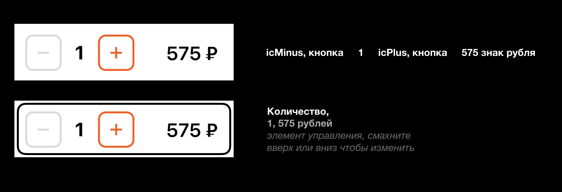 Horizontal
 UICollectionView. It turned out that it is .adjustableconvenient to apply for horizontal UICollectionView. For example, choose a share on the menu or a car in a taxi.
Conclusion
This time we made out the traits: their types, states and behavior. This is a standard set for common tasks . For complex controls, you can use .adjustable.Next time, let's look at a solution to common problems : bypass order, modal windows, loading indicators.In order not to miss the next article, subscribe to my Dodo Pizza Mobile channel .
And now we have one vacancy in the mobile direction. So I just leave it here: Senior iOS Developer (Nizhny Novgorod).