In AvaloniaUI, as in any other high-quality tool, a lot of opportunities. But unfortunately, unlike the web, various animations of downloads and other specific things were not done (for now) in large numbers for it.In this article, I want to introduce you a little more to the styling of Avalonia, with its animations and show with an example how to make a simple loading window.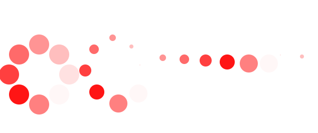 Here are some examples:
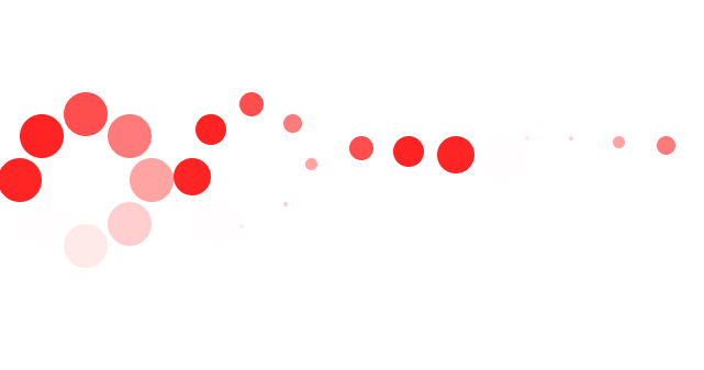 We’ll look at the simplest animation that many people are familiar with:
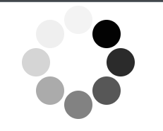 In order to make a similar animation, create an mvvm Avalonia project from the template and add the Controls directory to it, into which we will add the necessary files.
 Add 2 files to the solution:
 In the cs file, just create a class that we will inherit from ContentControl, and we won’t add anything else to it, because all the magic will be done only from xaml.
 public class LoadRound:ContentControl
{
}
First, create a template for our future animation:<Styles xmlns="https://github.com/avaloniaui"
xmlns:x="http://schemas.microsoft.com/winfx/2006/xaml"
xmlns:cc="clr-namespace:Load.Controls">
<Style Selector="cc|LoadRound">
</Style>
</Styles>
Here we indicated that the future design will be associated with the above class.Now fill in the template. To do this, we need 8 black circles, placed in a circle on the canvas.<Style Selector="cc|LoadRound">
<Setter Property="Template">
<ControlTemplate>
<Grid ClipToBounds="True">
<ContentPresenter Name="Content"
Content="{TemplateBinding Content}"
ContentTemplate="{TemplateBinding ContentTemplate}" />
<Canvas Width="160" Height="160"
IsHitTestVisible="False">
<Ellipse Width="40" Height="40" Classes="ellipse pos_el_8" Canvas.Left="60" Canvas.Top="20"
Fill="Black" />
<Ellipse Width="40" Height="40" Classes="ellipse pos_el_7" Canvas.Left="100" Canvas.Top="40"
Fill="Black" />
<Ellipse Width="40" Height="40" Classes="ellipse pos_el_6" Canvas.Left="120" Canvas.Top="80"
Fill="Black" />
<Ellipse Width="40" Height="40" Classes="ellipse pos_el_5" Canvas.Left="100" Canvas.Top="120"
Fill="Black" />
<Ellipse Width="40" Height="40" Classes="ellipse pos_el_4" Canvas.Left="60" Canvas.Top="140"
Fill="Black" />
<Ellipse Width="40" Height="40" Classes="ellipse pos_el_3" Canvas.Left="20" Canvas.Top="120"
Fill="Black" />
<Ellipse Width="40" Height="40" Classes="ellipse pos_el_2" Canvas.Left="0" Canvas.Top="80"
Fill="Black" />
<Ellipse Width="40" Height="40" Classes="ellipse pos_el_1" Canvas.Left="20" Canvas.Top="40"
Fill="Black" />
</Canvas>
</Grid>
</ControlTemplate>
</Setter>
</Style>
So we get some kind of static picture. Next, to simulate the movement, we will change the transparency of the circles.For this, we indicate one more style.
<Style Selector="Ellipse.pos_el_1">
        <Style.Animations>
            <Animation Duration="0:0:0.5" IterationCount="INFINITE">
                <KeyFrame Cue="0%">
                    <Setter Property="Opacity" Value="0.17" />
                </KeyFrame>
                <KeyFrame Cue="14%">
                    <Setter Property="Opacity" Value="0.34" />
                </KeyFrame>
                <KeyFrame Cue="28%">
                    <Setter Property="Opacity" Value="0.50" />
                </KeyFrame>
                <KeyFrame Cue="42%">
                    <Setter Property="Opacity" Value="0.67" />
                </KeyFrame>
                <KeyFrame Cue="56%">
                    <Setter Property="Opacity" Value="0.84" />
                </KeyFrame>
                <KeyFrame Cue="70%">
                    <Setter Property="Opacity" Value="1" />
                </KeyFrame>
                <KeyFrame Cue="84%">
                    <Setter Property="Opacity" Value="0" />
                </KeyFrame>
                <KeyFrame Cue="100%">
                    <Setter Property="Opacity" Value="0.07" />
                </KeyFrame>
            </Animation>
        </Style.Animations>
    </Style>
Inside the style, we indicated only animations how transparent this circle should be in a certain% of the animation application. In the Duration property, we specified the duration of the entire animation, and in the IterationCount property, the number of repetitions.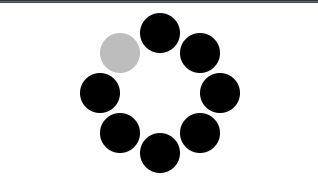 And we get such a blink. And applying this animation (with a time shift) to all circles we get the effect of "movement" that is necessary for us.To use our new control, you need to add its namespace to the description of the main window.
xmlns:controls="clr-namespace:Load.Controls"
Add control to the page itself<controls:LoadRound />
And apply a style within the window that adds visualization to our control. <Window.Styles>
<StyleInclude Source="avares://Load/Controls/LoadRound.xaml" />
</Window.Styles>
Support for c # can be found here , and for Avalonia here .