Visualization of science: illustrations and infographics
 Where is the line between illustrator and infographic specialist? How to visualize data? What does science say about various design solutions?Before delving into the discussion, I want to talk about the context. The ideas described below form the basis of my own experience. In part, these are my observations of 20 years as an art director. This is not an exhaustive review of literary sources, not a rigorous look at the scope of scientific visualization. These are reflections related to my work in the publishing industry, as well as references to some useful or provocative sources and communities. In some ways, I will probably be mistaken, because I am not an expert in all the sub-disciplines I will talk about. But I work at the intersection of these sub-disciplines, and over time I have developed a number of resources that may interest you.
Context
What influenced my point of view? I consider myself an editor of graphic materials, a specialist in infographics and in relations with the scientific community. I gained experience for the most part in traditional (physical) publications. Here is one of my first scientific illustrations: an ink-drawn image of parts of the oral apparatus of hydrothermal shrimp. For several summer seasons, I worked in a crustacean lab at the Natural History Museum in Los Angeles. In the late 1980s, thanks to my school teacher, I was able to experiment with Commodore Amiga. Later, at Smith College, I switched to tablets and digital drawings, where my teacher Gary Niswanger taught classes like blind outline drawing. In the center of the room was a model, we sat with our backs to the monitors and painted on Wacom tablets lying on our knees.I loved science classes no less than art and design classes. I did not want to sacrifice one discipline for the sake of another, and at the same time specialized in geology and studio art. Then my attention was drawn to the scientific illustration training program at the University of California at Santa Cruz (now part of the University of California at Monterey Bay), and I was able to formally combine the two disciplines under the direction of Anne Cowdle, Jenny Keller and Larry Lavelndal. Instead of devoting myself to one area of research, I use visual language to help other people's research reach a wider audience.After graduation, I became a trainee in the art department of Scientific American magazine. Here is my first illustration for this edition, a watercolor cockroach.
 My internship turned into a full-fledged position, and as I moved from an artist to an art director, I found that my main tool instead of watercolors and rapidographs was a computer. In 1998, I left Scientific American and became an assistant art director, and later a designer in National Geographic magazine . All this time I gained experience as an art director and studied printing with the best specialists. Five years later, I moved and started a freelance research community business focusing on magazine and book projects.In 2007, I returned to Scientific American, and now I work here as a senior editor of graphic materials. Today, our team includes two people, Amanda Montañez and me. We manage the entire magazine infographic, from data visualizations to illustrated explanations. Sometimes we ourselves create the final images, but most often we hire freelance artists and manage the project.
 We also manage digital versions of all images for the web and display on smartphones. Amanda is creating images specifically for the web.
 But I remain true to the printed versions.Editorial illustrations, such as the works by Maria Corte Maidagan and Jay Bendt below, are curated by other members of the art department — design director Michael Dark and art director Jason Mishka.
 What is the difference between these materials? I believe that information graphics are illustrations created on the basis of research and intended mainly for the transmission of information. And editorial illustrations are thematic images inspired by the text and prompting the reader to become more familiar with the contents of the magazine.
 For example, for an article about a microbiome, illustrator Brian Christie created a U-turn image, which is not a literal reflection of the idea of the article, but only hints at the idea that a person is determined by microorganisms living in him and on him. Brown tells the story with visual symbols and composition. This is not an infographic, but a metaphorical illustration that echoes the theme of the article.
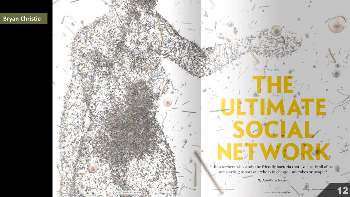 Later in the article, Brian and his co-author Joe Lertola moved on to infographics, and with the help of visual symbols and compositions reflected the specific information reflected in the article. This is not an editorial illustration. This is an infographic, or an explanatory diagram.
 Some artists, like Brian Christie, are capable of working well in both areas.
 But as an illustrator and editor, I tend to infographics. Although I can study and often work with artists who create illustrations of both types. For example, for an article on malaria vaccines, I put together a content plan and developed an infographic composition:
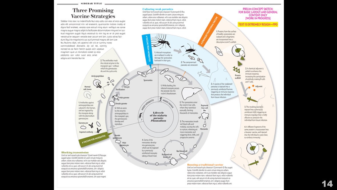 But I understood that in order to breathe life into this concept, an experienced artist would be required. So I hired illustrators Peter and Maria Hoy to create the final version. They handle iconography very well, develop variable textures and deepen editorial ideas.
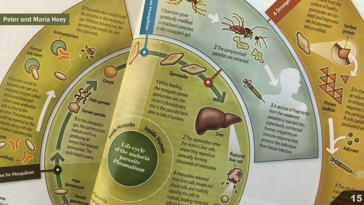 I also relied heavily on editorial illustrator Leandro Castelao to choose this style and color for this interferometer circuit, as if it were printed in a regular popular journal, not in a scientific one.
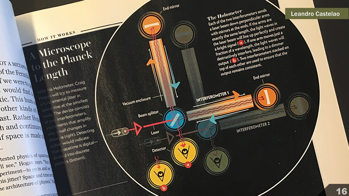 And Gavin Potenza gave a fresh look to a topic about which much has already been written, and stylistically highlighted the different stages of the exploration of Mars.
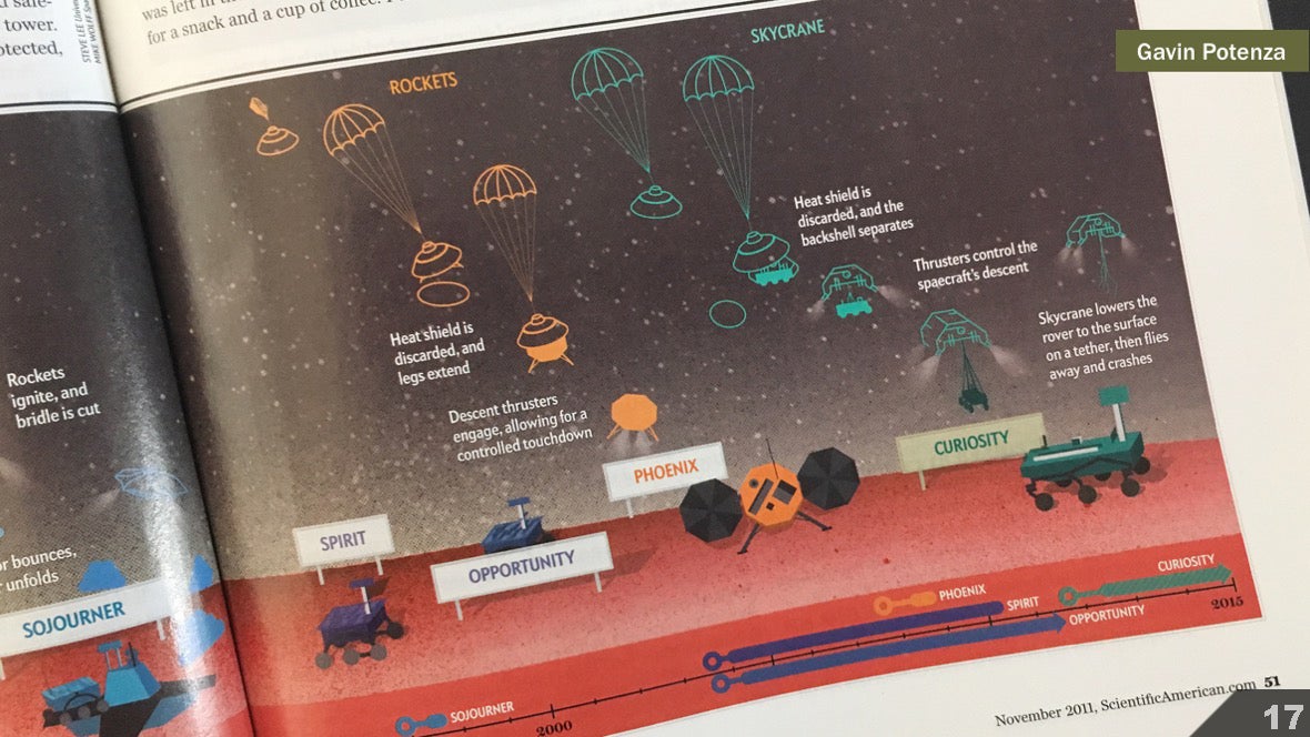 Working on my illustrations, I noticed that sometimes I focus too much on details and accuracy, and pay less attention to style. An image can very quickly become academically accurate and faceless. Editorial illustrators Gillian Ditner and Chad Hagen reminded me that it’s normal to bring the artist’s vision and sense of style to the image, especially in the magazine.
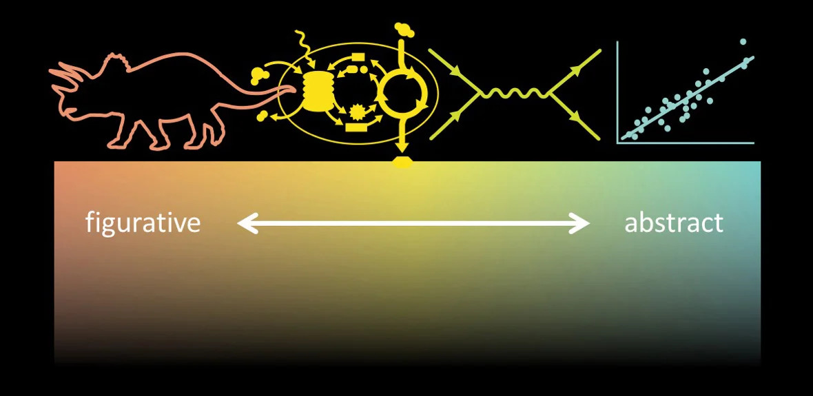
 I tend to perceive infographics as a continuum with a visual representation of information on one edge of the scale and an abstract representation on the other edge.From the point of view of scientific visualization, it can be argued that the entire continuum can be considered data visualization.In fact, all our work is based on data collection at some stage: from measuring bone lengths in dinosaur reconstructions, to carefully documented laboratory experiments that form a more complete picture of processes like photosynthesis, to presenting mathematical expressions like a Feynman diagram, to plotting the data itself.
 But outside the realm of scientific visualization, the continuum is useful to take in this way:
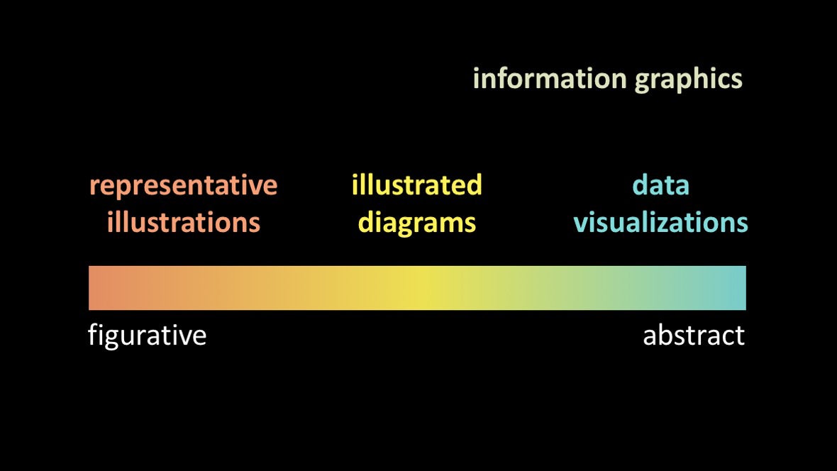 When I leaf through old Scientific American issues , I see that many artists have worked across the spectrum. The works of the Bunji Tagawa amaze me. Here are a few examples to help you understand his skill level. Visual representation of objects:
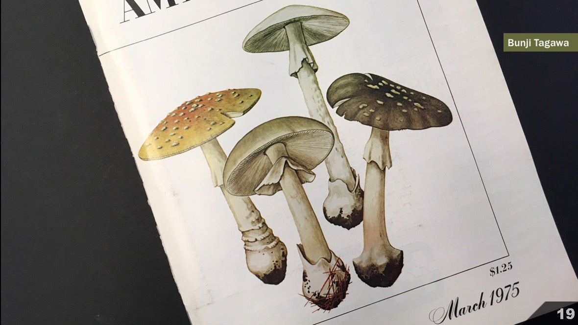 Anatomical sections:
 Technical diagrams:
 And data visualization:
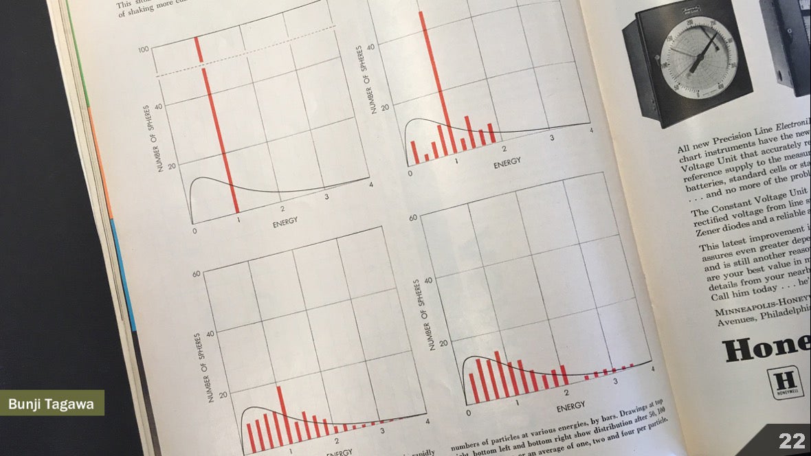 More information about his work is written here: https://blogs.scientificamerican.com/sa-visual/remembering-bunji-tagawa/But as an editor of graphic materials today, I engage artists from different groups of freelancers for various tasks within the continuum.
 Perhaps this is a consequence of my bias, but when flipping through old numbers of Scientific American , I get the feeling that the increased specialization of artists may be due to a change in tools in each of the areas. When pen and ink were the main tools for creating visual illustrations that explain diagrams and visualizations for print magazines, the artist could become a pen and ink master, and then explore other ways to solve problems in each area. Here are more examples of Tagawa's work. Organics:
 Technical sections:
 Abstract representation of processes:
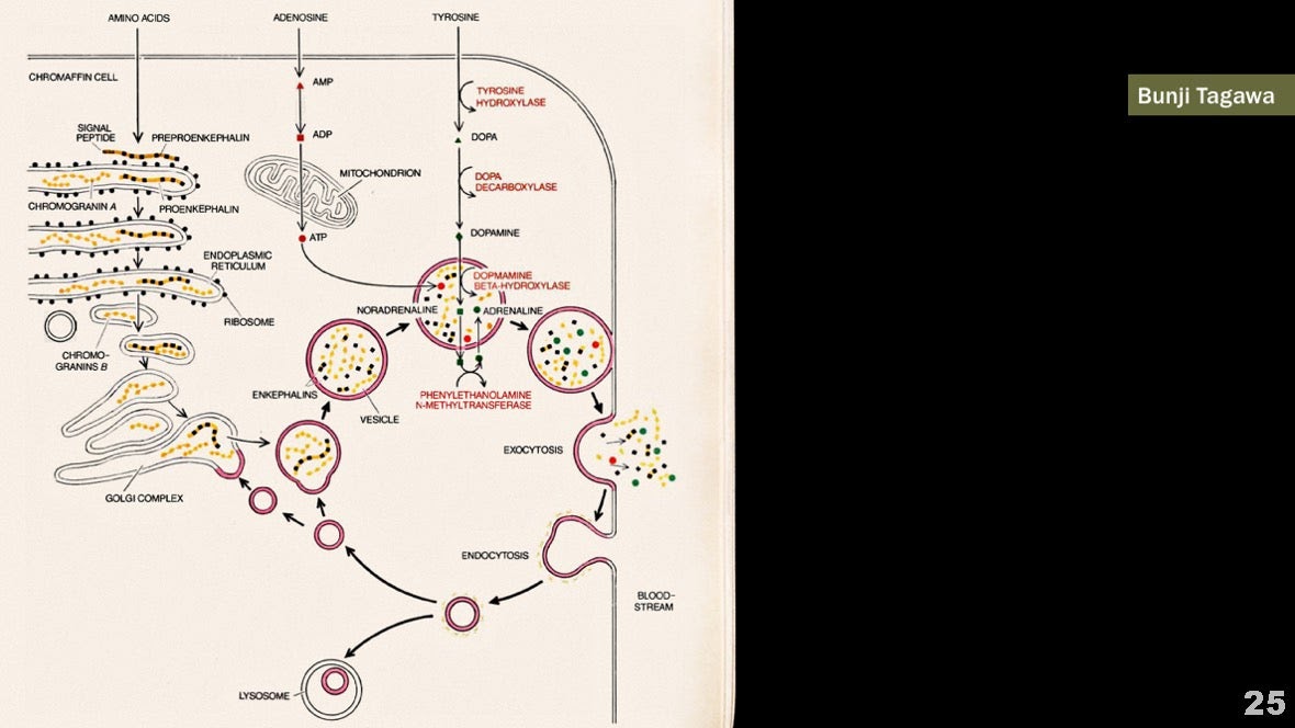 And numerical graphs:
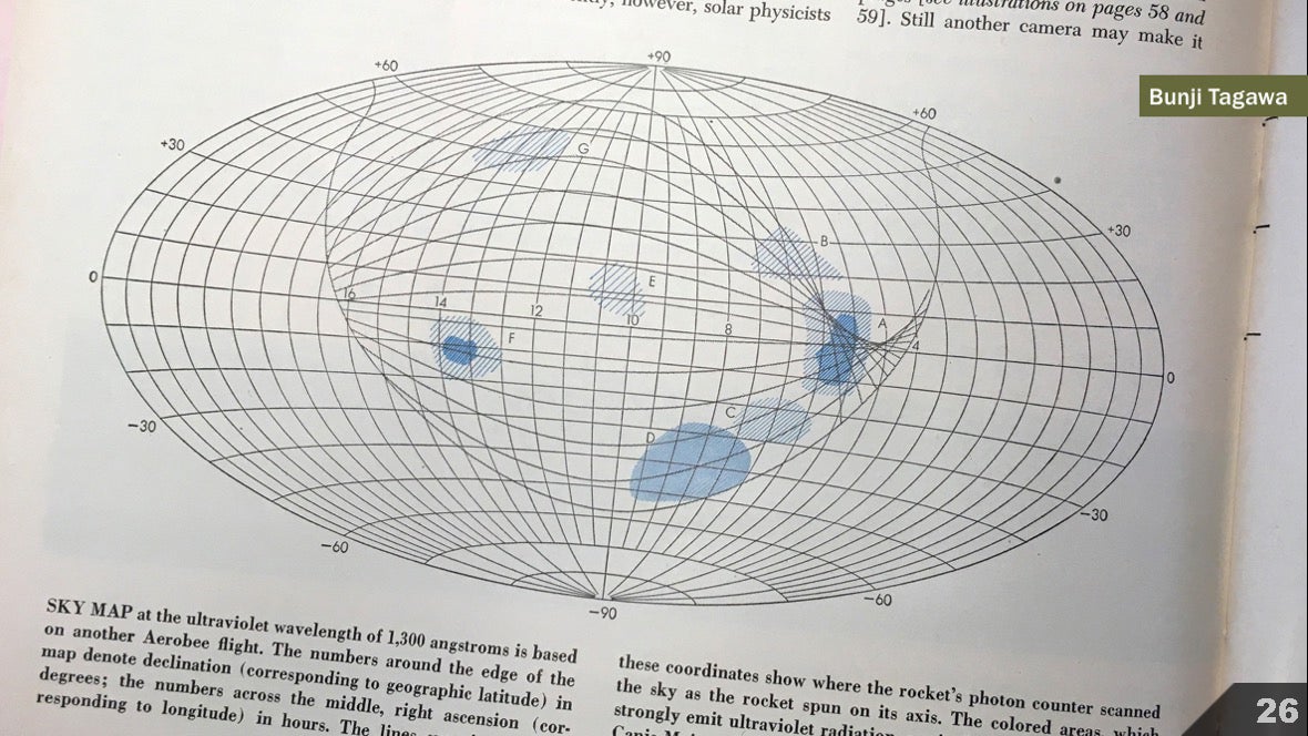 Everything is drawn in pen and ink.As desktop publishing systems spread, and the diversity and availability of digital tools increased, such a simple task as choosing the main tool became the boundaries of the artists' interests. As an art director, I am looking for 3D artists to illustrate physical objects like Don Fowley.
 And I'm looking for artists like Tami Crowd, who, with tools like Adobe Illustrator, hone their mastery of composition and flow of information for explanatory diagrams.
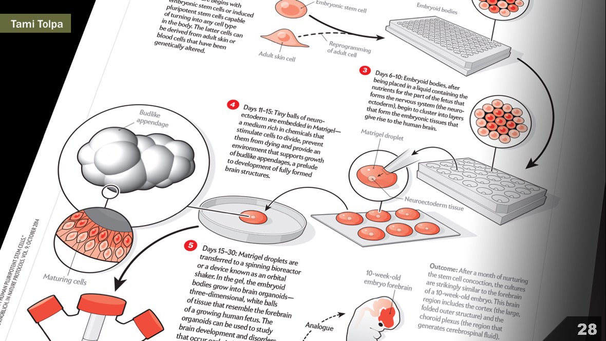 And to visualize large datasets using programming, I am looking for data designers like Jan Willem Tulp.
 It takes a lot of time to masterfully master any of these tools, tools, styles, and genres. And they all gravitate to different areas of the continuum.Many conferences and communities with whom I spoke have a tendency towards such a separation. And it’s becoming increasingly difficult to find artists working in more than one field.Maybe I'm a little dramatic. Probably, in reality it’s getting closer to such a scheme:
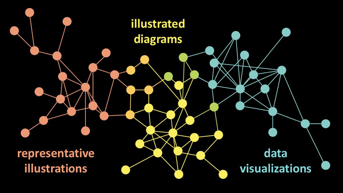 Or maybe this is a completely normal situation, especially considering that the basic tools for these various subdisciplines branch out over time. Or maybe there’s no point in trying to connect disconnected clusters.Some of my favorite recent illustrations for Scientific American.are the result of the collaboration of different artists. We select experts from different groups and combine their efforts, and do not look for jacks of all trades. For example, I like to take an artist who can create point illustrations with a stylus or pen, and pair it with an artist who knows how to program data visualizations, as in this work Moritz Stefanera and Gillian Walters.
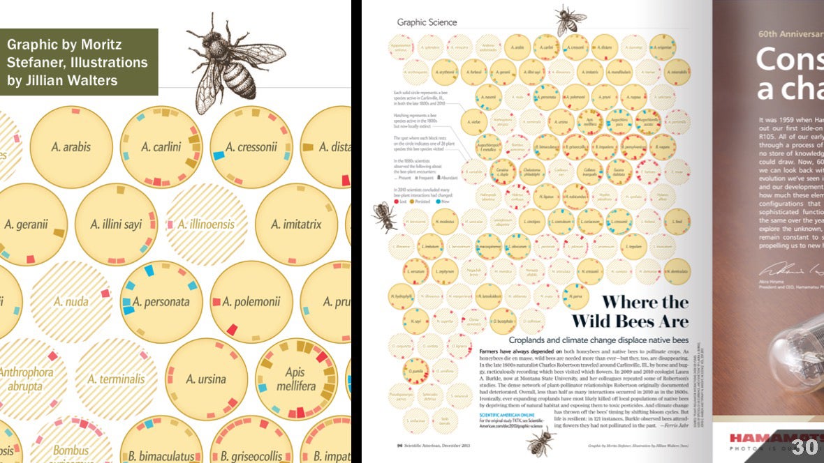 The same approach applies to this type of illustration, in which visualizations of different types are better suited for different elements of history, and therefore different artists.
 In other words, I believe that even if you do not want to work within the entire continuum - or spend time on becoming an experienced artist throughout the continuum - in each of its areas you will find something to study. And I like to see an exchange of ideas. I think everything would be beneficial to us if reality were like this:
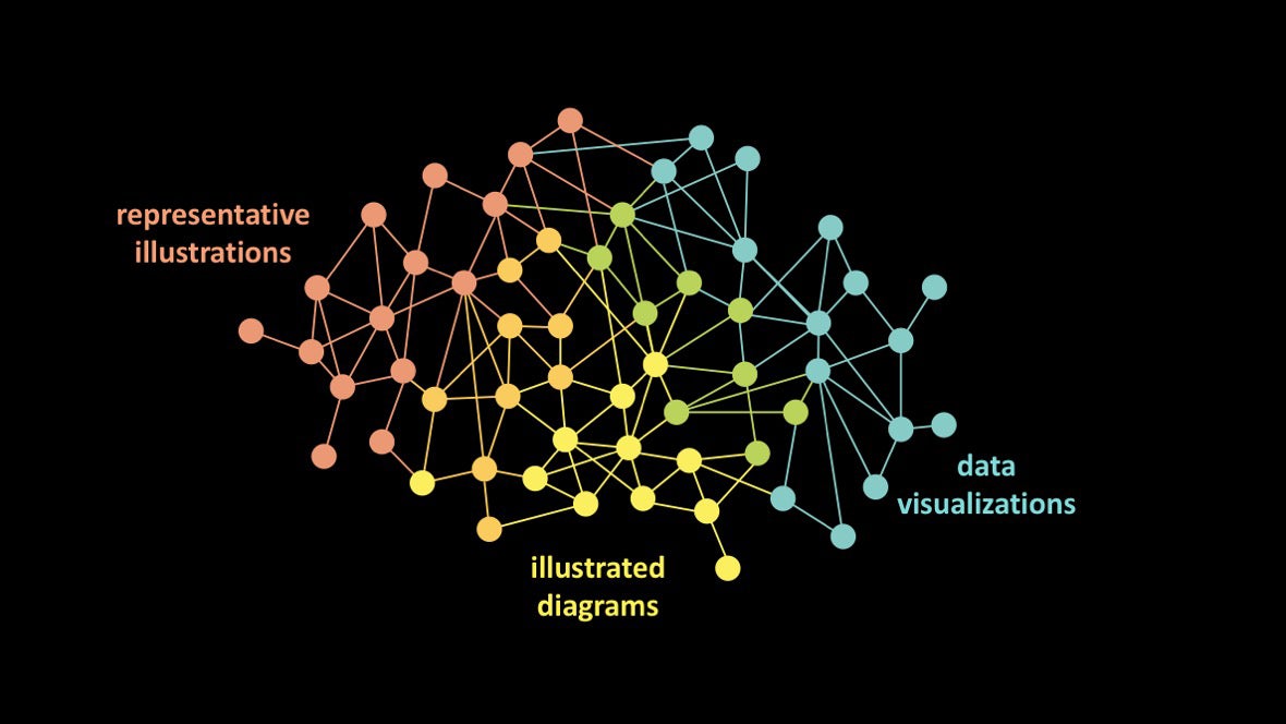 Better yet:
 I do not say that every artist should be able to program. Or that everyone should be able to sculpt clay models and draw from life. I affirm that we, as scientific visualizers, can - and should - learn to think and solve problems within the entire spectrum.And I want to share some ideas that I got from representatives of different groups of artists.First, pay attention to this table: http://bit.ly/jenGNSI. It provides links and brief descriptions of many useful sources. I will illustrate ideas with examples from the magazine, but many ideas are gleaned from books, blog posts, presentations, podcasts, and workshops.And here you will find a generalized list of links that I have compiled to answer specific requests from students, scientists and artists who want to learn more about scientific visualization. And also there are links related to my work as an editor of graphic materials.Let's get back to visual illustrations. Here are five key lessons I learned in the scientific illustrator community.
The lessons. Graphic illustrations
Lesson number 1: you need to pay attention to every detail. Every property needs to be monitored and considered.In an article on the impact of mosquitoes on public health, artist Immy Smith demonstrated that the image of a number of different types of mosquitoes can be visually interesting and informative: And the artist emphasized that different types are associated with different human diseases. Some of my colleagues were skeptical of this plan, they thought that all mosquitoes would look the same. But the artist’s attentiveness and thoroughness made it possible to clearly show the differences between them.
 Obviously, here every stroke is made intentionally and thoughtfully. In my opinion, a thoughtful and meticulous reflection of every detail is a challenge for the reader, who, in turn, will carefully and thoughtfully examine each insect.Lesson number 2: show the objectFor the article about the grave-bugs, the artist Kelly Murphy needed to show an insect from different angles. Images on the net were well suited for top views. But in order to show the oral apparatus and more accurately depict the beetle in various poses, the artist arrived at the California Academy of Sciences and photographed the sample from all angles.
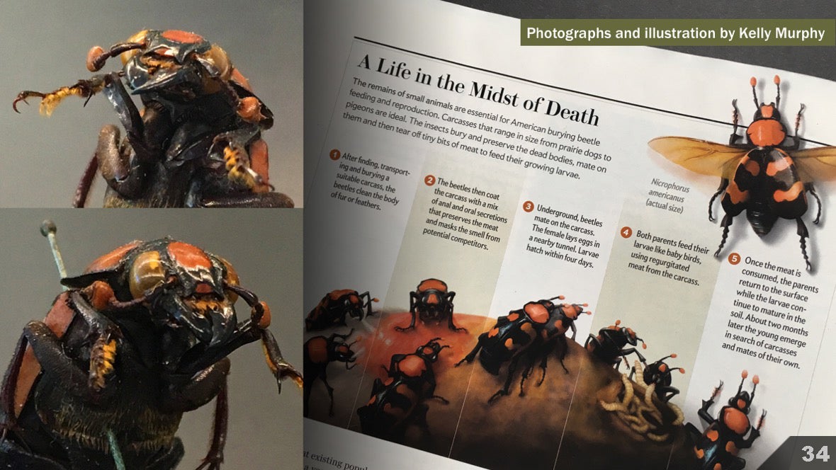 Lesson number 3: if you can’t show the object, try to guess what it looked likeThe scenes created by James Gurney are incredibly convincing. Partly thanks in part to the dimensional models that he creates to enhance composition and lighting.
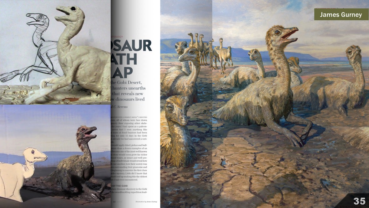 Lesson number 4: photo and super-realistic images have their advantagesEd Bell wrote in 2010:
, . , . , ? — , NASA Cassini, , MESSENGER, , — .
 Lesson number 5: non-photorealistic images also have advantages.Here the artist Carol Donner removes irrelevant details and uses transparency to create an aesthetically attractive and clear image of the heart. Unlike the task that Ron Miller solved in the illustration with Saturn, there is no need to help the reader to feel in a new environment. Here you need to reflect the behavior of the object.
 Ian Sack and his co-authors wrote in The Journal of Biocommunication :
Medical illustration inherently requires a certain simplification and idealization of the object. The role of the illustrator is to aesthetically and effectively educate the reader with visual images, despite complex biomedical procedures, structures, or processes.
The lessons. Explanatory diagrams
Lesson # 1: It is important to know when and how to distort the physical shape of an object in order to best convey information.This illustration was created by Bunji Tagawa. It is a variation of the classical schematic representation of the cardiovascular system. Instead of displaying the details of the human figure, information is simplified to emphasize the closed process of blood circulation in the system. Lesson # 2: it's all about composition: artists must carefully think about how to guide the reader’s gaze through illustrations.Here John Grimvade deliberately guides the reader’s gaze with the help of repeating lines, selected colors and a flow chart that forces the flow of information.
 Lesson # 3: text is as important as imagesIn this example, Emily Cooper presented an elegant set of four fragments of the Atlantic Ocean. Labels help the reader navigate, you can put together all parts of the story: we see how the current in the bay is related to temperature. But it is not clear what kind of remote signatures these are.
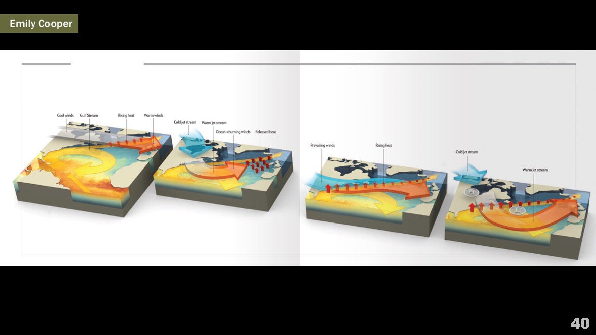 The text comes to the rescue. Headings and brief explanations immediately provide the necessary context.
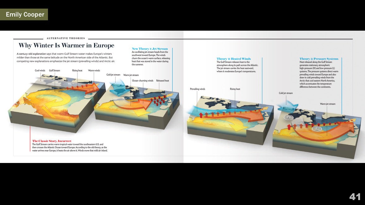 Images of four different scientific models explain why winter is warmer in Europe. The reader can now compare these models.
 Lesson # 4: Elements in the form of pictures or funny moments associated with illustrations can attract readersNigel Holmes masterfully adds humor and humanity to illustrative illustrations. Here he breathed life into illustrations about group theory and the mathematical foundations of symmetry. But the added pictures are not just embellishment. They reinforce the idea of rotating a cube around different axes.
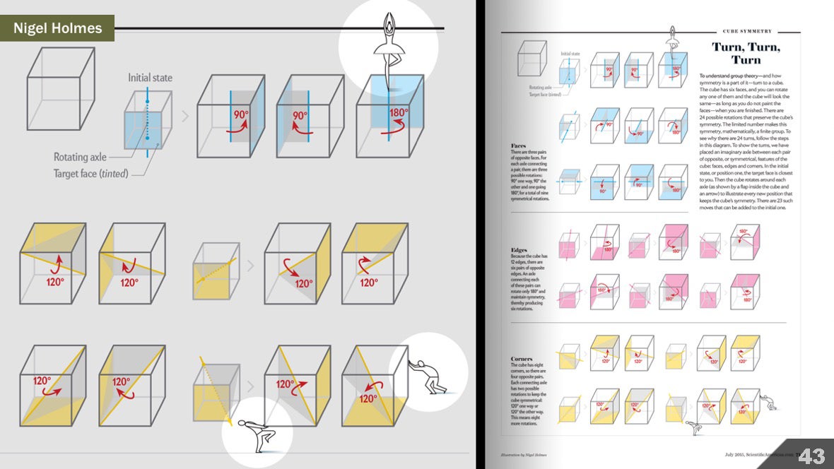 Lesson number 5: the context is very important. The content and style of illustration must be selected based on the characteristics of the audience and the task of infographicsFor an article on artificial photosynthesis, a scientist provided us with the source material (left). This is a schematic representation of a device in which photosynthesis takes place. For scientific tasks and the context of scientific articles, this picture fits perfectly. But in the publication for the general reader, it is necessary not only to involve non-specialists, but also to help them immediately see the parallels between artificial and natural photosynthesis. Our illustration is shown on the right. Please note that as a basic context, we have added an explanation of what photosynthesis is. And the context of the mass media allowed us to freely choose the artistic style, so that it closely resembled the style of the artist-botanist Sary Sinnen.
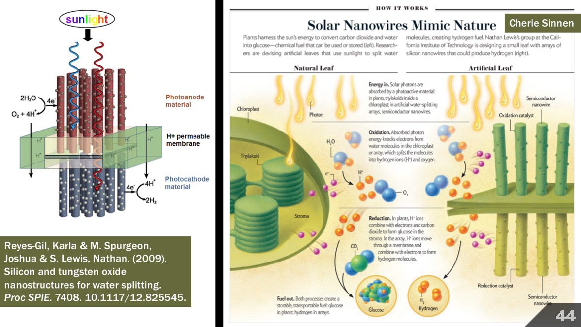
The lessons. Data visualization
Lesson # 1: analyze the entire data set. Then analyze again.To illustrate the change in bee populations over time, the artist Moritz Stefaner began to analyze raw data in various forms, from histograms to tables, from heatmaps to network diagrams. He tried to look at the data from different angles. The images on the left are just a small fragment. And only after a thoughtful analysis of different forms of presentation, the artist began to create an illustration that was best suited for this data and our readers. Lesson number 2: complexity is normalWhen you introduce people to a complex, multi-level, and broad view of a topic, always give the reader the tools necessary to interpret the illustrations. For an article on the evolution of mythical stories, Accurat Design Studio has gathered several levels of information in one illustration. This is a complex and data-rich visualization, built on the basis of a complex and rich data set provided by scientists. Someone may say that illustration requires too much effort from the reader. It cannot be read quickly.
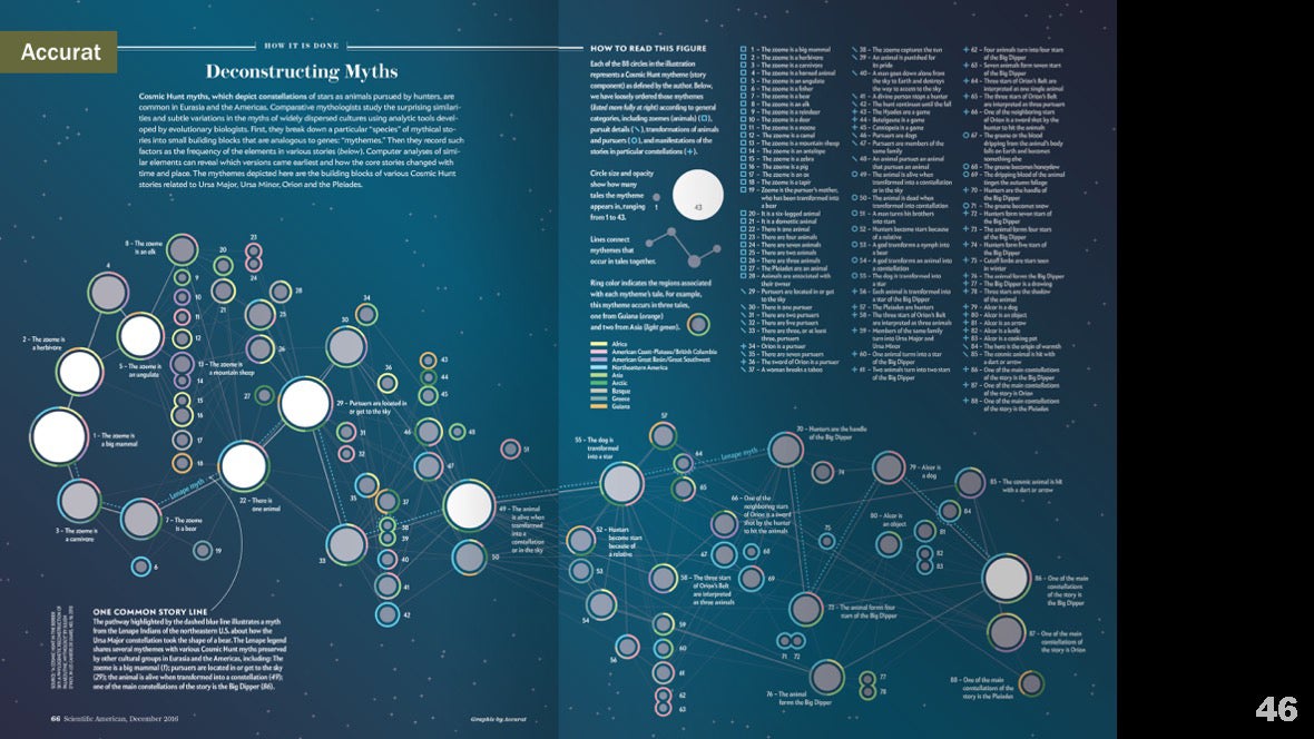 However, we added a hint “How to read this diagram”, and throughout the illustration we used an informal language in which you can communicate with friends. The idea is that after the reader makes some efforts and learns to read the diagram, he will be able to run a glance, find the main points and independently study the illustration in more detail. This approach also allowed us to show the entire data set, rather than reduce it to an overly simplified squeeze.
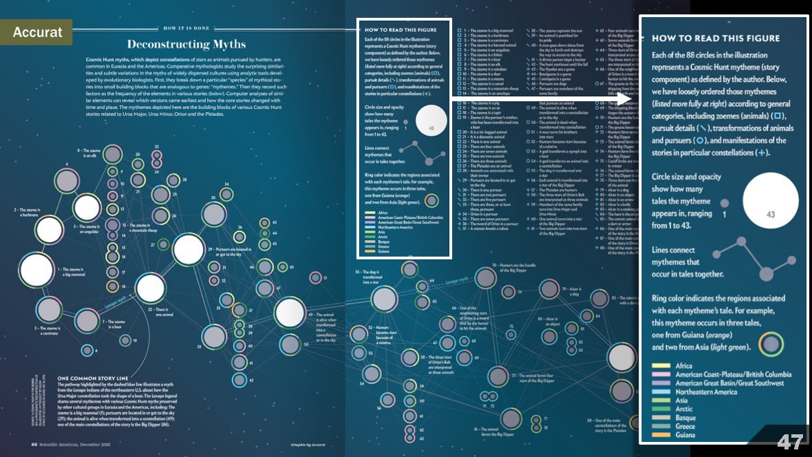 Lesson number 3: new forms can captivate the reader ...For an article on the time of birth of children, data analysis specialist Zan Armstrong and visualization specialist Nadier Bremer together created this solution for the magazine. Information could be presented in the form of a classic histogram, but I doubt that it would also attract attention. Circles not only attract the eye, but also emphasize the cyclical nature of the data, like a clock. However, as with a complex example, the reader should receive clear guidance on reading the chart.
 Lesson # 4: ... but sometimes a regular line graph or histogram is best suited.For this graph, which reflects the results of a study of coronary heart disease, it was not necessary to push the boundaries or try to be smarter. It was enough simple and clear schedule.
 Lesson number 5: your data source is neither objective nor completeThere are great sources on my list of links, but I think some quotes should be given here.Researcher, artist and software developer Katrina D'Ignazio writes in her post “What would a feminist data visualization look like?”:
What is the problem? From the point of view of the theory of feminism, the question is that all knowledge is socially significant, and the opinions of oppressed groups, including women, minorities and others, are systematically excluded from “general” knowledge ...
... Until we understand and realize the impact of such introductions and exceptions, and until we develop an appropriate visual language for them, we must recognize that data visualization is another powerful and imperfect tool of oppression.
Artist and researcher Mimi Onuoha writes about excluded data:— , . , , …
… , , , , - .
Such ideas made me approach some projects with great trepidation and attention. In articles on infectious diseases, we wanted to convey to our readers a sense of global events. How did infectious diseases affect global health in different countries and at different times?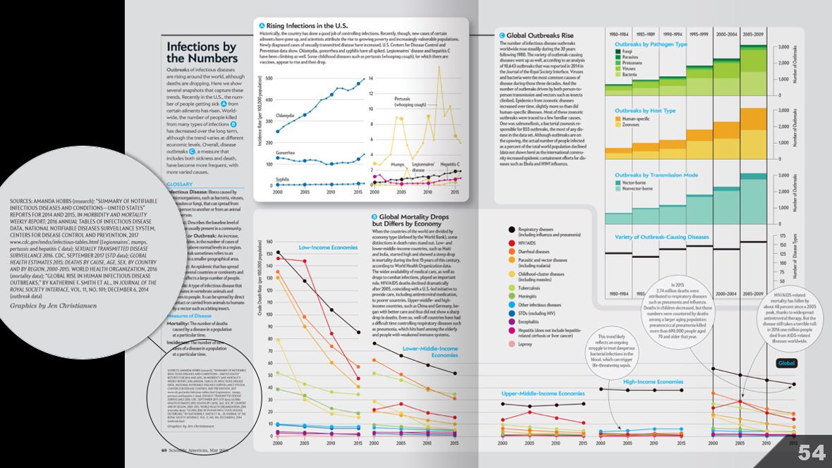 Art researcher Manda Hobbs has provided tremendous help. She conducted a large study of literary sources and identified some pitfalls. As a result, for most of the material, we used fairly standard and authoritative sources: the Centers for Disease Control and Prevention and the World Health Organization.But even such authoritative sources cannot control the change in data collection. And data collection methodologies are created by individuals and subject to the bias of the authors. Therefore, I carefully read the documentation, avoiding the pitfalls and noting when exactly the methodologies were changing. This helped us choose the time intervals, as well as draw up explanations on the graphs. In addition, we additionally consulted with several experts in this field.I still think that it should have helped readers more to understand that the data presented is not perfect. In the future I will try to keep more explanatory signatures. But at least we left a fairly clear trace of breadcrumbs citing sources so that people could check the source data themselves.
The lessons. Whole continuum
Lesson # 1: question the “rules” of design
Probably many of you can quote the “rule” formulated by Edward Tufte:Visual perfection - this is what allows the viewer to convey the most ideas in the shortest possible time, with a minimum of ink and a minimum area.
But how do we know that this is true? And if this is true in one situation, then what about the other? Researchers of human perception have steadily put an end to some of these rules.I recommend listening to the Datastories podcast with some of these researchers. On the Eagereyes blog, Robert Kosara talks about what else to look for. Also read Kennedy Elliot's post, “39 Studies of Human Perception in 30 Minutes.”
Lesson number 2: share knowledge
I am often struck by the nobility of the data journalist community when it comes to sharing best practices in the field of visualization, ideas, methods, tools and sources. If you want to expand your knowledge, I recommend starting with the Computer Assisted Reporting program of Investigative Reporters and Editors.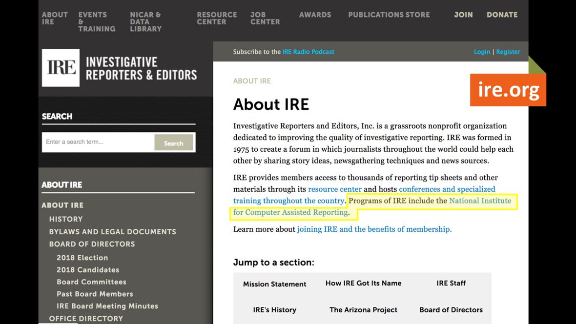 I also recommend an article by Jennifer LaFleur:
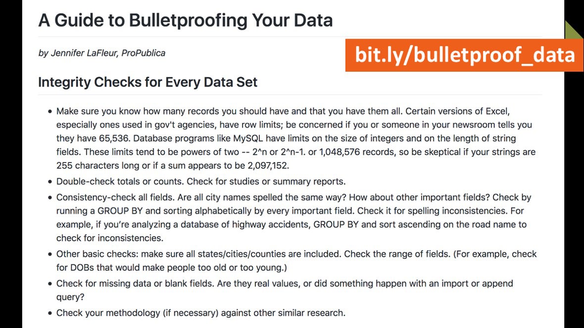 ... and the The Nerd Blog on ProPublica.
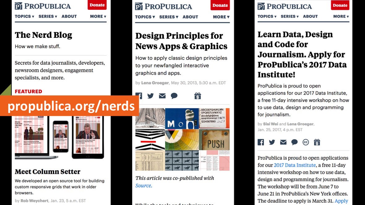
Lesson 3: Create Discussion Pads
The intersection of science and art is beyond my competence, but I want to study how artists and performers engage a wide audience at different venues. And I want to understand how to apply these engagement techniques in my journal work.I recommend watching SciArt Center, an online platform that offers interdisciplinary cooperation, holds exhibitions and organizes various events. Jamie McCray spoke in more detail about the performing arts and science at her 2017 SciVizNYC conference, and information can also be found in the SuperHero Clubhouse community.
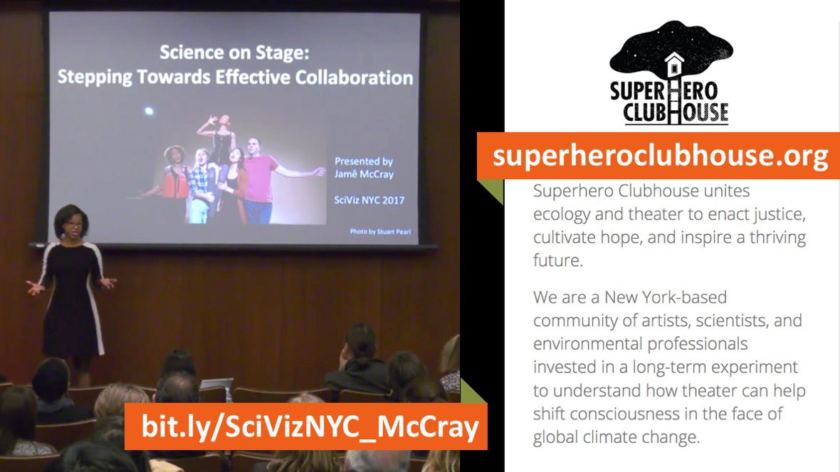 At the same time, as one of the organizers of SciVizNYC, I try to actively create platforms for dialogue between members of the community of specialists in scientific visualization.
 The idea for this event came about as a result of a conversation with medical article illustrator Jill Gregory. We liked coming to each other's work and watching how we use our knowledge and experience to create scientific illustrations. I wanted to know if the format of mobile meetings would work, in which a group of participants moves from an office to a studio during the day, then to the news department, while studying how different employees use scientific visualization in everyday work. As this idea evolved, co-organizers Christopher Smith, Amanda Montañez and Nika Ford joined us. We came to a more traditional and logistically simple format: a daytime meeting at the same site with 14 speakers. The first meeting in 2016 was free. At the second meeting, we took $ 35 per seat to prevent failure to appear.But it was important for us to keep the cost at the lowest possible level, while at the same time paying the speakers small fees for the time they spent. Thanks to the help of the Ikan School of Medicine on Mount Sinai, we succeeded. Today, our meetings bring together various representatives of the scientific visualization community, benefits from New York and the surrounding area.
Which leads me to lesson number 4: together we are stronger
I want to pay tribute to the platforms and communities that inspired us on this idea and provided the right tools. I gained a lot of experience by watching how the community solves real-time problems on Twitter; Watching panel discussions about technology and interaction through an ethical prism at Eyeo Listening to speeches about the open web on OpenVisConf; studying the experience of visual journalists in solving emerging problems at the Malofiej World Summit ... the list can be very long. Here are my favorite sources. There are already community peer learning outcomes. For example, the idea of using annotations in infographics has come from the world of data visualization. This was demonstrated by Suzy Lu, who in 2017 developed the appropriate toolkit, building with the help of graphics programming with built-in explanations.
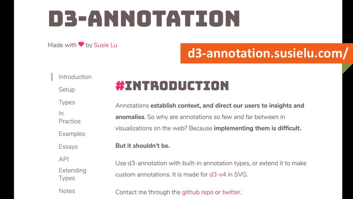 You may not agree with the dynamics between photorealistic and non-photorealistic illustrations, which reflects the dynamics between complex and simple data visualization.
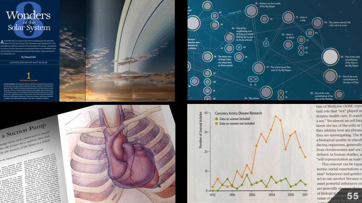 We still have much to learn from each other, especially when it comes to visualizing scientific uncertainty. This problem is relevant for all areas of science, and therefore for all areas of scientific visualization.
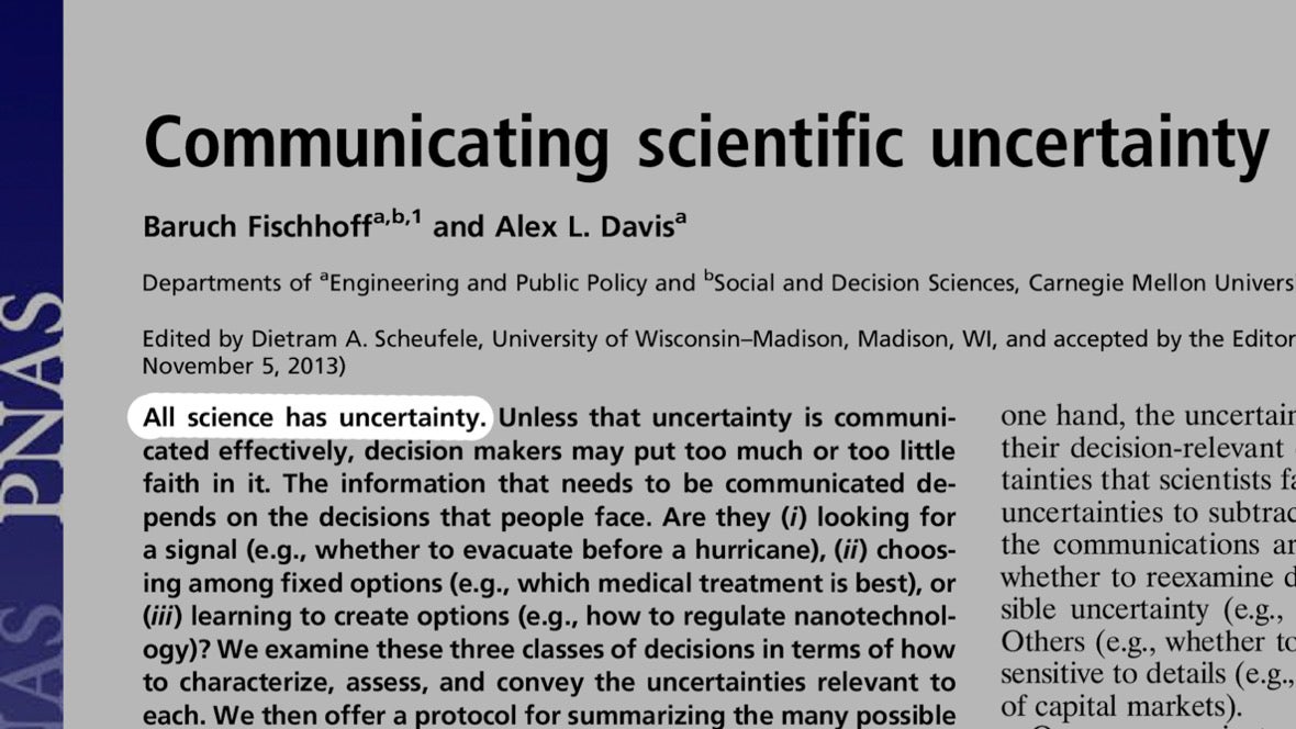 We in the magazine often work with representatives of the academic community and research scientists. These communities regularly come to agreement on error margins. And I very often have to reproduce these errors (gray vertical lines), believing that adding a few signatures may be enough to convey meaning.
 The same applies to trust boundaries. Perhaps I have not done enough to help readers understand what they are looking at.
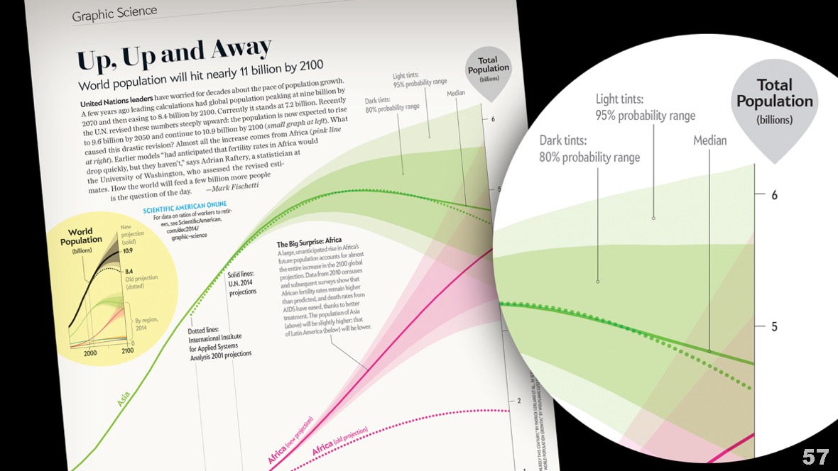 A few years ago I had a conversation with a cartographer at the Gordon Research Conference on Visualization in Science and Education. Diane Sinton (from Cornell University) made me more critical in displaying scientific uncertainty. We started working together with a small grant from NASA, and created this poster guide in the hope of starting a broader discussion about the visualization of uncertainty.
 At that time, talk of uncertainty was mostly about climate forecasts. And later, the task of predicting election results became relevant.First, we studied literary sources. This led me to think that in data visualization we rely too much on conventions such as span diagrams , margin of error, andtreble clefs . And do we not go around in circles discussing which of these approaches is better?
 But what if we borrow ideas not from quantitative but from qualitative examples? At Scientific American, we use explanatory diagrams to reflect different types of uncertainty in different disciplines. Is it possible to take some ideas from there and apply them for data visualization?
 What if data visualizers draw inspiration from scientific illustrators, and vice versa? Perhaps we can work together to develop more intuitive ways of representing statistical uncertainty.A good starting point can be quantum mechanics and Heisenberg's uncertainty principles. In particular, the idea that "events at the atomic level cannot be observed with certainty." It is important to emphasize that the principles of uncertainty describe quantum behavior and uncertainty at a practical level, and are not a good analogy for uncertainty at a macro or classical physical level.
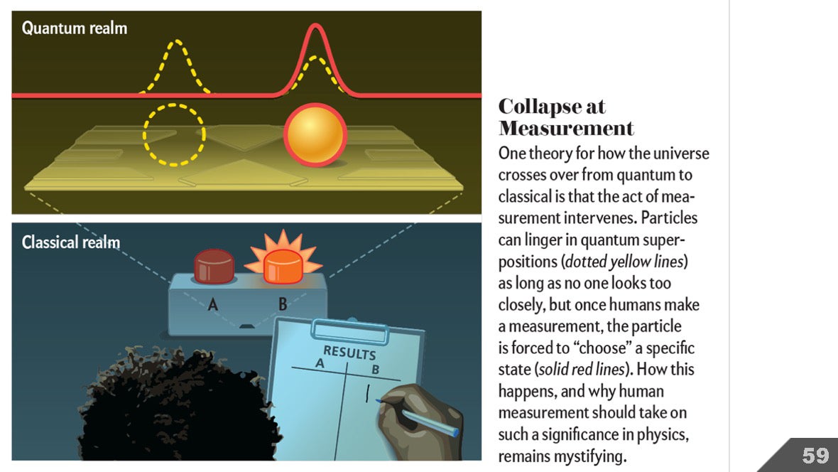 But I'm more worried about how we illustrate the uncertainty surrounding the idea. Therefore, I believe that the study of such images reflecting quantum mechanics can still be useful outside the quantum world.
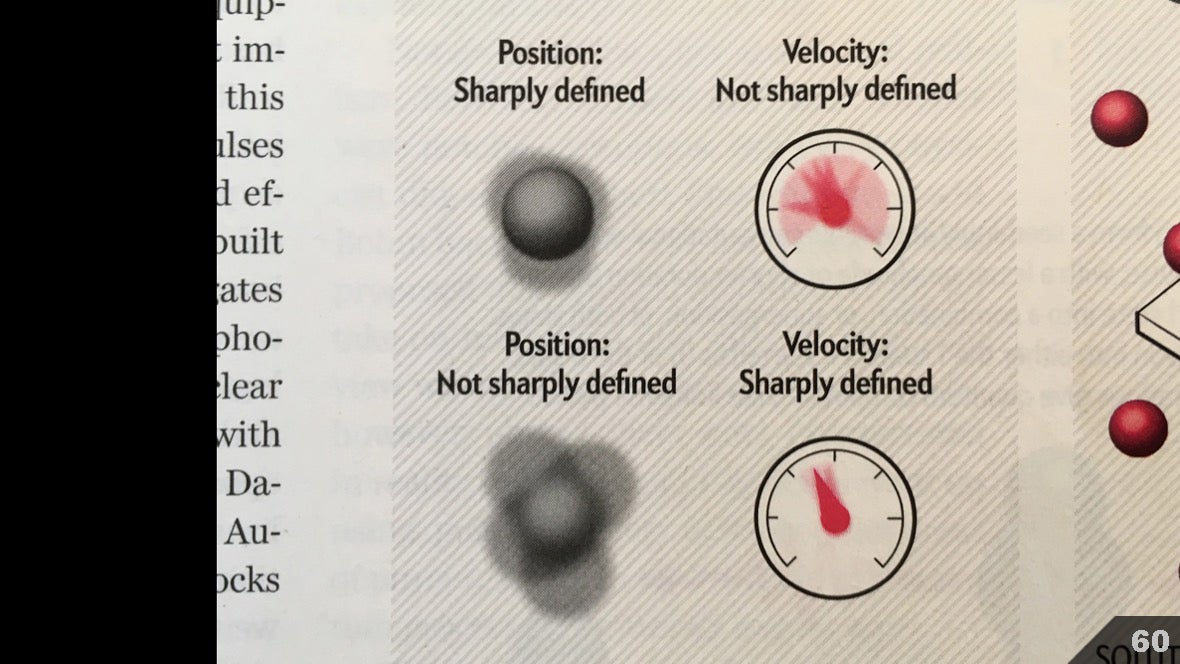 They will not delve into the scientific concepts behind these examples. In truth, I only have a passing idea. But I think these examples can be informative and inspiring. On the left is the classical representation of light as a combination of oscillations of electromagnetic fields. On the right, the light is presented from the point of view of quantum mechanics: the line fluctuates within a large range of uncertainty (color region).
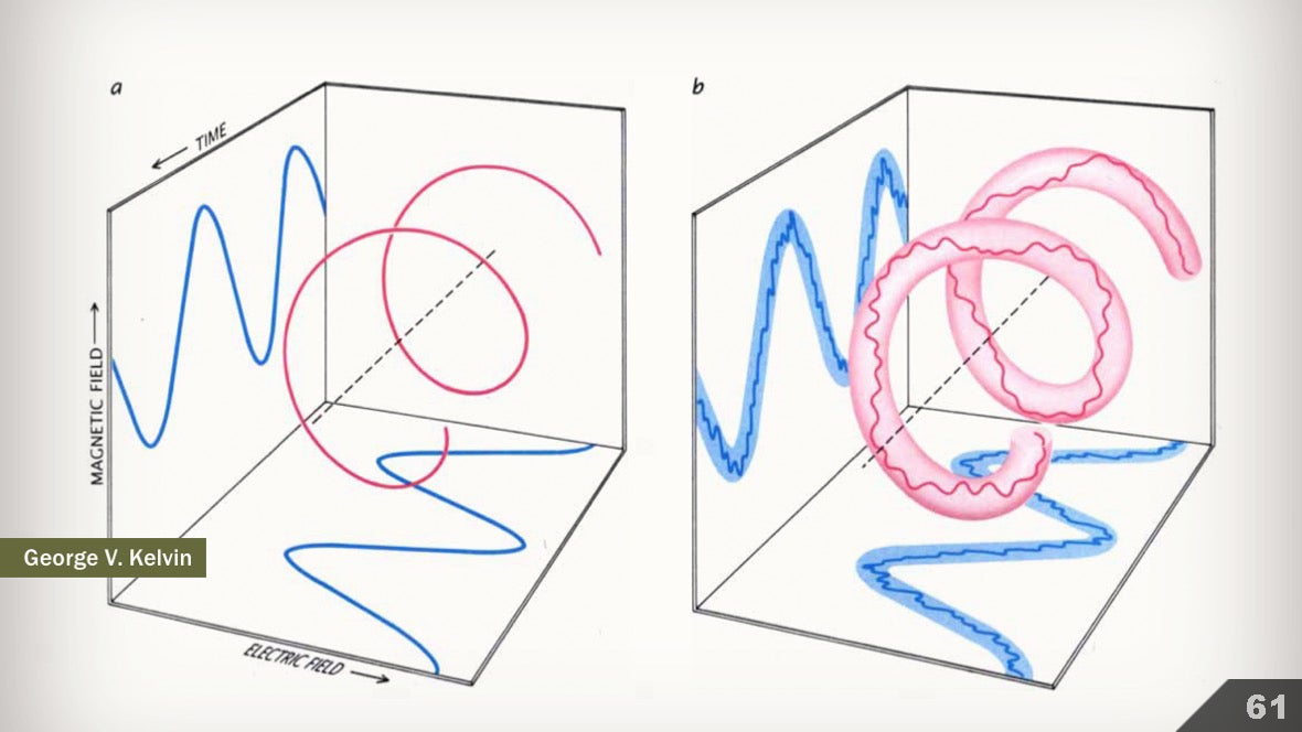 The level of uncertainty depends not only on space, but also on time. Here is an example of three ways to visualize this concept.
 Neurophysiology is another area of science that operates with uncertainty. In this illustration, parts of the brain are labeled as mountain systems on a map. Borders are not drawn because they are not known exactly.
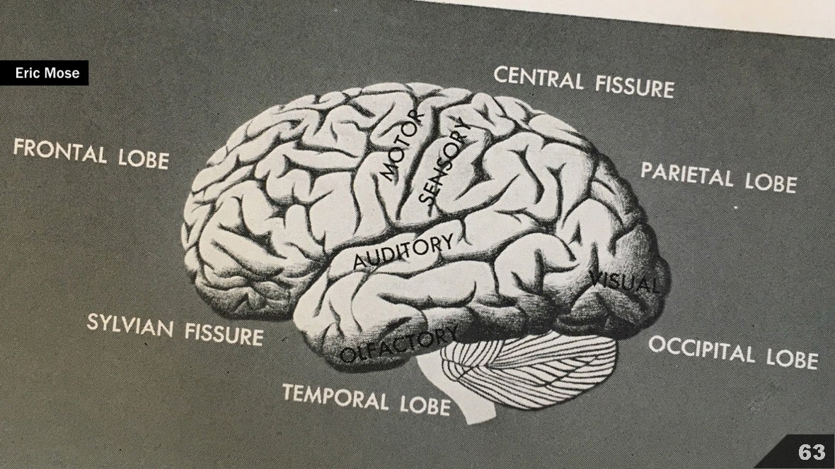 About 70 years later, some structures and functions are already known with higher accuracy. But we still often use blurry edges.
 Here is another strategy for representing uncertainty in the geography of the brain: the whole structure is depicted abstractly.
 And here the brain is depicted realistically, but the arrows indicating the course of processes suggest that we still have to find out the details.
 This 1969 illustration is my favorite. The inputs to the brain - A, B and C, the outputs - X, Y and Z, it turns out more or less clear. However, the following is signed: "much less is known about the work of the areas between them, which make up the majority of the brain."
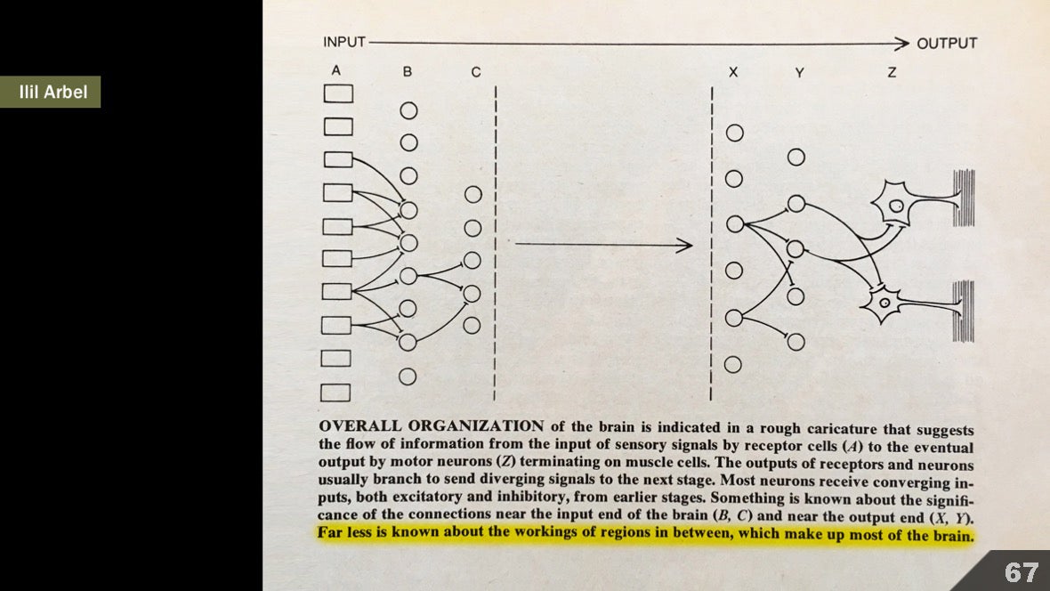 Those who work in the field of animal reconstruction are constantly faced with the problem of reconstructing forms based on incomplete information. Here, artist Rudolf Frund used thick bold lines to represent known fragments, and with thin dashed lines he depicted the alleged fragments.
 Many illustrators depict processes that are not yet fully understood by science, or unproven hypotheses. Sometimes it’s advisable to simply draw a question mark and make an insert suggesting that some kind of interpretation is not yet generally accepted.
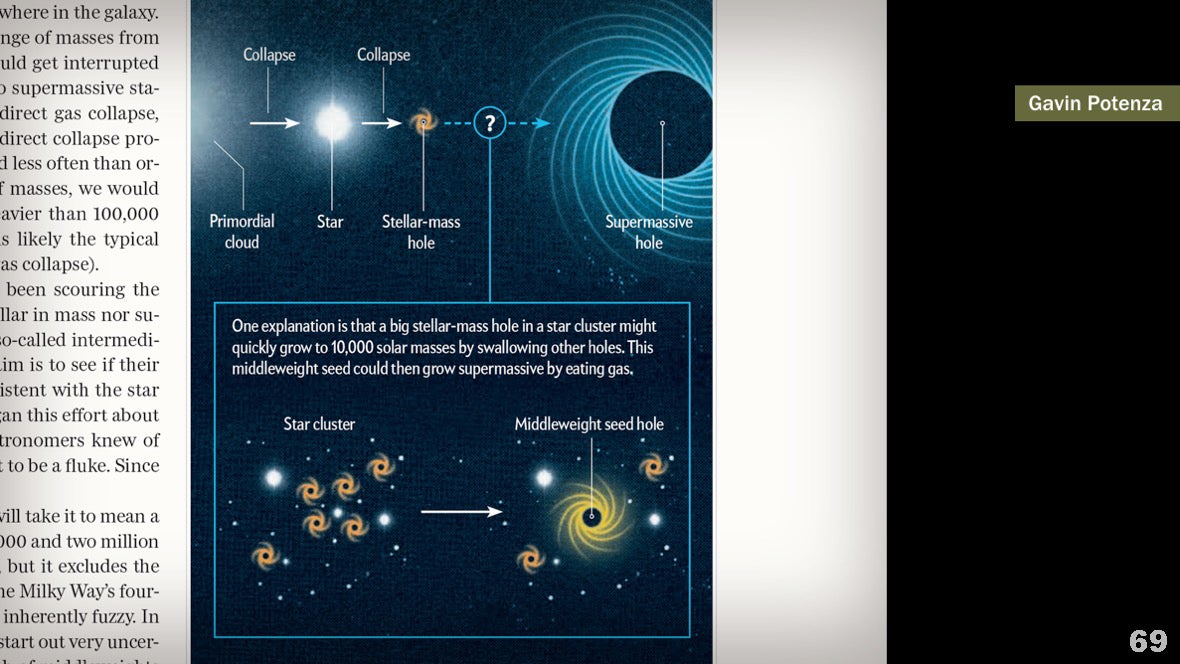 I am not saying that these examples are ideal representations of uncertainty. But it seems to me that you were interested to see how qualitative solutions can complement quantitative ones, and vice versa.
Source: https://habr.com/ru/post/undefined/
All Articles