While preparing some of the results for publication in the journal, the question arose: how to evenly distribute data along the axis in gnuplot . I decided the question, I got the graphics. Who cares how, please, under cat.Initially, during the workflow, all graphs were built in MS Excel. It is quite convenient in it to quickly sketch data, build a couple of curves and move on. But working in MS Excel, there is no control over the resulting drawing. Therefore, when writing results for articles, I often use gnuplot.It is required to receive such a graph: By this data set
data.csv7.3; 0.0251; 250; 217.9006251
5.3; 0.0348; 293; 238.6280188
3.3; 0.0398; 176; 177.7890558
7.4; 0.0413; 262; 229.6579533
3.2; 0.0438; 186; 180.6920998
7.2; 0.0468; 265; 233.6496388
5.1; 0.0486; 247; 248.6435206
5.2; 0.0685; 239; 263.0861645
3.4; 0.0697; 180; 199.4893097
3.1; 0.0717; 167; 200.9408317
4.3; 0.0718; 405; 358.2750638
2.2; 0.0728; 267; 255.5794728
1.1; 0.0797; 226; 314.1587397
1.3; 0.0797; 225; 314.1587397
1.2; 0.0822; 292; 315.9731422
2.4; 0.0852; 276; 264.5789092
1.4; 0.0879; 299; 320.1099799
6.4; 0.098; 362; 311.209506
2.3; 0.102; 331; 276.771694
2.1; 0.1021; 233; 276.8442701
6.1; 0.1182; 372; 325.8698782
4.1; 0.1263; 335; 397.8290383
4.4; 0.1436; 459; 410.3847036
4.2; 0.1455; 435; 411.7636495
6.2; 0.153; 360; 351.126361
If you run this through gnuplot, you get the following: the points merge.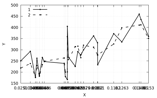 But this does not seem much like what I wanted to get.The official documentation helped to understand the proper names of labels on the axis ( xtic ) and labels in the graph area ( sprintf ):
set xtics rotate by -60
Label(String,Size) = sprintf("{/=%d %s}", Size, String)

plot "data.csv" using 2:3:xtic(2) title "1" w lp ls 1 ,\
     "data.csv" using 2:4 title "2" w lp ls 2 ,\
     "data.csv" using 2:($3>$4?$3+20:$4+20):(Label(stringcolumn(2), 12)) with labels notitle
Slice($3>$4?$3+20:$4+20)
allows you to set marks in the figure above the selected points by 20 units.It turned out this way: But the question with the uneven distribution of data along the axis remained open.The decision was formed in the process of wandering around forums and articles - number the lines .The easiest option is to number manually.The second option is to number automatically:
 nl -v 0 -s ';' -w 1 data.csv >> data_nums.csv
If you need to exclude commented out lines, the command takes the form:grep -v "^#" data.csv | nl -v 0 -s ';' -w 1 >> data_nums.csv
data_nums.csv0; 7.3; 0.0251; 250; 217.9006251
1; 5.3; 0.0348; 293; 238.6280188
2; 3.3; 0.0398; 176; 177.7890558
3; 7.4; 0.0413; 262; 229.6579533
4; 3.2; 0.0438; 186; 180.6920998
5; 7.2; 0.0468; 265; 233.6496388
6; 5.1; 0.0486; 247; 248.6435206
7; 5.2; 0.0685; 239; 263.0861645
8; 3.4; 0.0697; 180; 199.4893097
9; 3.1; 0.0717; 167; 200.9408317
10; 4.3; 0.0718; 405; 358.2750638
11; 2.2; 0.0728; 267; 255.5794728
12; 1.1; 0.0797; 226; 314.1587397
13; 1.3; 0.0797; 225; 314.1587397
14; 1.2; 0.0822; 292; 315.9731422
15; 2.4; 0.0852; 276; 264.5789092
16; 1.4; 0.0879; 299; 320.1099799
17; 6.4; 0.098; 362; 311.209506
18; 2.3; 0.102; 331; 276.771694
19; 2.1; 0.1021; 233; 276.8442701
20; 6.1; 0.1182; 372; 325.8698782
21; 4.1; 0.1263; 335; 397.8290383
22; 4.4; 0.1436; 459; 410.3847036
23; 4.2; 0.1455; 435; 411.7636495
24; 6.2; 0.153; 360; 351.126361
When working with such a dataset, gnuplot will distribute the data along the axis at regular intervals: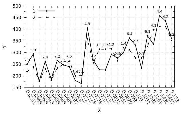 Summary script:
#!/usr/bin/gnuplot -persist

set encoding utf8
set terminal pngcairo size 640,400 enhanced monochrome
set output "img.png"

set ylabel "Y"
set xlabel "X"
set key left top samplen 5 spacing 1.15 width 2
set xrange [-0.5:24.5]
set mytics 2
set xtics rotate by -60
set grid
set pointsize 0.5
set datafile separator ";"
set style line 1 linetype 1 pointtype 7 linewidth 2 linecolor black
set style line 2 linetype 2 pointtype 7 linewidth 2 linecolor black

Label(String,Size) = sprintf("{/=%d %s}", Size, String)

plot "data_nums.csv" using 1:4:xtic(3) title "1" w lp ls 1 ,\
     "data_nums.csv" using 1:5 title "2" w lp ls 2 ,\
     "data_nums.csv" using 1:($4>$5?$4+20:$5+20):(Label(stringcolumn(2), 10)) with labels notitle
update:Thanks to attentionDeosisand an exact reference to the documentation (paragraph Pseudocolumns ) it turned out that you can do without artificial numbering.For uniform distribution of data along the axis, you can use the null column ($ 0), which provides row indices.In this case, it is possible to use the original data set - data.csv, and make the following changes in the script:plot "data.csv" using 0:3:xtic(2) title "1" w lp ls 1 ,\
"data.csv" using 0:4 title "2" w lp ls 2 ,\
"data.csv" using 0:($3>$4?$3+20:$4+20):(Label(stringcolumn(2), 12)) with labels notitle