Two hours and 3.5 dollars. How I made a simple site with visualization of the distribution of coronavirus
It all started with the fact that I could not find a normal visualization of the data on the distribution of coronavirus. Rather, there was one site showing the dynamics on the map and metrics for China, but this is exactly what I was least interested in, I am interested in the global picture. To be honest, this virus scares me.Plan
Well, this is the simplest task, I thought:- We are looking for an open API on the WHO website.
- We are writing a parser.
- We raise a little servo with a base somewhere in the free tier of Amazon.
- We buy a domain, there should not be difficulty in choosing.
- Set the flask, wrap d3js for graphs, screw letsencrypt there for greater importance.
Reality
Something went wrong:- There is no open API on the WHO site.
- You can’t write a normal parser, WHO uploads the data in PDF, the format changes, and spending more than one evening on creating a dashboard was not in my plans.
- It turns out that I already spent my free tier on some experiments.
- Almost all coronavirus and coronavirus 2020 domains are already taken, who needs them at all?
- Given the preceding paragraphs, I definitely won’t get on with one evening, setting up flask and the base for it ...
New plan
Someone on github published his nocode project , but what am I worse?- Well, to hell with it with the API, well, at least there is data.
- , PDF . , , , 5 , , , .
- , shared-, - , - .
- coronavirus2020.live $3.5, , 20, , .
- What do we have from ready-made solutions? For visualization, let's take the free Google Datastudio, which integrates perfectly with Google Sheets. Instead of letsencrypt SSL, we use cloudflare.
Decision
We can say that the solution turned out to be really nocode and fully meet my expectations:- The data is collected in a small plate in Google Sheets.

- Datastudio created a simple dashboard.
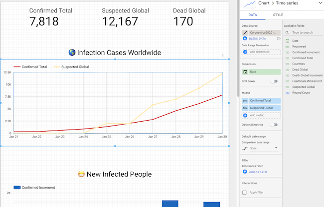
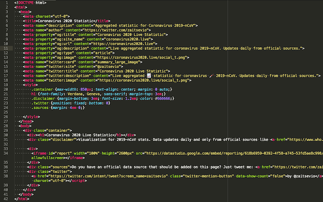
- The entire site - one html file in 42 (not so special) lines, half of which is metadata of any markup.
- Instead of certificate and google analytics - cloudflare.
- Instead of connecting mail for feedback - a link to Twitter.
findings
- Now, any person who does not even have any experience with databases and does not know SQL can work with data quite efficiently and build beautiful reports. But SQL is still better to know.
- You should never forget about the ultimate goal, a simple solution leading to a goal is always better than a complex, and even more so - not implemented.
- Coronavirus is insidious and does not think to stop.
Surely some of this could be made even simpler and faster, or maybe someone even made a steeper visualization by connecting more data sources (many publications are in Chinese, and I'm, alas, not very good in it). If you have something to share, I will gladly discuss it in the comments. All health, comrades. Source: https://habr.com/ru/post/undefined/
All Articles