 Good day, friends!Tired of JS, switch to CSS!
Task
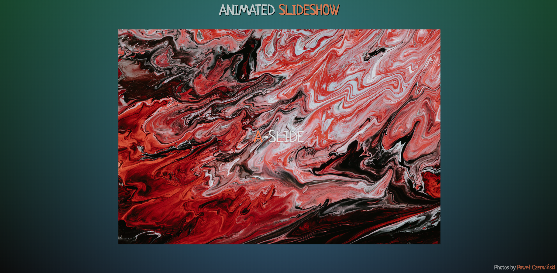
Make an animated slideshow using CSS. Slideshows can be used, for example, in special occasions to display photos on the screen through the projector. Through looping, the displayed photos can serve as a backdrop for a solemn speech.Possible Solution
For the slideshow, we’ll take the strange “macro photo” Paweł Czerwiński (they’re cool).So let's go.Our markup will look like this:<div class="slideshow">
<img src="https://thebestcode.ru/media/animatedSlideshow/1.jpg" alt="#" class="i_1">
<p class="p_1">a-slide</p>
<img src="https://thebestcode.ru/media/animatedSlideshow/2.jpg" alt="#" class="i_2">
<p class="p_2">b-slide</p>
<img src="https://thebestcode.ru/media/animatedSlideshow/3.jpg" alt="#" class="i_3">
<p class="p_3">c-slide</p>
<img src="https://thebestcode.ru/media/animatedSlideshow/4.jpg" alt="#" class="i_4">
<p class="p_4">d-slide</p>
<img src="https://thebestcode.ru/media/animatedSlideshow/5.jpg" alt="#" class="i_5">
<p class="p_5">e-slide</p>
<img src="https://thebestcode.ru/media/animatedSlideshow/6.jpg" alt="#" class="i_6">
<p class="p_6">f-slide</p>
</div>
What are we observing here?Photos are wrapped in a slideshow class, which is used to align elements horizontally and vertically..slideshow has the following styles:.slideshow {
width: 100vw;
height: 100vh;
display: flex;
justify-content: center;
align-items: center;
}
We have 6 photos. Each photo is assigned the class "i_number of photos". Under each photo there is a signature with the class “p_number of photo”.Img has the following styles:img {
position: absolute;
max-width: 90vw;
max-height: 80vh;
opacity: 0;
animation: slideshow 36s ease-in-out infinite;
}
Animation time depends on the number of photos and the display time of each photo. In this case: 6 photos for 6 seconds each.Let's move on to the animation:@keyframes slideshow {
from {
opacity: 0;
filter: grayscale(100%);
}
5% {
opacity: 1;
filter: grayscale(50%);
}
10% {
opacity: 1;
filter: grayscale(0);
transform: scale(1.1);
}
15% {
opacity: 1;
filter: blur(0);
}
20% {
opacity: 0;
filter: blur(2px);
transform: scale(0.9);
}
25% {
opacity: 0;
}
}
We use only 25% of the animation, but in six steps. 25% is the fourth part, so the photos will overlap slightly. Since we are implementing the “fade in-fade out” effect, i.e. We work with transparency, this is exactly what we need.With the help of “filter: grayscale” we saturate the color of the displayed (discolored) photo, with the help of “transform: scale” we scale the photo a little forward when outputting and a little back when replacing, using “filter: blur” we blur the replaced photo.Next, we work with individual photos:.slideshow .i_1 {
animation-delay: 6s;
transform: translateX(-100px) rotate(-3deg);
}
.slideshow .i_2 {
animation-delay: 12s;
transform: translateX(100px) rotate(3deg);
}
.slideshow .i_3 {
animation-delay: 18s;
transform: translateY(-100px) rotate(3deg);
}
.slideshow .i_4 {
animation-delay: 24s;
transform: translateY(100px) rotate(-3deg);
}
.slideshow .i_5 {
animation-delay: 30s;
transform: rotate(-6deg);
}
.slideshow .i_6 {
animation-delay: 36s;
transform: rotate(6deg);
}
We set the animation delay for each photo (6 seconds of the first and +6 seconds of each subsequent). For a change, we shift and rotate each photo using "transform: translate rotate" (the values were selected empirically).We finished the photo. Now let's get down to the signatures.P has the following styles:p {
margin: 0;
position: absolute;
top: 50%;
left: 50%;
transform: translate(-50%, -50%);
color: #e4e4e4;
text-shadow: 0 0 1px #000;
text-transform: uppercase;
font-size: 2.8em;
opacity: 0;
animation: title 36s linear infinite;
}
The animation time for the captions corresponds to the animation time for the photo.Signature animation looks a lot easier:@keyframes title {
from {
opacity: 0;
}
5% {
opacity: 1;
}
20% {
opacity: 1;
}
25% {
opacity: 0;
}
}
We also display a separate signature using animation delay:.slideshow .p_1 {
animation-delay: 7s;
}
.slideshow .p_2 {
animation-delay: 13s;
}
.slideshow .p_3 {
animation-delay: 19s;
}
.slideshow .p_4 {
animation-delay: 25s;
}
.slideshow .p_5 {
animation-delay: 31s;
}
.slideshow .p_6 {
animation-delay: 37s;
}
Please note that the animation delay of captions is 1 second more than the corresponding photo values. This is done in order to display captions after the appearance and transformation of a particular photo.That's all. In my opinion, it turned out simple, but interesting.The result can be seen here .Thank you for attention.